
Why Is My YouTube Thumbnail Low Quality? Causes & Fixes
Find out why your YouTube thumbnail looks low quality and learn how to improve its resolution, sharpness, text clarity, and export settings.
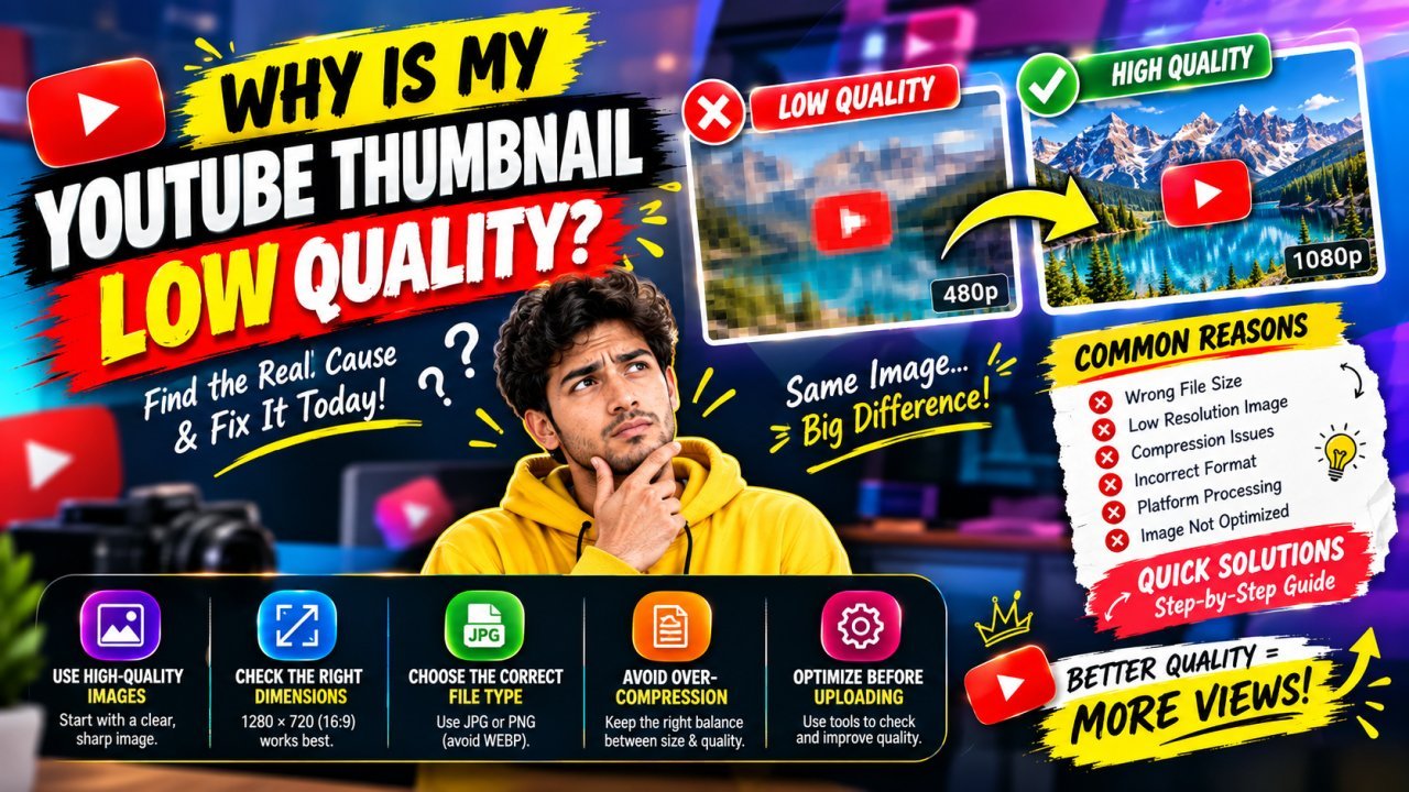
Why Is My YouTube Thumbnail Low Quality?
Introduction
You have designed a YouTube thumbnail, added text and images, and uploaded it to your video. But when you view it on YouTube, it looks blurry, pixelated, dull, or less professional than expected.
If you are asking, “Why is my YouTube thumbnail low quality?”, the issue may not be YouTube alone. Image quality can be affected by the original photo, thumbnail dimensions, resizing, editing choices, compression, and export settings.
A thumbnail can also look different in a design editor than it does in a video feed. The editor may show the image at a larger size, while YouTube displays it in a smaller space where fine details and tiny text are harder to see.
This guide explains the common reasons a YouTube thumbnail looks low quality and how to improve it. You will learn what to check first, how to avoid quality loss, and how to create a thumbnail that looks clear on both desktop and mobile.
Why Is My YouTube Thumbnail Low Quality?
A YouTube thumbnail may look low quality for several reasons:
- All Tools
- The original image is small or blurry.
- The design was enlarged beyond the source image’s useful resolution.
- The thumbnail was exported at the wrong dimensions or with low quality.
- The image was compressed repeatedly.
- Text or important details are too small.
- The design uses too many effects, making it look cluttered or soft.
- The thumbnail looks clear in the editor but is being viewed at a much smaller size on YouTube.
The best way to find the cause is to inspect the thumbnail at each stage: the original image, the design canvas, the exported file, and the version displayed on YouTube.
What Does “Low Quality” Mean for a YouTube Thumbnail?
“Low quality” can describe more than one problem. Identifying what you see will help you choose the right fix.
| What you notice | Possible cause |
|---|---|
| Blurry faces or objects | Low-resolution source image or excessive enlargement |
| Blocky or pixelated areas | Compression or a small image enlarged too much |
| Fuzzy text | Text is too small, thin, or compressed |
| Jagged edges | Resizing or low-resolution graphics |
| Dull or muddy appearance | Weak contrast, compression, or too many effects |
| Looks good in the editor but poor on YouTube | Export settings, display size, or processing differences |
A thumbnail does not need to be packed with detail to look professional. It needs a clear main subject, readable text if text is used, and enough image quality for its intended display size.
Start With the Correct Thumbnail Dimensions
One of the first things to check is the size of your thumbnail file. If you design on a small canvas and enlarge it later, the final image may look soft or pixelated.
YouTube’s official thumbnail guidance recommends using a large image with a 16:9 aspect ratio. Check YouTube Help for the current upload requirements before publishing, as platform specifications can change.
For a practical workflow, create the design at the intended final dimensions from the beginning. This avoids unnecessary enlargement and helps you judge text and details at a realistic size.
Why the aspect ratio matters
A 16:9 design is a wide rectangle. If your image has a different shape, you may need to crop it or add space around it to fit the thumbnail layout.
Stretching an image to force it into a different shape can distort faces, products, and other important elements. Cropping can also remove part of the subject if the composition was not planned for the thumbnail shape.
Before you finish your design:
- Confirm that the canvas has the intended aspect ratio.
- Keep faces and important objects away from the edges.
- Avoid stretching the image to fill the canvas.
- Check the thumbnail after cropping.
Low-Resolution Source Images Can Lower the Quality
A thumbnail cannot show more real detail than its source images contain. If you use a tiny photo, a blurry screenshot, or an image downloaded at a small size, enlarging it will not make it genuinely sharp.
For example, a small portrait may look acceptable when viewed at its original size. But if you enlarge it to fill half of a thumbnail, the face may become soft and individual details may turn into blocks or smudges.
Choose a better source image
Whenever possible, use the original photo or a high-quality image that is large enough for your design. If you are making a thumbnail from your own video, choose a clear frame rather than a frame with motion blur or poor lighting.
Before using an image, ask:
- Is the subject in focus?
- Does the image have enough detail for the size I need?
- Is the lighting clear enough to see the subject?
- Will cropping remove an important part of the image?
If the source image is already blurry, replacing it is often more effective than trying to fix it with filters.
Enlarging an Image Too Much Can Make It Look Pixelated
Resizing changes the number of pixels used to display an image. When a small image is enlarged, software must estimate how to fill the extra space. This can make edges look soft and details appear blocky.
The problem is especially noticeable around faces, hair, text, and high-contrast edges.
A simple example
Imagine using a small profile picture as the main subject of a wide thumbnail. If you stretch the picture until it fills a large area, the face may become visibly pixelated.
A better approach is to use a larger source image, reduce how much of the thumbnail it occupies, or choose a different image that fits the composition.
Tip: Avoid enlarging a small image repeatedly. Start with a suitable source and resize it only as much as your design requires.
Part 1 Summary
A low-quality YouTube thumbnail can result from a weak source image, incorrect sizing, excessive enlargement, compression, or design details that are too small to read.
Begin by identifying the specific problem instead of applying random filters. Check the original image, confirm the canvas dimensions, and inspect the final exported file. These simple checks can help you find where quality is being lost.
Next (Part 2) will include export settings, PNG vs. JPEG, compression, practical fixes, sharpening advice, examples, and common mistakes.
Check the Exported File Before Uploading
Your thumbnail may look sharp inside a design editor but lose quality when you export it. The editor preview is not the same as the image file you upload.
After exporting, open the saved image separately and inspect it at a normal viewing size. Look closely at faces, text, outlines, and other important details.
Before uploading, check:
- The image dimensions are correct.
- The file looks clear when opened outside the editor.
- Text and edges are not visibly pixelated.
- The image has not been saved at an unnecessarily low quality.
- The file is the final version, not an earlier draft.
If the exported image already looks blurry, fix the file or export it again before uploading. Uploading the same soft image again is unlikely to solve the underlying problem.
PNG vs. JPEG: Which Format Should You Use?
PNG and JPEG can both be suitable for YouTube thumbnails. The better choice depends on the kind of image you are creating and the quality settings available in your editor.
| Format | Often useful for | Keep in mind |
|---|---|---|
| PNG | Text, shapes, logos, illustrations, and sharp graphic edges | Files may be larger than JPEGs |
| JPEG | Photos, portraits, and thumbnails with photographic backgrounds | Strong compression can create visible artifacts |
PNG is often a practical choice when your thumbnail contains large text, graphic shapes, or crisp outlines. A high-quality JPEG can also look good, especially when the design is mostly photographic.
The format alone does not guarantee a sharp thumbnail. A low-resolution image saved as PNG can still look blurry, while a well-prepared JPEG can look clear.
Choose the format that preserves the appearance of your design while meeting YouTube’s current upload requirements.
Avoid Repeated Image Compression
Repeatedly saving and re-editing a compressed image can reduce its quality. This is especially relevant when working with JPEG files, which use lossy compression.
For example, if you download a JPEG, edit it, save it, reopen it, and save it again, each export may introduce additional compression. Over time, details around text and edges can look less clean.
A better workflow
- Keep an original copy of your source image.
- Make edits in your design project rather than repeatedly editing the exported JPEG.
- Export the final thumbnail once you are satisfied with the design.
- If you need to make changes later, return to the original project and export a fresh final file.
This approach helps you avoid unnecessary quality loss and makes it easier to compare different versions.
How Incorrect Resizing Can Lower Thumbnail Quality
Resizing can affect image clarity, particularly when a small image is enlarged to fill a large part of the thumbnail.
When an image is enlarged, the software has to estimate the extra pixels. The result may look softer than the original, especially around hair, faces, text, and sharp edges.
Avoid these resizing problems
- Enlarging a tiny image until it fills the canvas.
- Stretching an image to fit a different shape.
- Resizing the same image repeatedly.
- Cropping so tightly that the remaining subject becomes too small or unclear.
What to do instead
Start with a source image that is large enough for the space it will occupy. Create the thumbnail canvas at the intended final dimensions, then resize the source image only as much as needed.
If a subject becomes blurry when enlarged, try using a better source image or making the subject smaller in the composition.
Use High-Quality Source Images
The source image has a major effect on the final thumbnail. If the original photo is out of focus, dark, noisy, or too small, editing may improve its appearance—but it may not restore all the missing detail.
When choosing a source image, look for:
- A clear subject that is in focus.
- Good lighting and visible facial or object details.
- Enough resolution for the size you need.
- A composition that leaves room for text, if you plan to use it.
- A frame without unwanted motion blur.
If you are taking a frame from your own video, choose a moment when the subject is clear and well-lit. A sharp frame is usually a better starting point than a blurry frame that requires heavy editing.
How to Fix a Low-Quality YouTube Thumbnail
The best fix depends on what is making the thumbnail look poor. Use this order to troubleshoot it instead of applying every possible enhancement.
Step 1: Inspect the original image
Open the original photo or screenshot. If it is already blurry or pixelated, replace it with a clearer source when possible.
Step 2: Check the canvas dimensions
Make sure the design uses the intended thumbnail dimensions and aspect ratio. Avoid stretching the image to force it into place.
Step 3: Review the design
Make important text larger, improve contrast, and remove effects that make the subject or lettering harder to see.
Step 4: Export a fresh copy
Export the thumbnail using a suitable image format and good quality settings. Avoid repeatedly saving a compressed image.
Step 5: Inspect the exported image
Open the final file separately. If it looks blurry before upload, return to the design and correct the issue.
Step 6: Compare it with the uploaded version
If the exported file looks clear but the displayed thumbnail looks different, compare the two at a similar viewing size. This can help you determine whether the issue is in the design, export, or display.
Important: Do not expect an “HD” or sharpening tool to recreate details that are missing from the source image. Use enhancement tools carefully and compare the result with the original.
How to Sharpen a Thumbnail Without Making It Look Artificial
Sharpening can make a slightly soft image appear clearer by increasing contrast around edges. However, too much sharpening can make the thumbnail look harsh or unnatural.
Watch for these signs of over-sharpening:
- Bright or dark halos around a person or object.
- Rough-looking skin or exaggerated facial details.
- Noisy backgrounds.
- Jagged edges around text and shapes.
Use a restrained approach
Apply a small amount of sharpening, then zoom out and inspect the entire thumbnail. The goal is to make the subject easier to see—not to make every edge look extremely hard.
If the image is very blurry or pixelated, sharpening may emphasize the defects. In that case, replacing the source image is usually the better option.
Should You Reduce Noise Before Sharpening?
A grainy image can make a thumbnail look rough or low quality. Noise reduction may help when the source photo contains visible grain, especially in dark areas.
But heavy noise reduction can also remove real detail and make faces or objects look waxy.
A careful order is:
- Check whether the grain is distracting at the thumbnail’s normal viewing size.
- Apply mild noise reduction only if it improves the image.
- Use light sharpening if the image still looks slightly soft.
- Compare the edited result with the original.
Do not apply noise reduction and sharpening automatically to every thumbnail. If the original image is already clear, extra processing may make it look worse.
Why Does Thumbnail Text Look Low Quality?
Text may look blurry or difficult to read when it is too small, too thin, or placed over a busy background. Compression and resizing can make the problem more noticeable.
Make thumbnail text clearer
- Use a bold, readable font.
- Keep the wording short.
- Make the text large enough to read at a small display size.
- Choose strong contrast between the text and its background.
- Avoid excessive glow, blur, shadow, or outline effects.
- Leave enough space around the words.
If the text is difficult to read when the thumbnail is shown small, simplify the wording or increase its size. A thumbnail should communicate its main idea quickly, not force viewers to zoom in to read it.
Too Many Effects Can Make a Thumbnail Look Less Sharp
Effects can help separate the subject from the background, but too many effects may make a thumbnail look messy or soft.
For example, strong glow, heavy blur, thick outlines, excessive sharpening, and multiple shadows can compete with the main subject. These effects may also make text and edges harder to distinguish.
Keep the design focused
Use effects only when they improve clarity. A simple background, a clear subject, readable text, and a small number of supporting elements can be more effective than a crowded design.
Before exporting, temporarily hide unnecessary effects and compare the result. If the thumbnail looks cleaner without them, leave them out.
Check Your Thumbnail at Different Viewing Sizes
A thumbnail may look excellent when zoomed in but become difficult to understand when displayed small. This is why it is important to review the design at more than one size.
Check:
- Full size: Are the source image and edges clear?
- Normal viewing size: Is the main subject easy to recognize?
- Small size: Can you still understand the main idea and read any important text?
If the thumbnail loses clarity when reduced, simplify it. Remove minor details, enlarge the main subject, and make the text more readable.
A useful thumbnail is not one that looks detailed only when zoomed in. It should communicate clearly at the size viewers are likely to see it.
Examples: Finding the Cause of Low Thumbnail Quality
Example 1: A blurry face
You use a small portrait as the main subject and enlarge it to cover a large part of the thumbnail. The face looks soft around the eyes and hair.
Likely cause: The source image does not have enough detail for the size you need.
Better fix: Use a larger, clearer portrait or reduce the size of the subject in the design.
Example 2: A pixelated product
A product photo looks blocky after you enlarge it and crop tightly around the object.
Likely cause: The source image is too small, or the crop leaves too few pixels for the final display.
Better fix: Use a higher-resolution product image, avoid an overly tight crop, or choose a clearer photo.
Example 3: Blurry thumbnail text
The text looks readable in the editor but becomes fuzzy after export.
Likely cause: The text may be too small, the image may have been resized, or the export may use strong compression.
Better fix: Increase the text size, use a bold font, check the final dimensions, and export a fresh copy at suitable quality.
Example 4: A thumbnail looks dull after upload
The exported file looks clear, but the version you see on YouTube appears less crisp.
Possible cause: You may be comparing images at different display sizes, or the uploaded image may be processed differently from the local file.
Better check: Compare the exported file and displayed thumbnail at similar sizes before making further edits.
Quick Troubleshooting Table
| Problem | First thing to check | Practical next step |
|---|---|---|
| Blurry face | Original portrait | Replace it with a clearer image |
| Pixelated object | Source resolution and crop | Use a larger source or reduce the crop |
| Fuzzy text | Font size and export | Enlarge text and export a fresh file |
| Jagged edges | Resizing | Avoid repeated resizing or stretching |
| Grainy photo | Original image noise | Try mild noise reduction if needed |
| Harsh, artificial look | Sharpening and effects | Reduce sharpening and simplify effects |
| Clear in editor, blurry after export | Exported file | Inspect dimensions and export quality |
| Clear file, different-looking upload | Display size and uploaded version | Compare both at similar viewing sizes |
Use the table to identify the most likely cause, then change one thing at a time. This makes it easier to tell which adjustment actually helps.
Best Workflow for a Clear YouTube Thumbnail
Follow this workflow each time you create a thumbnail:
- Choose a clear source image. Avoid blurry photos and low-quality screenshots.
- Create the canvas at the intended dimensions. Do not design small and enlarge everything later.
- Build a simple composition. Make the main subject easy to recognize.
- Use readable text. Keep it short, bold, and high-contrast.
- Resize carefully. Avoid stretching and repeated resizing.
- Use effects sparingly. Add sharpening or noise reduction only when it improves the image.
- Export a fresh final file. Choose a suitable format and quality setting.
- Inspect the exported file. Open it separately from the editor.
- Check it at a small size. Confirm that the subject and message remain clear.
- Upload only after the quality check. Keep the original project so you can make changes without repeatedly compressing the final image.
This process helps you catch quality problems before they reach YouTube.
Common Mistakes to Avoid
Using a small image as the main subject
A small source image may become blurry when enlarged. Use a better source or reduce its size in the layout.
Stretching an image to fit
Stretching can distort faces and objects. Preserve the image’s proportions and adjust the crop or composition instead.
Saving the same JPEG repeatedly
Repeated lossy exports can reduce quality. Edit the original project and export a fresh final file.
Making text too small
Tiny text becomes difficult to read when the thumbnail is displayed at a smaller size. Keep the message short and use readable lettering.
Applying too much sharpening
Over-sharpening can create halos and harsh edges. Use only enough to improve a slightly soft image.
Adding too many effects
Excessive glow, blur, shadows, and outlines can make the design look cluttered. Keep effects purposeful.
Checking only inside the editor
The editor preview may not match the exported file. Always inspect the final image separately before uploading.
Expecting an enhancement tool to restore every detail
Image enhancement may improve appearance, but it cannot reliably recover all detail from a severely blurred or tiny source. Replace the source image when possible.
Conclusion
If you are asking, “Why is my YouTube thumbnail low quality?”, the cause may be the original image, resizing, compression, export settings, or a design that becomes hard to read at a small size.
Start by checking the source image and the final exported file. Make sure your canvas uses the intended dimensions, avoid stretching small images, keep text readable, and export a fresh copy rather than repeatedly saving a compressed file.
If the thumbnail is already blurry, replacing a poor source image is often more effective than applying stronger sharpening. Sharpening can help with slight softness, but it cannot reliably restore details that were never captured.
A simple workflow—clear source image → correct canvas → careful editing → suitable export → final quality check—can help you create thumbnails that look cleaner and more professional.
Key Takeaways
- Use a clear, high-quality source image.
- Create your thumbnail at the intended dimensions and aspect ratio.
- Avoid enlarging small images too much or stretching them to fit.
- Inspect the exported file before uploading it.
- Keep text large, bold, and easy to read.
- Avoid repeatedly saving compressed JPEG files.
- Choose PNG or high-quality JPEG based on the design; neither format can fix a poor source image.
- Use sharpening and noise reduction only when they improve the result.
- Remove effects that make the thumbnail cluttered or difficult to understand.
- Check the design at a small viewing size, not only while zoomed in.
- Compare the original, exported, and uploaded versions when troubleshooting.
- Fix the cause of the quality problem instead of applying random filters.
CTA
A low-quality thumbnail can make a video look less polished, but you can often prevent the problem with a few simple checks.
Before uploading your next thumbnail, review the source image, canvas size, text readability, and exported file. If your current thumbnail looks blurry, identify where the quality changed and make one adjustment at a time.
Create your next thumbnail with a clear source image, careful editing, and a final quality check before publishing.
1. Why is my YouTube thumbnail low quality?
A YouTube thumbnail may look low quality because the original image is blurry or too small, the design was enlarged too much, the file was compressed heavily, or text and details are too small to see clearly. Check the original and exported files to help identify the cause.
2. How can I improve my YouTube thumbnail quality?
Start with a clear source image, design at the intended thumbnail dimensions, avoid excessive resizing, and export the final image at suitable quality. Keep text readable and inspect the exported file before uploading.
3. Why does my YouTube thumbnail look blurry after upload?
The thumbnail may look blurry because of a low-resolution source image, excessive enlargement, compression, or differences in display size. Compare the original design, exported file, and displayed thumbnail at similar sizes to narrow down the issue.
4. Does YouTube reduce thumbnail quality?
YouTube processes uploaded images, so the displayed version may not look exactly like the original file. Starting with a properly sized, high-quality image helps provide a better source for the platform to process.
5. Is PNG or JPEG better for YouTube thumbnails?
PNG can be useful for designs with text, shapes, and crisp graphic edges. A high-quality JPEG can work well for photographic thumbnails. The source image, dimensions, and export settings matter too—choosing a format alone will not make a blurry image sharp.
6. Why does my thumbnail text look blurry?
Text may look blurry when it is too small, thin, compressed, or affected by repeated resizing. Use a bold font, short wording, strong contrast, and minimal effects so the text stays readable at a smaller display size.
7. Can sharpening fix a low-quality thumbnail?
Sharpening may improve a slightly soft image, but it cannot reliably restore details missing from a very small or severely blurry source. Excessive sharpening can create halos and harsh edges, so use it carefully.
8. Why does my YouTube thumbnail look bad on mobile?
Small screens make fine details and tiny text harder to see. Simplify the design, make the main subject easy to recognize, and check that any text remains readable when the thumbnail is viewed at a small size.
9. Can using a screenshot lower thumbnail quality?
Yes. A screenshot may have less detail than the original image, depending on the source and display. When possible, use the original photo or video frame instead of enlarging a screenshot.
9. Can using a screenshot lower thumbnail quality?
Yes. A screenshot may have less detail than the original image, depending on the source and display. When possible, use the original photo or video frame instead of enlarging a screenshot.
Add relevant links to these related articles on your website:
- How to Make a YouTube Thumbnail HD: Size, Resolution & Quality Guide — link from the section about thumbnail dimensions.
- How to Improve YouTube Thumbnail Quality on a Low-Resolution Image — link from the source-image section.
- How to Fix a Pixelated YouTube Thumbnail Online — link from the troubleshooting section.
- How to Make a YouTube Thumbnail Look Professional Online — link from the design and readability sections.
- How to Make YouTube Thumbnail Text Clear and Sharp — link from the thumbnail text section.
- How to Make a YouTube Thumbnail More Eye-Catching — link from the best-practices section.
Ready to optimize your images?
Every tool mentioned in this article is free to use. No upload, no signup, and no watermarks — ever.
Try our free toolsRelated articles
Why Does My YouTube Thumbnail Look Blurry After Upload?
Find out why your YouTube thumbnail looks blurry after upload and learn how to fix image quality, resolution, compression, resizing, and export problems.
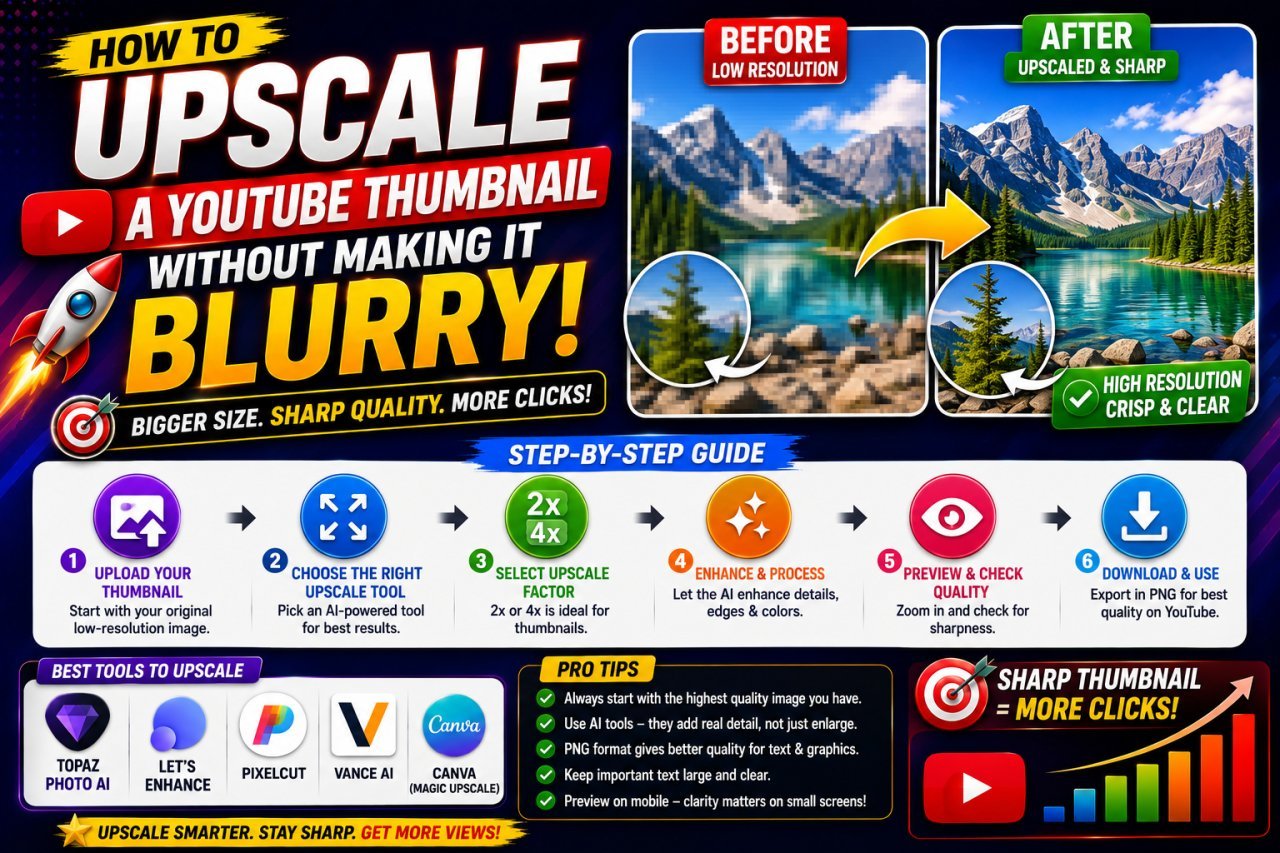
How to Upscale a YouTube Thumbnail Without Making It Blurry
Learn how to upscale a YouTube thumbnail without making it blurry. Discover the right image size, AI upscaling tips, sharpening techniques, and common mistakes to avoid.
YouTube Thumbnail Quality Enhancer: Make Thumbnails Clear & Sharp
Want clearer YouTube thumbnails? Learn how to enhance thumbnail quality, fix blurry images, sharpen details, resize correctly, reduce compression, and create thumbnails that look crisp on phones, desktops, and TVs.