
How to Make YouTube Thumbnail Text Clear and Sharp
Learn how to make YouTube thumbnail text clear and sharp with better fonts, sizing, contrast, spacing, outlines, export settings, and simple design techniques.

How to Make YouTube Thumbnail Text Clear and Sharp
If the text on your YouTube thumbnail looks blurry, tiny, or difficult to read, the problem may not be the words themselves. Font choice, text size, contrast, spacing, image resolution, and export settings can all affect how clearly the text appears.
Learning how to make YouTube thumbnail text clear and sharp starts with one simple principle: design the text so it remains readable even when the thumbnail is viewed at a smaller size.
A thumbnail may look perfect while you are editing it on a large screen, but that does not mean the text will remain easy to read when the thumbnail appears as a small preview.
The good news is that you can improve thumbnail text without making your design complicated.
This guide explains the basic techniques beginners can use to create cleaner, sharper, and more readable YouTube thumbnail text.
Why Clear Thumbnail Text Matters
Thumbnail text usually has very little time to communicate its message.
A viewer may quickly scan a page containing many videos, images, and titles. If your text blends into the background or becomes unreadable at a smaller size, an important part of your thumbnail's message can be lost.
Clear text can help viewers understand:
- What the video is about
- The main benefit or topic
- A question being answered
- A comparison being made
- A result being shown
- An important number or phrase
- All Tools
However, readable text does not mean you should fill the thumbnail with words.
The best thumbnail text is often short, large, well-spaced, and visually separated from the background.
What Makes YouTube Thumbnail Text Clear and Sharp?
Several elements work together to make thumbnail text readable.
| Element | Why It Matters |
|---|---|
| Font choice | Determines how easily letters can be recognized |
| Font size | Keeps text readable at smaller display sizes |
| Contrast | Separates text from the background |
| Letter spacing | Prevents letters from appearing crowded |
| Line spacing | Makes multiple lines easier to read |
| Text placement | Keeps important words away from distracting areas |
| Outline or shadow | Can improve separation from the background |
| Image resolution | Helps preserve fine text details |
| Export quality | Reduces unnecessary softness or compression |
| Short wording | Makes the message easier to process quickly |
You don't need to perfect every setting separately.
The goal is to make all of these elements work together.
1. Choose a Font That Is Easy to Read
The font you choose has a direct effect on how clearly your thumbnail text can be understood.
Decorative fonts can look attractive in some designs, but they may become difficult to read when the thumbnail is displayed at a smaller size.
For most thumbnails, start with a font that has:
- Simple letter shapes
- Good spacing
- Strong weight
- Clear uppercase and lowercase characters
- Distinct letters
- A style that matches the channel
Bold or semi-bold fonts are often useful because their strokes remain more visible when the design is reduced.
Before choosing a font, type your actual thumbnail phrase and view it at a small size.
A font that looks excellent at a large editing size may not work well in the final thumbnail.
2. Make the Text Large Enough
One of the most common thumbnail text problems is simply making the words too small.
If the thumbnail contains a long sentence, you may be tempted to reduce the font size until everything fits.
That usually creates a readability problem.
Instead, shorten the phrase.
For example:
Too long:
"THE BEST WAY TO MAKE YOUR YOUTUBE THUMBNAILS LOOK PROFESSIONAL"
Shorter:
"BETTER THUMBNAILS"
The shorter phrase can be displayed at a larger size and may be easier to understand quickly.
Think about the thumbnail as a visual message rather than a place to repeat the entire video title.
3. Use Strong Text-to-Background Contrast
Even a large font can become difficult to read if it has weak contrast with the background.
For example, light gray text over a pale background may almost disappear.
Similarly, dark text over a dark photograph can be difficult to see.
You can improve contrast by changing:
- Text color
- Background brightness
- Background saturation
- Text weight
- Text position
- Separation effects
A simple solution is to place the text over an area with fewer visual details.
You can also use a subtle outline, shadow, or background shape when appropriate.
4. Avoid Putting Text Over Busy Areas
A photograph may contain many colors, textures, objects, and lines.
Placing text directly over that detail can make individual letters harder to recognize.
For example, text placed across:
- Hair
- Tree branches
- Detailed buildings
- Crowded rooms
- Product shelves
- Complex patterns
may become difficult to read.
If possible, position your text over a relatively simple section of the image.
Another option is to darken, blur, or simplify the area behind the text.
The objective is simple:
Give the letters enough visual space to remain recognizable.
5. Use Text Outlines Carefully
An outline can create separation between text and its background.
For example, light text with a dark outline can remain visible over a photograph containing different shades.
Outlines can be useful for:
- Short headline text
- Large words
- High-contrast designs
- Text placed directly over photographs
But a very thick outline can make letters look heavy or distorted.
Start with a subtle outline and check the result at a smaller size.
If the outline becomes more noticeable than the text itself, reduce it.
6. Add a Subtle Shadow When Necessary
A shadow can help separate text from the image behind it.
A simple shadow can create a small amount of visual depth and improve readability.
Avoid making the shadow:
- Too dark
- Too large
- Too far from the text
- Too blurry
- Too strong compared with the letters
The shadow should support the text rather than become a separate design element.
If your text is already clearly separated from the background, you may not need a shadow at all.
7. Keep Letter Spacing Under Control
Letter spacing, sometimes called tracking, affects how much space appears between characters.
If letters are packed too closely together, words can look crowded.
If they are spaced too far apart, the word may lose its visual unity.
For example:
TOO TIGHT:
"BETTERTHUMBNAILS"
BALANCED:
"BETTER THUMBNAILS"
The exact spacing depends on the font.
Check the complete word rather than adjusting each letter individually unless you have a specific design reason.
8. Pay Attention to Line Spacing
If you use more than one line of thumbnail text, the distance between lines matters.
Too little spacing can make separate lines appear merged.
Too much spacing can make the text block feel disconnected.
For example:
MAKE YOUR
THUMBNAIL CLEAR
is generally easier to understand when the two lines have balanced spacing.
Try to keep the text block compact while leaving enough space for each line to remain distinct.
9. Use Short Thumbnail Text
Short text is easier to make large and readable.
Instead of trying to place the entire title on the thumbnail, identify the most useful phrase.
Examples:
- "FIX BLURRY TEXT"
- "LOOKS BETTER"
- "EASY METHOD"
- "HD QUALITY"
- "BEFORE / AFTER"
- "WHICH ONE?"
- "5 SIMPLE TIPS"
These are examples of formats, not phrases that should be used regardless of the video.
Your thumbnail text should accurately reflect what viewers will find in the video.
Thumbnail Text Length: A Simple Comparison
| Text Style | Example | Readability |
|---|---|---|
| Very long | How to Make Your YouTube Thumbnail Text Look Clear and Sharp | Difficult |
| Medium | Make Thumbnail Text Clear | Better |
| Short | CLEAR TEXT | Easy |
| Very short | SHARP! | Easy, but may lack context |
Shorter is not always better.
The text still needs enough meaning to support the video's topic.
10. Use Text Hierarchy
If your thumbnail contains multiple pieces of text, they don't all need to have the same size.
You can create hierarchy by changing:
- Font size
- Font weight
- Position
- Spacing
- Color
- Background treatment
For example:
MAKE IT
SHARP
The word "SHARP" could be larger because it represents the main idea.
This helps guide the viewer's eye through the design.
11. Keep Important Words Together
Avoid splitting an important phrase in an awkward way.
For example, if the main idea is:
IMAGE QUALITY
placing "IMAGE" on one side of the thumbnail and "QUALITY" in an unrelated area may weaken the visual connection.
Keep related words together whenever possible.
If the design requires multiple text areas, make sure the viewer can still understand the intended reading order quickly.
12. Check Your Thumbnail at a Smaller Size
This is one of the most useful tests you can perform.
After designing the thumbnail, reduce its display size.
Then ask:
- Can I read the main words?
- Can I identify the letters?
- Does the text blend into the background?
- Is the font too thin?
- Is the outline too heavy?
- Does the text still look sharp?
- Can I understand the message quickly?
If the answer is no, go back to the design and simplify it.
Don't judge the thumbnail only while it is enlarged inside your editing software.
Why Thumbnail Text Can Look Blurry
Text can appear blurry for several different reasons.
Low-Resolution Source
If your original design is too small, text may not contain enough pixel detail.
Excessive Resizing
Repeatedly enlarging and shrinking an image can affect how sharp fine details appear.
Weak Font Weight
Very thin fonts may lose visible detail when displayed at a small size.
Compression
Heavy image compression can reduce fine edges and make text appear softer.
Poor Contrast
Text may technically be sharp but still look unclear because it blends into the background.
Excessive Blur or Effects
A strong glow, shadow, or blur effect can reduce the perceived sharpness of the letters.
Identifying the actual problem makes it easier to fix.
Basic Workflow for Sharp Thumbnail Text
If you're a beginner, use this simple process:
1. Choose a readable font
↓
2. Write a short phrase
↓
3. Make the text large
↓
4. Place it over a simple area
↓
5. Increase contrast
↓
6. Add a subtle outline or shadow if needed
↓
7. Check spacing
↓
8. Preview at a smaller size
↓
9. Adjust anything that looks unclear
↓
10. Export the final thumbnail
This workflow gives you a solid starting point without requiring advanced typography skills.
Beginner Mistakes to Avoid
When creating YouTube thumbnail text, avoid these common problems:
- Using decorative fonts that are difficult to read
- Making the text too small
- Writing the entire video title on the thumbnail
- Using weak contrast
- Placing text over a busy background
- Adding excessive outlines
- Using overly strong shadows
- Making line spacing too tight
- Using too many fonts in one thumbnail
- Stretching text unnaturally
- Ignoring the thumbnail at small display sizes
- Exporting at unnecessarily low quality
Fixing these basic issues can often make a bigger difference than adding complicated effects.
Quick Checklist for Clear and Sharp Thumbnail Text
Before publishing, check:
- Is the font easy to read?
- Is the text large enough?
- Is the wording short?
- Is there strong contrast?
- Is the text separated from the background?
- Are the letters properly spaced?
- Is line spacing comfortable?
- Are outlines subtle?
- Are shadows helping rather than distracting?
- Does the text remain readable at a small size?
- Does the text accurately represent the video?
- Does the thumbnail work with the video title?
If the text is clear before you add extra effects, you already have a strong foundation.
Advanced Ways to Make YouTube Thumbnail Text Clear and Sharp
Once the basic typography is correct, you can improve thumbnail text further by controlling hierarchy, positioning, contrast, rendering, and export quality.
The goal is not to make every letter as large or bold as possible.
Instead, you want the text to remain readable while working naturally with the image, subject, and video title.
A useful rule is:
Make the important message easy to see before adding decorative effects.
The techniques below can help you create cleaner thumbnail text without making the design unnecessarily complicated.
1. Use a Strong Text Hierarchy
When a thumbnail contains several words, viewers should know which words matter most.
You can create hierarchy using:
- Different font sizes
- Different font weights
- Position
- Spacing
- Contrast
- Background shapes
For example:
MAKE YOUR
TEXT SHARP
The second line can be larger because "TEXT SHARP" communicates the main idea.
Avoid making every word equally large, bold, colorful, and outlined.
When everything has maximum emphasis, nothing has clear priority.
2. Use Two Fonts Carefully
Using more than one font can create contrast, but too many fonts can make the thumbnail look inconsistent.
A simple combination might be:
Primary font: bold and clean
Secondary font: slightly lighter or stylistically different
For example, the main headline could use a bold sans-serif font while a small supporting label uses a simpler regular font.
For beginners, using one strong font is often enough.
If you use two fonts, make sure they are visually compatible and that the main message remains obvious.
3. Don't Stretch or Distort Text
If your text doesn't fit, avoid stretching the letters horizontally or vertically just to make them fit.
Distorted typography can make letters look unnatural and may reduce readability.
Instead:
- Shorten the phrase.
- Reduce unnecessary spacing.
- Adjust the font size slightly.
- Change the text position.
- Use a different font if necessary.
The text should retain natural proportions.
Clean typography usually looks more professional than text that has been forced into a particular shape.
4. Give Text Enough Breathing Room
Text needs space around it.
If letters are pushed directly against the edge of the thumbnail or another object, the design can feel cramped.
Leave reasonable space around:
- The top of the text
- The bottom of the text
- The left and right edges
- Nearby objects
- Faces
- Important product details
This space helps separate the text from surrounding elements and makes the composition easier to scan.
You don't need huge empty areas. A little breathing room can make a noticeable difference.
5. Use a Text Background When the Image Is Too Busy
Sometimes the photograph itself makes clear typography difficult.
In that situation, a text background can help.
Possible options include:
- A semi-transparent rectangle
- A gradient
- A soft dark overlay
- A solid shape
- A subtle highlight
For example, white text can be placed over a slightly darkened area of the image.
This creates separation without requiring a very thick outline.
The background shape should support the text rather than dominate the thumbnail.
6. Use Outlines and Shadows Together Carefully
Using both an outline and a shadow can create strong separation, but combining too many effects may make text look heavy.
A simple approach is:
Text → subtle outline → soft shadow
Check the result at a smaller size.
If the text looks muddy, reduce the effects.
You should still be able to recognize the letters clearly without relying entirely on the outline or shadow.
Effects are supporting tools. They shouldn't be responsible for making poorly designed text readable.
7. Use High-Resolution Design Files
Text clarity depends partly on the resolution of the design.
If you create your thumbnail on a very small canvas and then enlarge it significantly, the edges of letters may become soft.
Working at an appropriate final resolution gives your text enough pixel information for clean rendering.
If you're creating a thumbnail for YouTube, use the current recommended thumbnail specifications when setting up your canvas.
Also remember that resolution alone doesn't guarantee sharpness.
A high-resolution design can still look poor if:
- The font is too thin.
- The text is too small.
- The image is heavily compressed.
- The contrast is weak.
- Strong blur has been applied.
8. Export the Thumbnail Correctly
Your editing work can be affected by the final export.
Before downloading the finished image, check:
- Final dimensions
- File format
- Image quality
- Compression level
- Text clarity
- Overall appearance
Avoid unnecessarily aggressive compression when sharp typography is important.
After exporting, open the actual downloaded file and inspect it.
Don't assume that the preview inside your editing software looks exactly the same as the exported version.
9. Compare the Original Design With the Exported File
A useful quality-control step is to compare your editable design with the final exported image.
Look closely at:
- Letter edges
- Small text
- Thin strokes
- Outlines
- Shadows
- Fine details
- Color transitions
If the exported version looks noticeably softer, check your export settings and file format.
This is particularly important when text contains thin lines or small characters.
10. Use a Simple Color Strategy
Using several text colors can make a thumbnail harder to understand.
A cleaner approach is to assign colors based on importance.
For example:
Main words: one dominant text color
Important word: one accent color
Supporting text: neutral color
This creates hierarchy without making the typography chaotic.
The exact colors depend on your thumbnail image and channel branding.
Always prioritize contrast and readability over following a particular color trend.
11. Make the Important Word Stand Out
Sometimes one word carries most of the message.
For example:
MAKE IT SHARP
The word SHARP may be the strongest visual element.
You can emphasize it with:
- Larger size
- Heavier weight
- Different color
- Different position
- Subtle background shape
Don't emphasize too many words.
Choose one primary message and build the hierarchy around it.
12. Use Text Placement to Balance the Image
Text shouldn't simply be placed wherever there is empty space.
Consider how it interacts with the main subject.
For example, if a person's face occupies the right side of the thumbnail, placing the main text on the left may create a natural balance.
If a product is centered, text could be positioned above or beside it depending on the composition.
Before finalizing the design, try several positions.
A small movement can sometimes make the thumbnail significantly easier to understand.
13. Avoid Covering Important Facial Features
If your thumbnail includes a person, avoid placing large text directly over important facial features unless there is a deliberate design reason.
Covering:
- Eyes
- Mouth
- Major facial expressions
can weaken the visual impact of the image.
Instead, place text in available negative space or rearrange the composition.
The same principle applies to products, logos, and other important visual information.
14. Use Negative Space
Negative space is the relatively open area around the main elements of a design.
It doesn't have to be completely empty.
A simple background area can provide an ideal location for thumbnail text.
For example:
Person on the right + clean background on the left + headline on the left
This arrangement can make both the person and text easier to recognize.
Negative space is especially useful when your original photograph is visually busy.
15. Make Thumbnail Text Match the Video's Tone
Typography can communicate a mood.
A professional tutorial may benefit from clean, straightforward typography.
An entertainment video may use larger, more expressive text.
A technology review might use a modern, structured design.
A children's educational video may use friendlier typography.
There is no universal font style for every channel.
Choose typography that fits:
- Your subject
- Your audience
- Your channel
- Your visual identity
- The video's mood
15. Make Thumbnail Text Match the Video's Tone
Typography can communicate a mood.
A professional tutorial may benefit from clean, straightforward typography.
An entertainment video may use larger, more expressive text.
A technology review might use a modern, structured design.
A children's educational video may use friendlier typography.
There is no universal font style for every channel.
Choose typography that fits:
- Your subject
- Your audience
- Your channel
- Your visual identity
- The video's mood
Comparison Table: Thumbnail Text Approaches
| Approach | Benefit | Possible Problem | Best Use |
|---|---|---|---|
| Large bold text | Easy to notice | Can dominate the image | Main message |
| Thin text | Elegant appearance | May disappear at small sizes | Large, simple designs |
| Outline | Separates text from image | Can look heavy | Photo backgrounds |
| Shadow | Adds separation | Can make text muddy | Moderate contrast |
| Solid text box | Strong readability | Can cover image detail | Busy backgrounds |
| Accent color | Creates hierarchy | Too many colors cause clutter | Highlighting one word |
| All caps | Strong visual presence | Can feel aggressive | Short phrases |
| Mixed case | Natural reading | May feel less bold | Professional designs |
| Two fonts | Creates contrast | Can look inconsistent | Carefully planned designs |
Choose the approach that supports your content rather than combining every technique in one thumbnail.
Pros and Cons of Different Text Treatments
Bold Text
Pros:
- Easy to recognize
- Strong visual presence
- Useful for short phrases
Cons:
- Can look crowded if overused
- May dominate smaller designs
Text Outline
Pros:
- Helps separate letters from the background
- Useful over photographs
Cons:
- Thick outlines can reduce clarity
- Can make the design look dated if excessive
Text Shadow
Pros:
- Adds separation
- Can create subtle depth
Cons:
- Heavy shadows can blur the visual boundary
- May become distracting
Text Box
Pros:
- Excellent separation
- Useful over complex images
Cons:
- Covers part of the photograph
- Can make the design feel heavier
Common Advanced Mistakes
1. Using Too Many Effects
Glow, shadow, outline, gradient, texture, and blur don't all need to be applied at once.
2. Making Every Word Bold
If everything is emphasized, the viewer doesn't know what to read first.
3. Using Extremely Thin Fonts
Fine strokes can disappear when the thumbnail becomes small.
4. Placing Text Too Close to the Edge
Important letters can feel cramped or become harder to notice.
5. Using Poor Contrast
A beautiful font doesn't help if it blends into the image.
6. Writing Too Much
Long sentences force you to reduce text size.
7. Ignoring Export Quality
A sharp design can become softer after poor compression or resizing.
8. Designing Only at Full Size
Always check the final thumbnail at a smaller viewing size.
9. Copying Popular Thumbnail Styles Without Context
A style that works for one channel may not suit another audience or topic.
10. Sacrificing Accuracy for Attention
Thumbnail text should create interest without making claims the video cannot support.
Best Practices for Sharp YouTube Thumbnail Text
Use this checklist whenever you create a new thumbnail:
- Start with a high-quality image and appropriate canvas size.
- Choose a readable font.
- Keep the main message short.
- Use a sufficiently large font size.
- Maintain natural letter proportions.
- Create strong contrast with the background.
- Use negative space where possible.
- Keep letter and line spacing comfortable.
- Use one primary text style.
- Add an outline or shadow only when necessary.
- Highlight only the most important word or phrase.
- Keep text away from important visual details.
- Preview the design at a small size.
- Export at appropriate quality.
- Inspect the final exported file.
- Make sure the thumbnail text accurately represents the video.
Practical Example: Fixing Blurry Thumbnail Text
Imagine you've created a thumbnail that says:
"BEST CAMERA SETTINGS"
But after exporting it, the words look soft.
Instead of immediately adding more sharpening, work through the problem.
Step 1: Check the Canvas
Make sure the design wasn't created at an unnecessarily small resolution.
Step 2: Check the Font
If the font is extremely thin, try a stronger weight.
Step 3: Check the Size
Increase the text size and shorten the phrase if necessary.
Step 4: Check Contrast
Make sure the text clearly separates from the background.
Step 5: Reduce Effects
Turn down excessive blur, glow, or shadow.
Step 6: Export Again
Use appropriate quality settings.
Step 7: Inspect the Final File
View the exported image at a smaller size.
This method addresses the underlying problem rather than simply adding more sharpening.
Practical Example: Improving a Text-Heavy Thumbnail
Suppose your original thumbnail contains:
"HOW TO MAKE YOUR YOUTUBE THUMBNAIL TEXT LOOK MORE PROFESSIONAL AND CLEAR"
That's too much information for a simple thumbnail design.
You could reduce it to:
"CLEAR THUMBNAIL TEXT"
Then:
- Increase the font size.
- Move the text into negative space.
- Use strong contrast.
- Highlight "CLEAR."
- Remove unnecessary decorative elements.
The result communicates the core idea with fewer visual distractions.
The title can provide the detailed explanation while the thumbnail delivers the quick visual message.
Practical Example: Product Thumbnail
Imagine a thumbnail for a smartphone review.
The image contains the phone on the right and a detailed background.
Instead of placing a long headline over the phone, you could:
Left side:
"BEST PHONE?"
Right side:
Large smartphone image
Then simplify the area behind the text and use enough contrast to separate the words from the background.
This keeps the product visible while giving the viewer a short, readable message.
A Repeatable Advanced Workflow
Use this process for future thumbnails:
Step 1: Define the Message
Write down the one thing the thumbnail should communicate.
Step 2: Shorten the Text
Remove unnecessary words.
Step 3: Choose the Font
Pick a readable typeface that fits the channel.
Step 4: Establish Hierarchy
Decide which word or phrase deserves the most attention.
Step 5: Position the Text
Use negative space and avoid covering important subjects.
Step 6: Improve Contrast
Adjust the text or background until the letters are clearly separated.
Step 7: Add Supporting Effects
Use outlines, shadows, or text backgrounds only when necessary.
Step 8: Test at Small Size
Make sure the message remains readable.
Step 9: Export
Use suitable dimensions and image quality.
Step 10: Review
Compare the final file with the original design and make any necessary adjustments.
This workflow can become a repeatable part of your YouTube publishing process.
Final Part 2 Checklist
Before publishing, confirm:
- The main message is immediately understandable.
- The font is readable.
- The font weight is appropriate.
- The text is large enough.
- The wording is short.
- Letter spacing looks balanced.
- Line spacing looks comfortable.
- Text has enough breathing room.
- Contrast is strong.
- The background doesn't interfere with readability.
- The outline isn't too thick.
- The shadow isn't too heavy.
- The text isn't distorted.
- Important words have clear hierarchy.
- The text doesn't cover important visual details.
- The thumbnail works at a smaller size.
- The exported image still looks sharp.
- The text accurately represents the video.
- The thumbnail and title work together.
Learning how to make YouTube thumbnail text clear and sharp is mainly about good typography and smart design choices.
You don't need complicated effects or expensive software. A readable font, appropriate text size, strong contrast, balanced spacing, and a suitable image resolution can make a major difference.
Start by keeping your message short. Choose a font that remains recognizable at a smaller size, then place the text where it has enough visual space. If the background is busy, use a subtle outline, shadow, overlay, or text box to separate the letters from the image.
Most importantly, always check the thumbnail at a smaller size before publishing. Text that looks perfect while editing may become difficult to read when displayed as a small preview.
A good workflow is simple:
Choose a short message → Select a readable font → Increase text size → Improve contrast → Adjust spacing → Position carefully → Add subtle effects if needed → Preview small → Export at suitable quality → Review the final file.
The best thumbnail text isn't necessarily the biggest or most colorful. It is the text that viewers can understand quickly and comfortably.
Focus on clarity first. Once the text is clear, you can experiment with style and branding without sacrificing readability.
Key Takeaways
- Choose a simple, readable font for your YouTube thumbnail.
- Avoid fonts that become difficult to recognize at small sizes.
- Keep thumbnail wording short and meaningful.
- Make important text large enough to read quickly.
- Use strong contrast between text and its background.
- Avoid placing text over highly detailed parts of an image.
- Use negative space to give typography room.
- Keep letter spacing and line spacing balanced.
- Use outlines and shadows carefully.
- Don't stretch or distort text to make it fit.
- Highlight the most important word instead of emphasizing everything.
- Use text boxes or overlays when the background is too busy.
- Check your thumbnail at a smaller display size.
- Make sure your exported file retains good visual quality.
- Don't rely on sharpening effects to fix fundamentally weak typography.
- Keep your thumbnail text consistent with your channel's visual style.
- Make the thumbnail and title complement each other.
- Most importantly, make sure the thumbnail accurately represents the video.
Call To Action
Now it's time to put these techniques into practice.
Take one of your existing YouTube thumbnails and look at the text at a much smaller size. If the words are difficult to read, start by shortening the message, choosing a stronger font, increasing the text size, and improving the contrast.
Don't try to fix everything with effects.
Clear typography + strong contrast + simple wording + good spacing = a cleaner YouTube thumbnail.
Use this approach for your next thumbnail and build a consistent design style that makes your videos easy to recognize.
Ready to optimize your images?
Every tool mentioned in this article is free to use. No upload, no signup, and no watermarks — ever.
Try our free toolsRelated articles
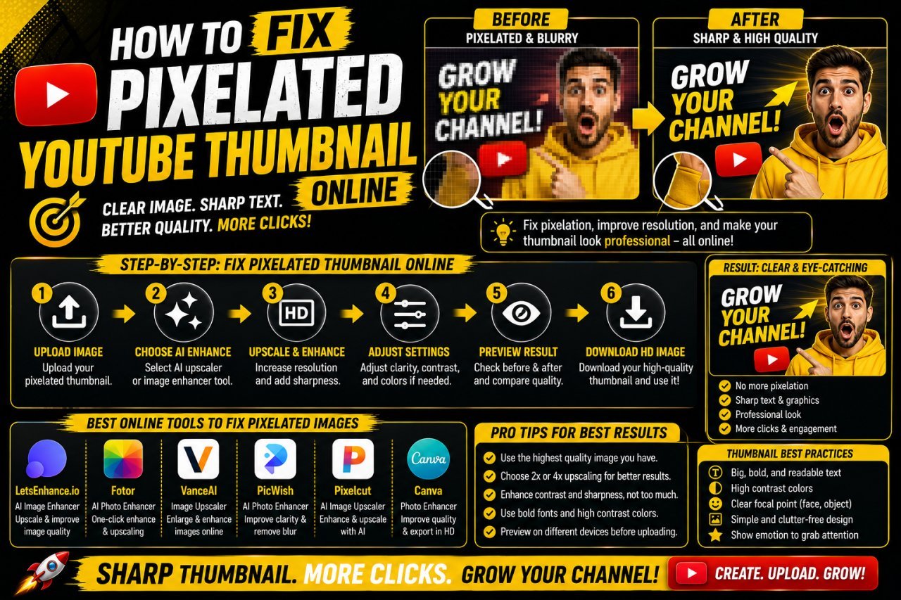
How to Fix a Pixelated YouTube Thumbnail Online
Learn how to fix a pixelated YouTube thumbnail online using better resizing, image enhancement, sharpening, compression, and export techniques.
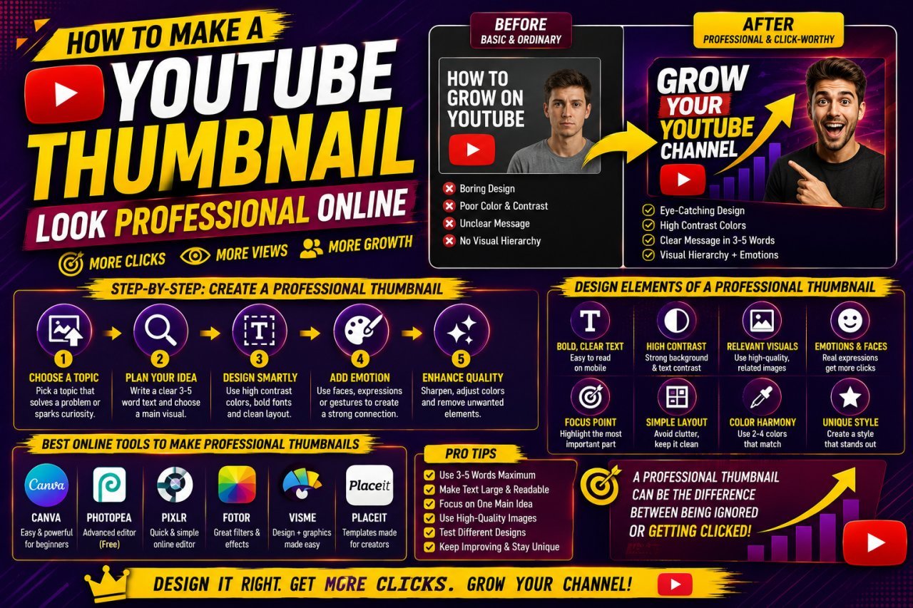
How to Make a YouTube Thumbnail Look Professional Online
Learn how to make a YouTube thumbnail look professional online with better layouts, images, text, colors, branding, and simple design techniques.
How to Restore an Old Photo With AI: Complete Beginner's Guide
Learn how to restore an old photo with AI by repairing damage, improving clarity, reducing noise, and bringing faded photographs back to life with simple techniques.