
How to Make a YouTube Thumbnail Look Professional Online
Learn how to make a YouTube thumbnail look professional online with better layouts, images, text, colors, branding, and simple design techniques.
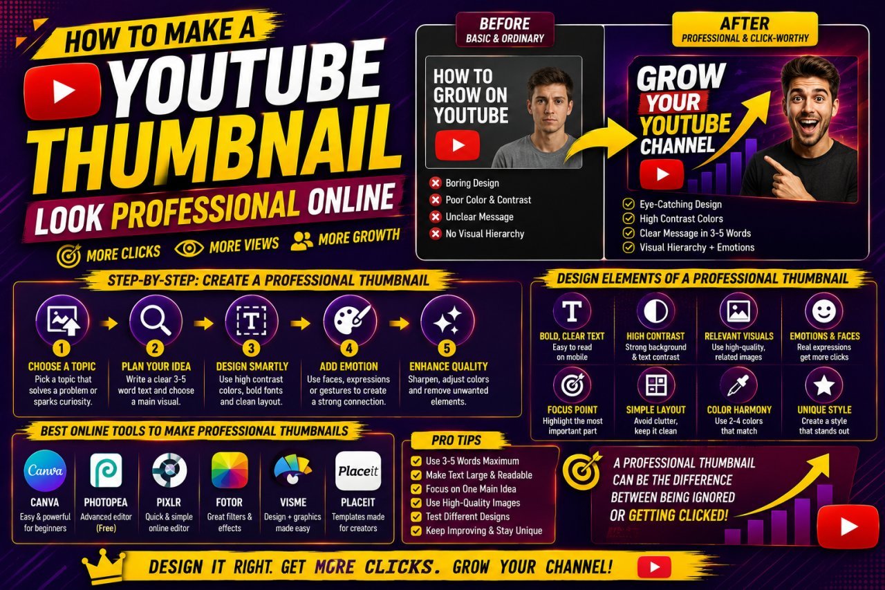
How to Make a YouTube Thumbnail Look Professional Online
Learning how to make a YouTube thumbnail look professional online does not require expensive software or advanced graphic-design skills.
A professional-looking thumbnail usually comes from a few basic decisions: using a strong image, creating a clear layout, choosing readable text, maintaining good contrast, and avoiding unnecessary design elements.
When you create thumbnails online, you can use browser-based editing tools to resize images, remove backgrounds, add text, adjust colors, and arrange different elements without installing complicated software.
The important part is not how many effects you use. It is how clearly the thumbnail communicates what the viewer can expect from the video.
For standard horizontal YouTube videos, YouTube currently recommends a 16:9 aspect ratio for thumbnails and recommends a high-resolution thumbnail of 3840 × 2160 pixels, with a minimum width of 640 pixels. YouTube Help — Add custom thumbnails
In this guide, you'll learn how to create a professional-looking YouTube thumbnail online, even if you're a beginner.
Why Does a Professional YouTube Thumbnail Matter?
Your thumbnail is one of the first visual elements people see when they encounter your video.
Before watching the video, a viewer may see:
- The video title
- Your channel name
- The thumbnail
- Other videos competing for attention
- All Tools
A well-designed thumbnail can make your video look organized and easier to understand.
However, professional design does not mean making the thumbnail complicated.
A professional thumbnail usually has:
- One clear visual focus
- Strong image quality
- Readable text
- Good spacing
- Consistent branding
- Appropriate contrast
- A clear visual hierarchy
- YouTube Thumbnail Enhancer
Professional Does Not Mean Overdesigned
One common beginner mistake is adding everything available in an online editor.
They may use:
- Multiple fonts
- Several colors
- Heavy shadows
- Large borders
- Too many stickers
- Excessive glow
- Multiple photos
- Too much text
The result can look crowded rather than professional.
A better principle is:
Every element should have a reason to be there.
If an effect doesn't improve clarity or support the video's message, consider removing it.
Start With the Right YouTube Thumbnail Size
Before working on colors, fonts, or images, create the correct canvas.
For a standard horizontal YouTube video, use a 16:9 aspect ratio.
Here are common 16:9 dimensions:
| Dimensions | Ratio | Common Use |
|---|---|---|
| 1280 × 720 | 16:9 | HD thumbnail workflow |
| 1920 × 1080 | 16:9 | Full HD design |
| 2560 × 1440 | 16:9 | Higher-resolution design |
| 3840 × 2160 | 16:9 | YouTube's recommended high-resolution size |
YouTube's official Help documentation currently recommends 3840 × 2160 pixels for video thumbnails and specifies a minimum width of 640 pixels. YouTube Help — Add custom thumbnails
Why Aspect Ratio Matters
A correct canvas helps prevent unwanted cropping or distortion.
If you create your thumbnail in a different ratio, you may later have to:
- Crop important parts of the image
- Reposition text
- Resize design elements
- Rebuild the layout
Starting correctly saves time.
Online Thumbnail Design Tip
When using an online editor, look for options such as:
Custom Size → Width → Height → Create
Enter your chosen dimensions and confirm that the canvas maintains a 16:9 ratio.
Choose a Strong Main Image
A professional thumbnail usually starts with a strong visual.
Your main image could be:
- A person
- A product
- A location
- A screenshot
- A food dish
- A vehicle
- A before-and-after comparison
- An illustration
- A frame from your own video
The image should support the video's subject.
For example, if your video explains how to edit photos online, a thumbnail showing a relevant editing screen or before-and-after image makes more sense than an unrelated stock photograph.
Use High-Quality Images
Whenever possible, use the original image instead of a screenshot of a screenshot or a heavily compressed copy.
Look for:
- Sharp details
- Good lighting
- Clear subject
- Appropriate composition
- Minimal visual noise
A professional layout cannot completely hide a poor-quality source image.
Make One Subject the Star
Try to establish one primary visual element.
For example:
Cooking video: finished dish
Tech video: device or software screen
Travel video: destination
Tutorial: result or key tool
Review: product being reviewed
The viewer should understand the main visual idea quickly.
Create a Simple Thumbnail Layout
A strong layout makes a thumbnail easier to understand.
Instead of placing everything randomly, decide where the major elements will go.
A simple layout might contain:
Main subject + short text + supporting background
For example:
| Element | Purpose |
|---|---|
| Main image | Communicates the video's subject |
| Headline text | Explains the key message |
| Background | Creates visual separation |
| Small logo | Supports branding |
| Accent element | Draws attention to a specific area |
You don't need to use every element.
Use Visual Hierarchy
Visual hierarchy means deciding what the viewer should notice first, second, and third.
A useful order might be:
1. Main subject
2. Thumbnail message
3. Supporting detail or branding
If everything is equally large and bright, nothing feels important.
Leave Some Empty Space
Empty space is not wasted space.
It can make important elements easier to notice.
Instead of filling every corner, leave breathing room around:
- Faces
- Text
- Logos
- Products
- Important objects
A little space can make the entire design feel cleaner.
Keep Thumbnail Text Short and Readable
One of the fastest ways to make a thumbnail look less professional is to add too much text.
Your thumbnail does not need to repeat the entire video title.
For example, instead of:
"How to Make a YouTube Thumbnail Look Professional Online for Beginners"
you could use:
"LOOK PROFESSIONAL"
or:
"PRO THUMBNAIL"
The exact wording depends on the video's purpose.
Make the Text Easy to Read
Use:
- Large lettering
- Strong contrast
- Simple fonts
- Adequate spacing
- A clean background behind the text
Avoid fonts that are difficult to read at small sizes.
Use One or Two Fonts
Using many different fonts can make a thumbnail feel inconsistent.
A simple combination of one primary font and, when necessary, one supporting font is often enough.
Don't Put Text Too Close to the Edge
Leave enough space around the text so it doesn't feel cramped.
This also makes the design more comfortable when viewed at smaller sizes.
Use Contrast to Make Important Elements Clear
Contrast helps separate one element from another.
For example, dark text on a dark background can disappear.
Similarly, white text on a very bright background may be difficult to read.
You can improve contrast by adjusting:
- Text color
- Background brightness
- Image exposure
- Shadows
- Outlines
- Background blur
- Subject placement
Example
Suppose your subject is wearing a dark shirt and is standing against a dark background.
Instead of adding more effects to the subject, you could brighten or simplify the background behind it.
The subject then becomes easier to distinguish.
Contrast Is More Than Color
Contrast can also come from:
- Size
- Shape
- Position
- Brightness
- Detail
- Space
A large face next to a simple background naturally attracts attention.
You don't always need bright colors or dramatic effects.
Choose a Simple Color Palette
Color can help create consistency across your YouTube channel.
You don't need dozens of colors.
A practical approach is to choose:
- One primary color
- One supporting color
- A neutral color such as white, black, or gray
The exact palette should match your brand and video topic.
Keep Colors Consistent
If every thumbnail on your channel uses completely different colors, fonts, and layouts, viewers may have difficulty recognizing your content as belonging to the same channel.
A consistent visual style can include:
- Similar typography
- Similar text placement
- Repeated brand colors
- Consistent logo placement
- Similar image treatment
You don't have to make every thumbnail identical.
The goal is to make them feel like part of the same channel.
Use the Background to Support the Main Subject
A busy background can compete with the main subject and make text difficult to read.
If your original image has too many distractions, consider simplifying the background.
Online editing tools can help you:
- Blur the background
- Darken distracting areas
- Remove unwanted elements
- Add a simple gradient
- Place the subject over a clean background
A Useful Background Technique
One practical method is to duplicate the main image.
Use one copy as the foreground subject.
Use another enlarged copy as the background and apply blur or darkening.
This creates depth while keeping attention on the main subject.
Use the effect carefully.
If the background becomes too strong, it can compete with the foreground again.
How to Create a Clear Visual Hierarchy
A professional YouTube thumbnail should guide the viewer's eyes naturally.
The viewer should not have to study the design to understand what matters.
A simple hierarchy can look like this:
Main subject → Thumbnail message → Supporting details
For example, for a laptop review:
- Main subject: Laptop
- Main text: "BEST FOR WORK?"
- Supporting detail: Small channel logo
This is easier to understand than filling the thumbnail with several sentences, screenshots, icons, and decorative elements.
Use Size to Create Importance
The most important element should usually have enough visual size to be noticed.
You can make an element more prominent by changing:
- Size
- Position
- Contrast
- Spacing
- Brightness
- Background treatment
Avoid making every element equally large.
When everything competes for attention, the thumbnail loses its visual focus.
Use Faces and Expressions When They Fit the Video
For many creator-led channels, a person's face can be an effective focal point.
If you're using a face in your thumbnail, choose an image where the subject is:
- Clearly visible
- Properly lit
- Sharp enough
- Looking toward the relevant area when appropriate
- Expressive without looking unnatural
You don't need to exaggerate an expression simply to make the thumbnail noticeable.
Give the Face Enough Space
A common design mistake is placing text directly over important facial features.
Avoid covering:
- Eyes
- Mouth
- Important objects
- Product details
Instead, position text in an area where it remains readable without hiding the main subject.
Remove the Background When Useful
For some thumbnail styles, separating the person from the original background can create a cleaner composition.
You can then place the person against a simple background that matches the video's subject.
The effect should look intentional rather than overly edited.
Make the Main Subject Stand Out
A professional thumbnail should make its main subject easy to identify.
You can improve subject separation by using:
- Background blur
- Subtle shadows
- Contrast
- Light adjustments
- A simple outline
- Background removal
- Color separation
For example, if a person is wearing a dark shirt against a dark background, separating the subject from the background can improve clarity.
Avoid Excessive Outlines
Thick outlines are sometimes useful, but they can quickly make a thumbnail look dated or overly edited.
Start with a subtle effect.
If the outline is one of the first things you notice, it may be too strong.
The same applies to glow effects and drop shadows.
How to Make a YouTube Thumbnail Look Professional Online: Step-by-Step
You can create the complete thumbnail in a browser-based image editor.
Step 1: Create a 16:9 Canvas
Start with a YouTube-friendly horizontal canvas.
A 1920 × 1080 pixel canvas is a practical working size, while YouTube's official documentation currently recommends 3840 × 2160 pixels for video thumbnails. YouTube Help — Add custom thumbnails
Step 2: Add Your Main Image
Upload your own photograph, screenshot, product image, or other relevant visual.
Choose the strongest available image.
Step 3: Position the Subject
Place the main subject where it has enough room.
Don't automatically put everything in the center.
Try placing the subject on one side and leaving the other side available for text.
Step 4: Build the Background
Use a simple background that supports the subject.
You can use:
- A blurred version of the image
- A solid background
- A gradient
- Another relevant image
- A simple graphic treatment
Step 5: Add the Main Message
Use a short phrase that communicates the video's key idea.
Avoid copying the entire title.
Step 6: Adjust Typography
Choose a readable font and make sure the text has enough contrast.
Step 7: Add Branding
A small logo, channel name, or recurring visual element can help create consistency.
Don't make the branding larger than the main message.
Step 8: Review at Small Size
Zoom out.
If the subject and message are still clear, your hierarchy is working.
Step 9: Export the Final Image
Check the final file before uploading it to YouTube.
This workflow keeps the design simple and repeatable.
Example: Turning a Basic Thumbnail Into a Professional One
Imagine you start with a basic photograph of a smartphone.
Before
The original design contains:
- Full photo
- Small text
- Busy background
- Several colors
- No clear focal point
The viewer has to look around to understand the thumbnail.
After
You redesign it with:
- A larger smartphone image
- A simplified background
- Large readable text
- Two or three supporting colors
- Better spacing
- A small brand element
The actual photograph may not have changed much.
The presentation has changed.
This is an important principle in thumbnail design:
Professional appearance often comes from better composition, not simply more editing.
Basic Thumbnail vs Professional Thumbnail
| Design Area | Basic Approach | More Professional Approach |
|---|---|---|
| Image | Any available image | Strong, relevant image |
| Layout | Elements placed randomly | Clear visual hierarchy |
| Text | Long sentence | Short key message |
| Font | Several unrelated fonts | One or two complementary fonts |
| Colors | Many competing colors | Controlled color palette |
| Background | Busy or distracting | Supports the subject |
| Subject | Small or unclear | Clearly visible |
| Branding | Large logo | Subtle, consistent branding |
| Effects | Many filters | Purposeful effects |
| Spacing | Little empty space | Balanced spacing |
| Quality | Compressed or blurry | Clean final export |
| Overall look | Crowded | Simple and focused |
Pros and Cons of Creating YouTube Thumbnails Online
Pros
Easy to access: Browser-based tools can be used without installing traditional desktop software.
Beginner friendly: Many online editors provide templates and simple controls.
Fast workflow: You can resize, crop, add text, and export from one workspace.
Useful for repeated designs: Templates can help maintain a consistent channel style.
Accessible from different devices: Depending on the tool, you can work from a computer or other supported device.
Cons
Some advanced features may be limited: Complex photo manipulation may require more specialized software.
Template designs can look generic: Using the same template without customization can make thumbnails feel repetitive.
Internet access may be required: Many browser-based editors depend on an active connection.
Export limitations can vary: Different tools may offer different file formats, quality settings, or dimensions.
The important thing is to choose a workflow that gives you enough control over the elements that matter.
Common Mistakes to Avoid
Mistake 1: Too Much Text
A thumbnail isn't a blog post.
Long sentences are difficult to process when the image is displayed small.
Mistake 2: Poor Contrast
If the text and background have similar brightness or color, readability suffers.
Mistake 3: Too Many Fonts
Several unrelated fonts can make the design look inconsistent.
Mistake 4: Overusing Effects
Glow, shadows, outlines, filters, and stickers should support the design.
They shouldn't become the design.
Mistake 5: Low-Quality Images
A professional layout cannot completely compensate for an extremely blurry or pixelated source.
Mistake 6: Weak Composition
If the main subject is tiny while the background occupies most of the canvas, the thumbnail may lack impact.
Mistake 7: Copying the Video Title
Your thumbnail and title should work together rather than simply repeat each other word for word.
Mistake 8: Ignoring Mobile Viewing
A thumbnail can look good when enlarged on a desktop but become difficult to understand at a smaller size.
Always check it when reduced.
Mistake 9: Inconsistent Branding
If every thumbnail looks completely different, building a recognizable visual style becomes harder.
Mistake 10: Designing Without Checking the Final Export
Sometimes the working file looks good but the exported image contains unexpected compression, cropping, or quality issues.
Always inspect the final file.
Professional Thumbnail Examples by YouTube Niche
Different content types may benefit from different visual approaches.
| YouTube Niche | Strong Visual Approach | Useful Text Style |
|---|---|---|
| Tech | Product close-up or screen | Short benefit or question |
| Gaming | Character, gameplay, or reaction | Bold short phrase |
| Cooking | Finished dish or ingredients | Recipe/topic phrase |
| Travel | Destination or experience | Location or key experience |
| Education | Person + concept visual | Clear topic phrase |
| Finance | Relevant chart or presenter | Specific topic |
| Fitness | Exercise or transformation context | Short goal-focused phrase |
| Beauty | Product or presenter | Product/result-focused text |
| Tutorials | Before/after or interface | Action-focused phrase |
| Reviews | Product + presenter | Clear opinion or comparison |
These are starting points, not strict rules.
Your thumbnail should match your audience, topic, and existing channel style.
Create a Reusable Thumbnail Template
If you publish videos regularly, creating a reusable online template can save time.
Your template might contain:
- 16:9 canvas
- Brand colors
- Preferred font
- Logo position
- Text area
- Image area
- Standard background treatment
For each new video, replace the image and update the message.
Don't Make Every Thumbnail Identical
A template should provide consistency, not repetition.
Change the visual composition when the topic requires it.
For example:
Tutorial: subject on the right + text on the left
Review: product large in center + short opinion
Comparison: two products side by side + comparison phrase
List video: main subject + large number + short text
The framework stays consistent while the visual content changes.
A Simple Formula You Can Reuse
When you don't know where to start, use this basic structure:
Strong image + clear subject + short text + high contrast + clean background + consistent branding
For example:
[Person/Product] + [3–5 word message] + [simple background]
Then check:
- Can I identify the subject quickly?
- Can I read the text at a small size?
- Does the design match the video?
- Is anything distracting me?
- Does it look consistent with my channel?
- Is the image quality acceptable?
- Does the final export look clean?
If the answer is yes to most of these questions, the thumbnail is likely heading in the right direction.
Conclusion
Learning how to make a YouTube thumbnail look professional online is less about using complicated effects and more about making the right design decisions.
Start with a strong, relevant image. Use a 16:9 canvas, create a clear visual hierarchy, keep your text short, and make sure the main subject is easy to recognize.
A professional thumbnail should also look good at a small size. If the viewer cannot quickly understand the image or read the main message, adding more effects will not solve the problem.
YouTube's current Help documentation recommends a 16:9 video thumbnail and lists 3840 × 2160 pixels as the recommended resolution, with a minimum width of 640 pixels. YouTube Help — Add custom thumbnails
The best online thumbnail workflow is simple:
Choose a good image → create the correct canvas → build a clean layout → add readable text → improve contrast → maintain branding → check the final design at a small size → export carefully.
You don't need to make every thumbnail complicated to make it look professional.
In many cases, a simple and focused design will communicate the video's idea more effectively than a thumbnail filled with effects, text, and decorative elements.
Call To Action
Want to create a professional-looking YouTube thumbnail without complicated desktop software?
Try Image EditPro to prepare and design your thumbnail online. Resize your image, arrange your visual elements, add text, improve the composition, and create a clean thumbnail ready for your YouTube workflow.
Create a cleaner thumbnail, improve your presentation, and give your next video a professional first impression.
1. How can I make a YouTube thumbnail look professional online?
Start with a high-quality relevant image, use a 16:9 canvas, create a clear layout, keep text short, use strong contrast, choose a simple color palette, and avoid excessive design effects. Always preview the thumbnail at a smaller size before publishing.
2. What size should a professional YouTube thumbnail be?
YouTube currently recommends a 16:9 video thumbnail with a resolution of 3840 × 2160 pixels. Its Help documentation also specifies a minimum width of 640 pixels. YouTube Help — Add custom thumbnails
3. Can I create a professional YouTube thumbnail without Photoshop?
Yes. You can create YouTube thumbnails using browser-based image editors and design tools. Basic thumbnail creation usually requires image placement, cropping, resizing, text, color adjustments, and simple graphic elements.
4. How much text should I put on a YouTube thumbnail?
There is no universal word limit, but short text is generally easier to read at thumbnail size. Focus on a few important words rather than copying the entire video title onto the image.
5. What makes a YouTube thumbnail look professional?
A professional thumbnail typically has a clear subject, readable typography, balanced spacing, strong contrast, good image quality, and a consistent visual style. It should communicate the video's main idea without looking crowded.
6. Should I use bright colors in my YouTube thumbnails?
Bright colors can be useful, but they are not required. Choose colors that provide contrast and fit your channel's visual style. Too many competing colors can make the design look cluttered.
7. Should a YouTube thumbnail include a face?
A face can be useful when it naturally relates to the video's content, particularly for creator-led videos. However, a face is not required. Products, locations, objects, screenshots, illustrations, and other relevant visuals can also work well.
8. How do I make my thumbnail readable on mobile?
Use large, simple text with strong contrast and avoid placing important details too close together. Preview the thumbnail at a smaller size before publishing to check whether the main subject and message remain clear.
10. Can I use a YouTube thumbnail template?
Yes. A reusable template can save time and help maintain consistent branding. However, customize the image, text, and layout for each video so your thumbnails don't all look identical.
10. How can I make an online YouTube thumbnail look less cluttered?
Remove unnecessary elements, shorten the text, reduce the number of fonts and colors, simplify the background, and give the main subject enough space. If an element does not improve the message or composition, consider removing it.
Ready to optimize your images?
Every tool mentioned in this article is free to use. No upload, no signup, and no watermarks — ever.
Try our free toolsRelated articles
How to Make a YouTube Thumbnail More Eye-Catching
Learn how to make a YouTube thumbnail more eye-catching with better colors, text, contrast, composition, faces, branding, and simple design techniques.
How to Fix a Pixelated YouTube Thumbnail Online
Learn how to fix a pixelated YouTube thumbnail online using better resizing, image enhancement, sharpening, compression, and export techniques.

How to Make YouTube Thumbnail Text Clear and Sharp
Learn how to make YouTube thumbnail text clear and sharp with better fonts, sizing, contrast, spacing, outlines, export settings, and simple design techniques.