Complete Guide to Image Optimization for Websites (2026 Edition)
Every technique that matters for image performance in 2026, in one place — from format choice to lazy loading to CDN strategy. Bookmark this.
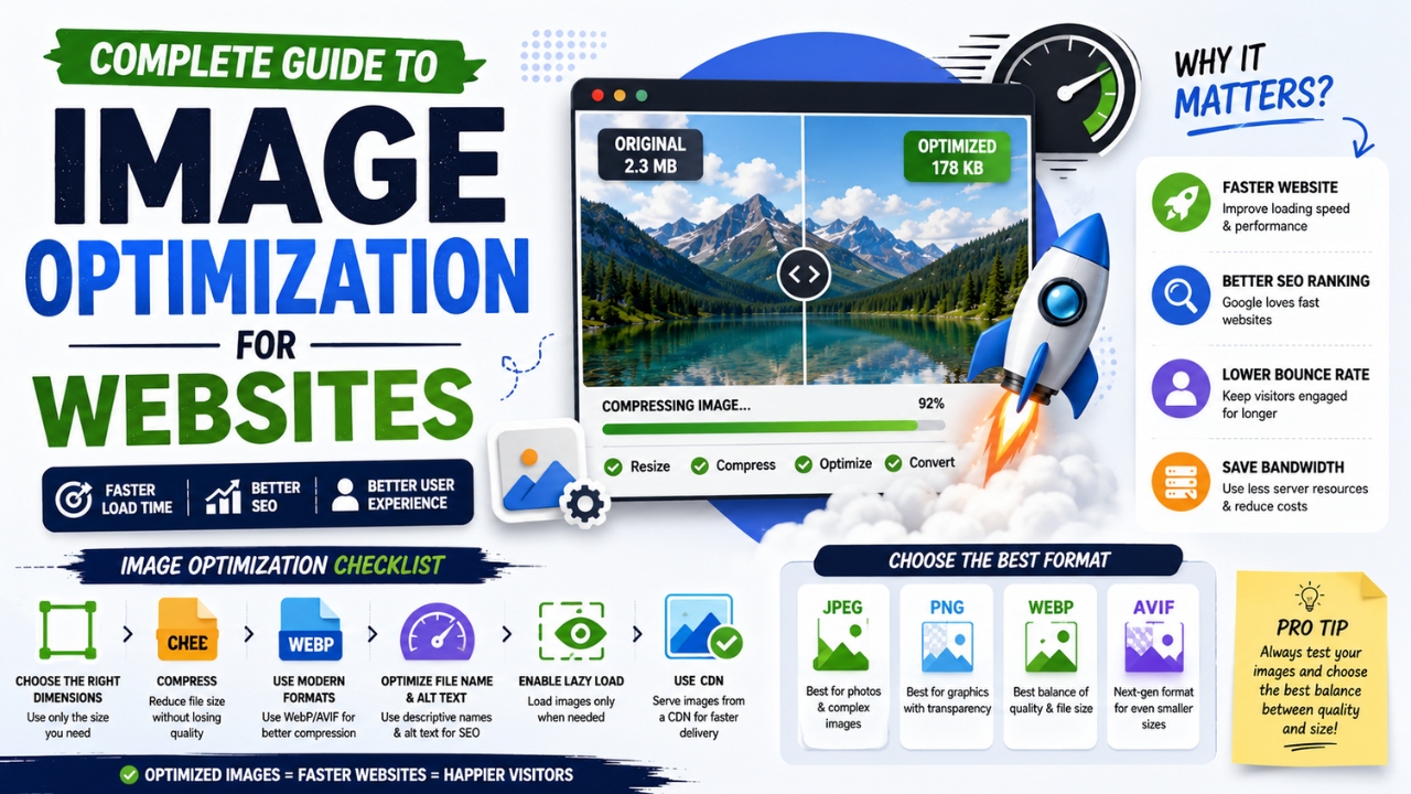
This is the definitive guide to image optimization for websites in 2026. Bookmark this; refer back when each new project starts. Every technique that actually matters, in priority order, with concrete actions.
The core principle
Smaller files, served efficiently, only when needed. That's it. Every technique below is a variation on those three ideas.
Step 1: Pick the right format
Format choice has the biggest impact. Use this rule:
- Photos for the web → WEBP
- Photos for cross-platform compatibility (email, print) → JPG
- Graphics with sharp edges or transparency → PNG
- Logos and icons (when possible) → SVG (vector, infinite scale)
- Animations → WEBP (animated) or video (
<video>element) instead of GIF
The biggest mistake: saving photos as PNG. PNG files for photos are typically 6-12× larger than JPG/WEBP with no visible quality benefit.
Convert legacy assets:
- PNG to JPG for photos
- PNG to WEBP for web photos
- JPG to WEBP for size reduction
Step 2: Compress to the right quality
For lossy formats (JPG, WEBP):
| Quality | Use case |
|---|---|
| 90-95 | Hero images, photography portfolios |
| 80-85 | Sweet spot for most web use |
| 70-79 | Below-the-fold content |
| < 70 | Avoid unless file size is critical |
Default to quality 80-85 for most images. Visible quality loss is rare; file size savings are real.
For PNG (lossless format), there's no "quality" setting, but you can reduce file size by:
- Using 8-bit PNG instead of 24-bit (limits to 256 colours; great for screenshots and graphics)
- Stripping metadata
- Running through a PNG optimiser (pngcrush, OptiPNG, etc.)
Use our free Image Compressor or Bulk Compressor for batch work.
Step 3: Resize to actual display dimensions
A 4000-pixel image displayed at 800 pixels wastes 95% of bytes. The browser downloads all 4000 pixels, then scales them down to fit.
Rule: the image dimensions on disk should be no larger than 2× the maximum display size.
Common targets:
- Full-width hero images: 1920 × 1080
- Inline blog images: 1200 × 800 (or 800 × 600 for smaller)
- Thumbnails: 400 × 300
- Avatar images: 200 × 200 or 400 × 400
For responsive sites, serve different sizes via srcset (see Step 8).
Use our free Resize tool for individual files; build pipelines (Vite, Next.js, etc.) handle this automatically.
Step 4: Strip EXIF metadata
EXIF metadata (camera model, GPS coordinates, etc.) often takes 50-200 KB per image. It's invisible to the user but bulks up file size.
Risks beyond size:
- GPS coordinates can leak photographers' or subjects' locations
- Camera serial numbers can leak identity
- Personally-named timestamps can leak schedule data
Strip with our free EXIF Remover before uploading.
Step 5: Lazy-load below-the-fold images
The browser doesn't need to load an image until it's about to scroll into view. Without loading="lazy", all images load immediately, slowing initial page render.
<!-- Above the fold -->
<img src="hero.jpg" alt="..." loading="eager">

<!-- Below the fold -->
<img src="story1.jpg" alt="..." loading="lazy">
<img src="story2.jpg" alt="..." loading="lazy">
Native browser support is 95%+ in 2026. Just add the attribute.
Don't lazy-load the LCP image (your hero image — it's the first thing that should render). Lazy-load everything else.
Step 6: Set explicit width and height
When the browser doesn't know an image's dimensions, it can't reserve space for it. When the image loads, the page violently shifts — Cumulative Layout Shift (CLS), a Core Web Vital Google measures.
Always:
<img src="hero.jpg" alt="..." width="1200" height="630" loading="eager">
The browser uses these values to reserve the correct rectangle before the image arrives. The image then scales into that rectangle proportionally. No layout shift.
Step 7: Use semantic filenames
IMG_2398.jpg tells Google nothing. golden-retriever-puppy-running-park.jpg tells Google everything.
Rename images before uploading. Use dashes (not underscores or spaces) and keep them descriptive.
Bonus: rename helps SEO directly in Google Image Search rankings.
Step 8: Serve responsive images with srcset
Different devices need different image sizes. A 1920-pixel image is overkill for a 400-pixel mobile display.
<img src="hero-800.jpg"
     srcset="hero-400.jpg 400w,
             hero-800.jpg 800w,
             hero-1600.jpg 1600w"
     sizes="(max-width: 600px) 400px,
            (max-width: 1200px) 800px,
            1600px"
     alt="..."
     width="1600" height="900"
     loading="eager">
The browser picks the smallest image that satisfies the user's display + DPR. Mobile users download a 400px image (~30 KB). Desktop users download 1600px (~250 KB). Both load fast.
Frameworks like Next.js / Astro / SvelteKit automate this. For static sites, you generate the variants once and reference them.
Step 9: Add descriptive alt text
Alt text serves three purposes:
- Accessibility — screen readers read this text aloud
- SEO — Google indexes alt text for image search rankings
- Fallback — if the image fails to load, alt text displays
Good alt text:
- Describes what's in the image
- Uses target keywords naturally
- Is 8-15 words for content images
- Empty
alt=""for purely decorative images (so screen readers skip them)
Bad alt text:
- "image.jpg"
- "[empty]" or missing entirely
- Keyword-stuffed ("best image compressor free online tool India 2026")
Step 10: Use a CDN
A CDN (Content Delivery Network) caches your images on servers around the world. Users get images from the nearest server instead of your origin.
For most sites:
- Cloudflare's free tier is enough
- Pages typically 100-400ms faster
- Includes automatic image optimization (Polish feature on paid tiers)
- DDoS protection bundled
Sign up, change your nameservers, done. No code changes needed for basic setup.
Step 11: Set long cache headers
For hashed image filenames (e.g., hero-a1b2c3d4.jpg), set browsers and CDNs to cache forever:
Cache-Control: public, max-age=31536000, immutable
immutable tells browsers to not even check if the file changed — saves a network roundtrip on repeat visits.
For non-hashed filenames, use a shorter cache:
Cache-Control: public, max-age=604800
(One week. Long enough to be useful; short enough to allow updates.)
Step 12: Compress hero images more aggressively
The hero image (largest visible image on page load) is your LCP element. Optimize it harder than other images:
- Resize precisely to display size (no oversizing "just in case")
- Quality 80 instead of 85 for slightly more savings
- Use
loading="eager"(not lazy) - Use
fetchpriority="high"to tell the browser this is the most important resource
<img src="hero.webp" alt="..." width="1920" height="1080"
     loading="eager" fetchpriority="high">
A 50 KB savings on the hero image often improves LCP by 100-200ms — disproportionately valuable.
Step 13: Audit with Lighthouse
Open Chrome DevTools → Lighthouse tab → run a Performance audit on your page. The output includes:
- LCP score
- Specific images that are oversized
- Specific images saved in suboptimal format
- Specific images missing width/height
- Specific images that should be lazy-loaded
Treat the Lighthouse audit as your action list. Most "image performance" issues are spelled out for you.
The 30-day optimization checklist
If you're starting from a website that hasn't been image-optimized:
Week 1: Compress
- Identify your 20 most-visited pages
- Compress every image on those pages with our Bulk Compressor
- Re-upload with the same filenames
Week 2: Convert to WEBP
- Convert remaining JPGs to WEBP for those pages
- Update CMS/code to reference .webp filenames where applicable
Week 3: Fix structure
- Add width/height to all
<img>tags - Add
loading="lazy"to below-the-fold images - Add descriptive alt text where missing
Week 4: Polish
- Strip EXIF metadata from all uploaded images
- Set up a CDN if you haven't
- Add semantic filenames going forward
- Set cache headers correctly
After 30 days: re-run Lighthouse. Expect a 20-40 point Performance improvement.
What to skip
A few "optimization" techniques that don't pay off:
- Image sprites for icons — replaced by SVG icons in modern apps
- Image placeholders / blur-up effects — fine but small impact compared to fixing format and compression
- Subsetting your own images — not worth the engineering effort for most sites
- Custom image servers — overkill unless you're at huge scale
What to look forward to
In 2027-2028:
- AVIF replacing WEBP as the default modern format
- HTTP/3 + multiplexing making CDN benefits even larger
- Native lazy-loading variants beyond the current
loading="lazy" - Better browser-side image manipulation APIs for client-side optimisation
The fundamentals (right format + good compression + sane resize + lazy load) will still matter. The specific tools improve.
The bottom line
Image optimization is the highest-leverage performance work you can do. Most websites haven't done it. Pulling these levers will:
- Improve Core Web Vitals → better Google rankings
- Reduce bandwidth costs → save money
- Improve user experience → higher engagement
- Reduce mobile data costs for users → better conversion in emerging markets
Start with our free image tools — compress, convert, resize, remove backgrounds — all browser-side, no upload, no signup. The fastest way to ship 80% of the optimization without changing your tech stack.
Ready to optimize your images?
Every tool mentioned in this article is free to use. No upload, no signup, no watermarks on small files.
Try our free toolsRelated articles
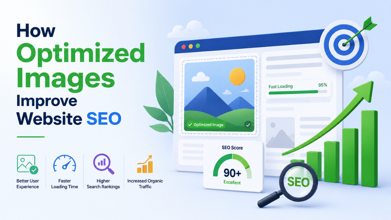
How Optimized Images Improve Website SEO (With Real Examples)
Image optimization is the highest-leverage SEO change most websites haven't made. Here's exactly how it moves rankings and the specific levers you can pull this week.
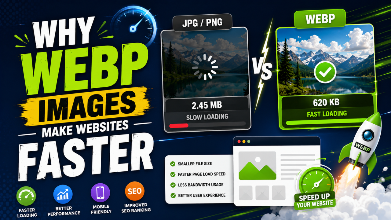
Why WEBP Images Make Websites Faster (With Real Speed Tests)
Same visual quality, 25-35% smaller files. WEBP is the easiest single SEO improvement you can ship this week — here's the data and how to convert.

Best Free Online Image Tools for Students (Project + Assignment Edition)
School and college projects often need image work — diagrams, presentations, posters. These free tools cover everything without subscriptions or installs.