Best Fonts for Thumbnail and Poster Design (and the Ones to Avoid)
The wrong font is the difference between 'amateur Canva' and 'looks professionally designed'. Here are the fonts that consistently work for thumbnails and posters — most free.
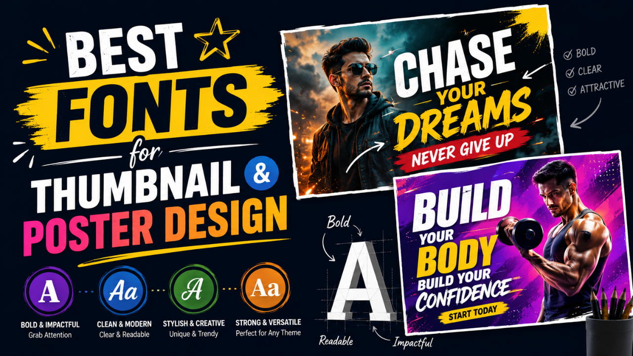
Bad font choice is the single fastest way to make a design look amateur. The good news: there are maybe 15 reliable display fonts you can use repeatedly across thumbnails, posters, and social posts, and most are free.
Here's the practical list.
What thumbnails and posters need (different from body text)
Display typography (the kind used in thumbnails and posters) has different requirements than body text:
- Readability at small size (YouTube thumbnails get viewed at 120 pixels wide)
- Visual impact (must compete with other content in a feed/grid)
- Strong character at heavy weights (you'll often use Bold or Black)
- Versatility across different topics
- Free for commercial use (most professional fonts cost money; many free options are excellent)
Body fonts (Open Sans, Roboto, etc.) usually don't work well as display fonts — too neutral. Display fonts often look weird as body text — too much character.
The reliable display fonts (all free for commercial use)
Sans-Serif (modern, clean)
1. Bebas Neue — Tall, condensed, all-caps. The go-to for "bold statement" headlines. Works for sports, tech, entertainment.
2. Inter — Modern, slightly geometric. Used by Notion, GitHub, modern tech brands. Works for clean, professional designs.
3. Montserrat — Versatile, friendly geometric sans. The "Canva default" for a reason — works for almost anything.
4. Poppins — Friendly, rounded, modern. Good for tech, education, lifestyle content.
5. Anton — Heavy condensed sans-serif. More aggressive than Bebas Neue. Sports, fitness, urgent messages.
6. Oswald — Tall condensed, slightly more refined than Anton. Used in editorial and magazine design.
Serif (editorial, premium)
7. Playfair Display — Elegant serif with high contrast. Fashion, beauty, luxury, editorial content.
8. Lora — Friendly serif, good balance. Lifestyle blogs, wellness, food content.
9. EB Garamond — Classical serif. Knowledge content, education, history.
10. Fraunces — Modern serif with personality. Editorial, premium brands, tech magazines.
Script and decorative
11. Permanent Marker — Hand-drawn marker style. Casual content, quotes, memes.
12. Alfa Slab One — Heavy slab serif. Western, rustic, food brands.
13. Caveat — Casual handwriting. Notes, quotes, personal content.
14. Pacifico — Retro script. Food brands, casual lifestyle. (Use sparingly — overused.)
For YouTube thumbnails specifically
YouTube thumbnails need very heavy fonts with high contrast since they're viewed at small sizes:
15. Impact — The classic YouTube thumbnail font. Pre-installed on Windows. Free, bold, attention-grabbing.
16. Coolvetica — Free alternative to Helvetica Inserat. Used by Mr. Beast and many top creators.
Font pairings that consistently work
Display fonts work best in pairs (or solo). Two reliable pairing patterns:
Pattern 1: Display + Body
- Bebas Neue headline + Inter body
- Playfair Display headline + Lora body
- Anton headline + Open Sans body
Pattern 2: Display + Accent
- Bebas Neue headline + Permanent Marker accent (for highlighting one word)
- Inter headline + Caveat subtitle (for personal touch)
- Montserrat headline + Lora subtitle (for editorial feel)
Fonts to avoid
These fonts mark a design as "amateur" instantly:
- Comic Sans — universally mocked, never appropriate (with humour-related rare exceptions)
- Papyrus — same energy, also universally mocked
- Default system fonts at default weight — looks like a draft
- Curlz MT — kindergarten-grade decorative font
- Brush Script MT — pre-installed Microsoft Office, dated since 2005
- Hobo — feels like 1985
- Free font sites with sketchy free fonts — many free fonts have technical problems (missing characters, bad kerning) that make designs look broken
How to actually find the right font
Method 1: Google Fonts (free, easy)
Visit fonts.google.com. Filter:
- Category: Display
- Properties: Bold weight available
Try 5-10 candidates. Type your actual headline in each. The right one is obvious.
Method 2: Steal from successful designs in your niche
Identify a successful thumbnail/poster in your niche. Use a font identification tool (WhatTheFont, Fontspring Matcherator, Font Squirrel Matcherator) to identify the font. Replicate the pattern.
Method 3: Templates as fonts library
Canva, Figma, Adobe Express all have free template libraries. Browse 30 templates in your niche; the fonts used there are battle-tested.
How many fonts per design?
One font: clean, modern, hard to mess up. Use weight variations (Light, Regular, Bold) for hierarchy.
Two fonts: standard pattern (display + body). Maximum versatility.
Three fonts: advanced — display + body + accent. Hard to balance.
Four or more: almost always wrong. The design feels chaotic.
Common typography mistakes
1. All caps with kerning too tight
"BIG BOLD HEADLINE" with default kerning looks like "BIGBOLDHEADLINE" at thumbnail size. Always increase letter-spacing (letter-spacing: 0.05em) for all-caps headers.
2. Subtle font weight differences
Beginners pair Light and Regular. The difference is too subtle — looks accidental. Pair Light and Bold instead.
3. Outline-only text
"Outline text" (transparent fill, just a stroke) is unreadable at thumbnail size. Always fill the text.
4. Centered text everywhere
Centered text feels formal but creates uneven left/right edges. Left-aligned reads faster and looks more designed.
5. Too small text
Whatever font size feels "fine" on your desktop monitor is often illegible on a phone. Always test thumbnail size on mobile.
Text on images: legibility tricks
When putting text over an image:
- Add a semi-transparent overlay to darken/lighten the image area behind the text
- Use a subtle drop shadow on the text (2-3px blur, low opacity)
- Place text on the least-busy part of the image
- Strong colour contrast — white text on dark areas, dark text on light areas
For consistent text-over-image work, our Watermark tool lets you add text with shadow + position presets at consistent positioning.
A starter typography stack
If you want to commit to one set and move on:
- Headlines (thumbnails, posters): Bebas Neue, Anton, or Impact
- Subtitles / accents: Playfair Display or Caveat
- Body / longer text: Inter or Lora
- Logo / brand name: custom or signature font
Use this combination across all your designs for 6 months. Switch only if you have a real reason.
Free font resources (legitimate, commercial-use friendly)
- Google Fonts — easiest, most options, free commercial use
- Fontshare — curated free fonts with commercial use
- Font Squirrel — older but reliable
- Adobe Fonts (free with Creative Cloud) — high quality
- DaFont — large library but read each font's license carefully; many are personal-use only
Avoid: random "free font" download sites where licenses are unclear or fonts have technical problems.
Quick recipe for a professional-looking thumbnail
- Heavy display font (Bebas Neue, Anton, or Impact)
- All caps, slight letter-spacing increase
- White or yellow text colour
- Subtle drop shadow for legibility
- Place on the left third of the thumbnail (right side for subject)
- Stick to 3-5 words maximum
- Test at 120px wide before publishing
That recipe alone gets you 90% of the way to "looks professional." The remaining 10% is composition and image quality.
For final delivery, resize to platform spec (YouTube thumb = 1280×720) and compress to JPG quality 85.
Ready to optimize your images?
Every tool mentioned in this article is free to use. No upload, no signup, no watermarks on small files.
Try our free toolsRelated articles
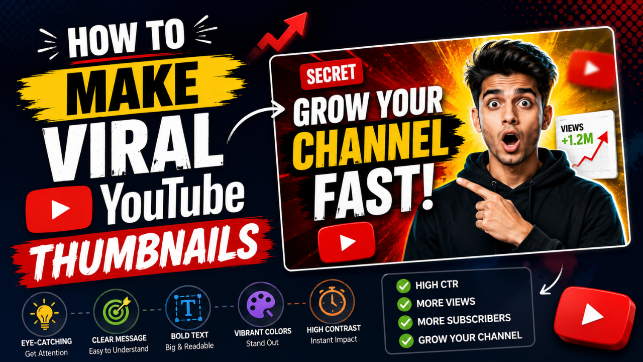
How to Make Viral YouTube Thumbnails (Real Patterns That Actually Work)
Mr Beast didn't get to 100M subscribers with bad thumbnails. We analysed 500+ trending thumbnails to find the patterns that consistently drive clicks.
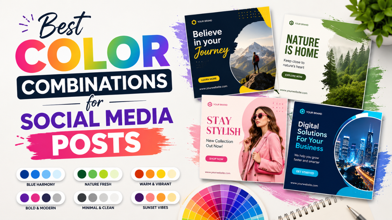
Best Color Combinations for Social Media Posts (Tested Across Platforms)
The right two colours can double a post's engagement. The wrong combination kills the scroll. Here are the palettes that consistently work — across Instagram, LinkedIn, Pinterest, and Twitter.
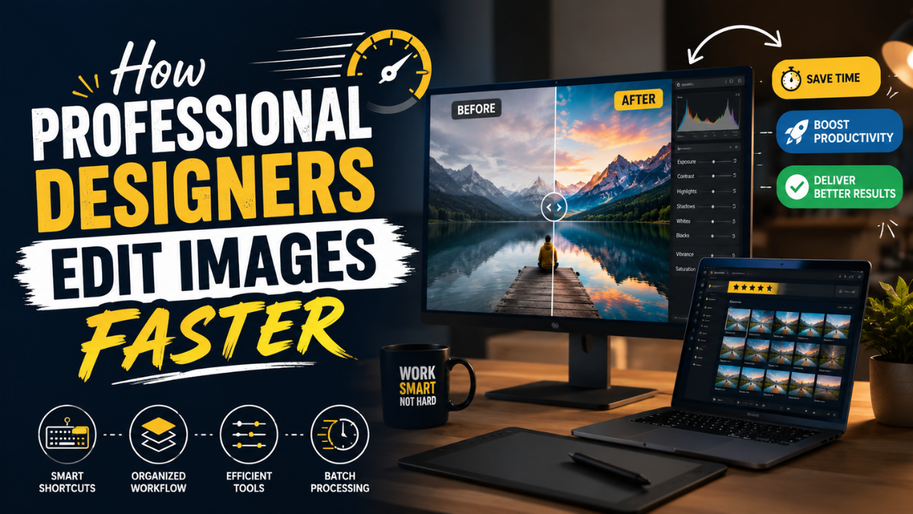
How Professional Designers Edit Images 10× Faster (Real Workflow Secrets)
The gap between amateur and pro editing isn't talent — it's workflow. Here's how working designers process 100+ images per day without burning out.