How to Make Viral YouTube Thumbnails (Real Patterns That Actually Work)
Mr Beast didn't get to 100M subscribers with bad thumbnails. We analysed 500+ trending thumbnails to find the patterns that consistently drive clicks.
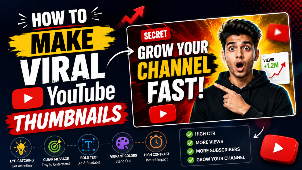
The YouTube thumbnail is the single most important asset in a creator's workflow. A 10× better thumbnail can mean a 10× wider audience for the same video. Algorithms reward click-through-rate (CTR), and the thumbnail does 90% of that work.
We looked at patterns across 500+ viral and top-performing thumbnails. Here's what's actually doing the heavy lifting in 2026.
What "viral" thumbnails share (and what doesn't matter)
Patterns that consistently appear:
- ✅ Big bold text with 3-5 words max
- ✅ A face with expressive emotion (surprise, shock, intensity)
- ✅ High contrast between subject and background
- ✅ Curiosity gap — the thumbnail makes you want to know more
- ✅ Visual symmetry or strong composition rule (rule of thirds, centred subject)
- ✅ Saturated colours (red, yellow, bright cyan in particular)
Patterns that don't matter as much as people think:
- ❌ Stock photography quality (low-quality face shots often outperform polished shots)
- ❌ Polished design (rough thumbnails outperform Mr-Beast-budget thumbnails in many niches)
- ❌ Brand consistency (the algorithm rewards CTR; consistency mostly matters for established channels)
- ❌ Following design "rules" (rules are starting points, not laws)
Pattern 1: "Face + reaction" thumbnails
The most common viral pattern: a face displaying strong emotion, often with eyes wide open or mouth dropped.
Why it works: human faces are hardwired-attention-grabbers. We're evolutionarily tuned to notice them. Emotional faces work especially well because they signal "something is happening."
How to do it:
- Take the photo / screenshot with intentional expression (look surprised, shocked, intense)
- Remove the background (free BG remover) so the face pops
- Place the face large — often 50% of the thumbnail width
- Add text in the empty area
Don't over-edit the face. Slight skin smoothing OK; aggressive retouching ruins authenticity.
Pattern 2: Before/after splits
What it is: thumbnail split vertically (or sometimes diagonally), showing "before" and "after" of something.
Examples:
- Cooking: raw ingredients vs finished dish
- Fitness: 1 year ago vs today
- Renovation: cluttered room vs clean
- Gaming: noob play vs pro play
- Educational: confused person vs knowing person
Why it works: instant context. Viewers see "this video has a transformation" in 0.5 seconds.
How to do it:
- Two photos / screenshots
- Place side-by-side or with diagonal split
- Add a vertical "VS" or arrow between them
- Text below: "BEFORE/AFTER" or specifics
Pattern 3: Bold number + topic
What it is: a single large number (preferably 1, 5, 10, 100, or 1000) dominating the thumbnail with the topic adjacent.
Examples: "10 SECRETS", "1 MONTH RESULT", "100 EXPERIMENTS"
Why it works: numbers signal structure. They imply the video has a clear, finite payoff.
How to do it:
- Use heavy display font (Impact, Bebas Neue, Anton — see our fonts guide)
- Number is the largest element (40-60% of thumbnail height)
- Topic text smaller, supporting the number
- Background: solid colour OR a relevant image
Pattern 4: Comparison/test setup
What it is: the thumbnail shows physical objects being compared or tested side-by-side. Common in tech, reviews, food, science.
Examples:
- iPhone vs Samsung (both phones visible)
- ₹100 vs ₹10,000 product
- Three different paints being tested
- A vs B vs C food taste test
Why it works: comparison content has built-in tension. Which one wins? Click to find out.
How to do it:
- Photo of all items together (or composite if individual photos)
- Use clear visual signposts (price tags, labels, colours)
- Add text identifying the question: "CHEAP vs EXPENSIVE"
Pattern 5: Arrow / circle pointing to detail
What it is: an arrow or circle drawing attention to a specific element in the thumbnail.
Examples:
- Photo of a chess board with an arrow at one piece
- Selfie with a circle around your earring (the topic of the video)
- Screenshot with red arrow at the relevant detail
Why it works: gives the viewer's eye somewhere to go. Creates a "what's there?" curiosity.
How to do it:
- Take/find the photo
- Add bright red or yellow arrow / circle (high contrast)
- Don't over-do it — one arrow per thumbnail max
Pattern 6: Tier list / leaderboard
What it is: a tier list (S, A, B, C, D ranks) with items placed in it. Used heavily in gaming, reviews, "best of" content.
Why it works: clear structure, visual hierarchy, implies the video reveals rankings.
How to do it:
- Create simple S/A/B/C tier rows in a coloured grid
- Place product/item thumbnails in each tier
- Title in heavy font: "TIER LIST" or specifics
What doesn't work in 2026
Patterns that have fatigued or never worked:
- Generic stock photos with no face — feels lazy
- Tiny text that can't be read at thumbnail size — wasted text
- Too much going on (5+ visual elements) — viewers can't parse it
- All cap headlines with no contrast — disappears
- Highly compressed/pixelated images — feels low-quality
- Same thumbnail every video (some channels do this and look identical to scrollers — kills CTR)
- Misleading clickbait — gets clicks but kills watch time + community trust
The technical specs
YouTube thumbnail spec (as of 2026):
- Dimensions: 1280 × 720 (16:9 aspect ratio)
- Max file size: 2 MB
- Format: JPG, PNG, GIF (animated GIF won't animate; not worth using)
- Display ratio: YouTube shows thumbnails at variable sizes — always test at 120×67 (mobile feed size)
Use our free Resize tool with the "YouTube Thumb 1280×720" preset for one-click sizing.
A 5-step workflow for fast thumbnail production
- Photograph or screenshot the key element (face, product, before/after) — 2 min
- Remove the background if needed (free BG remover) — 30 sec
- Layout in design tool (Canva, Figma, even Photoshop) — 5-10 min
- Add text + arrows + emphasis — 3-5 min
- Export, resize to 1280×720, compress to under 2 MB (compressor) — 1 min
Total: ~12-15 minutes per thumbnail. Faster with templates.
Testing what works for your channel
A/B testing is now built into YouTube Studio:
- Upload 2-3 thumbnail variants for the same video
- YouTube serves them randomly
- Wait 2-3 days for statistical significance
- Winner becomes the locked thumbnail
This reveals which patterns work for your audience, not generic advice. Use it.
Common mistakes
- Text too small at thumbnail size — always test at 120×67
- Over-edited faces — viewers smell fakeness
- Stock photos — feels lazy, AI-generated, or generic
- Inconsistent style — your last 12 thumbnails should feel like one channel
- Misleading content — clicks ≠ subs; misleading thumbnails kill returning viewers
Where to learn more
Some channels that consistently nail thumbnails (study their feed pages):
- MrBeast — face + bold text + extreme colour
- Marques Brownlee — clean minimal product shots
- Veritasium — science + curiosity gap
- Yes Theory — emotion + location
Scroll their thumbnails grids. The patterns are visible.
Your first thumbnail in 15 minutes
Pick a template that matches your video type. Adapt with:
- Your photo (preferably a face)
- Your topic in 3-5 words
- High-contrast background
- One emphasis element (arrow, circle, exclamation)
Export, test at thumbnail size, ship it.
For all the technical steps — resizing, background removal, compression — our free image tools keep your workflow free and browser-side. No upload, no signup.
Ready to optimize your images?
Every tool mentioned in this article is free to use. No upload, no signup, no watermarks on small files.
Try our free toolsRelated articles
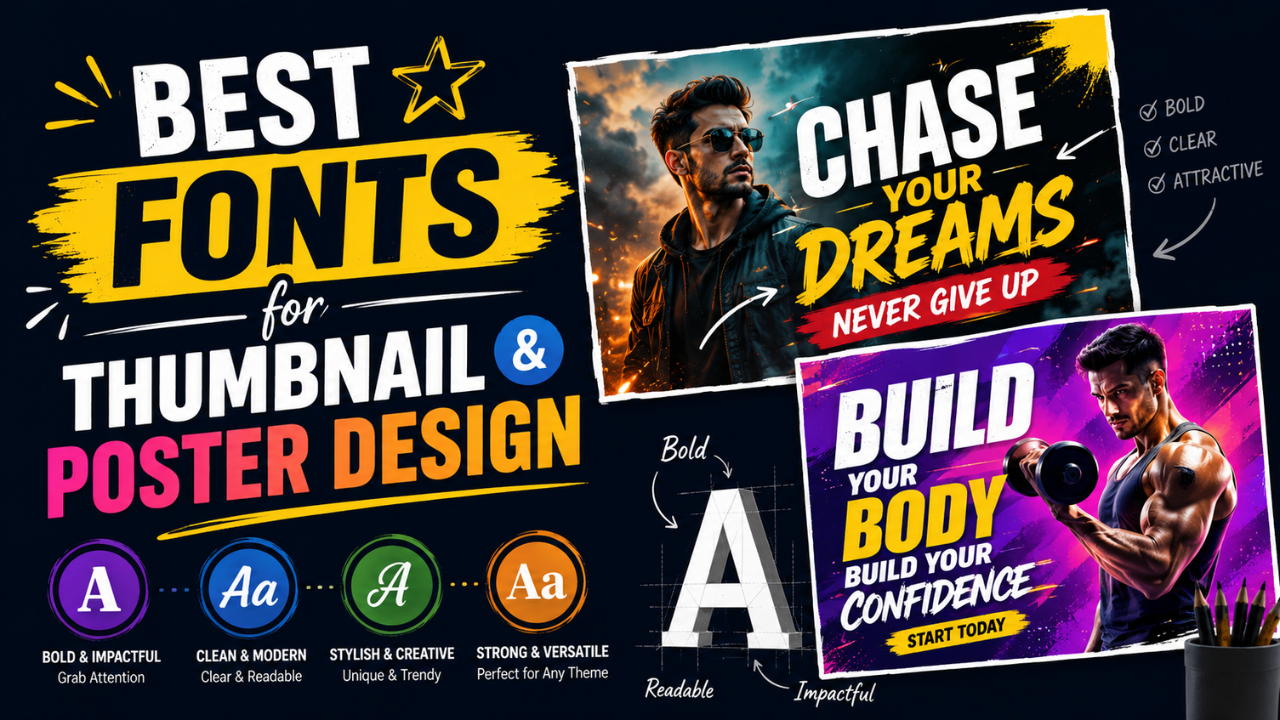
Best Fonts for Thumbnail and Poster Design (and the Ones to Avoid)
The wrong font is the difference between 'amateur Canva' and 'looks professionally designed'. Here are the fonts that consistently work for thumbnails and posters — most free.
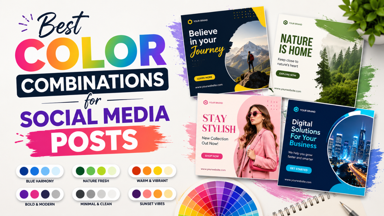
Best Color Combinations for Social Media Posts (Tested Across Platforms)
The right two colours can double a post's engagement. The wrong combination kills the scroll. Here are the palettes that consistently work — across Instagram, LinkedIn, Pinterest, and Twitter.
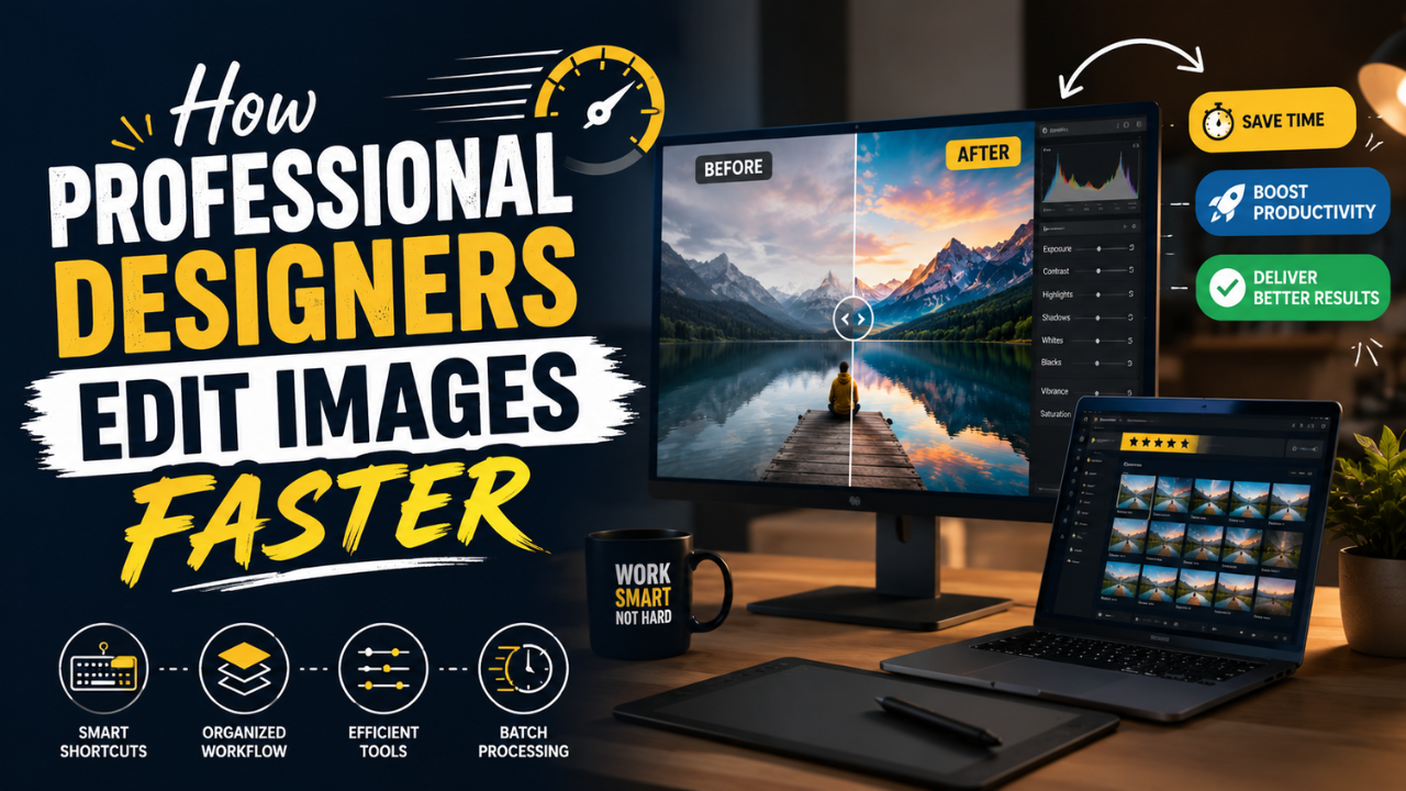
How Professional Designers Edit Images 10× Faster (Real Workflow Secrets)
The gap between amateur and pro editing isn't talent — it's workflow. Here's how working designers process 100+ images per day without burning out.