Best Color Combinations for Social Media Posts (Tested Across Platforms)
The right two colours can double a post's engagement. The wrong combination kills the scroll. Here are the palettes that consistently work — across Instagram, LinkedIn, Pinterest, and Twitter.
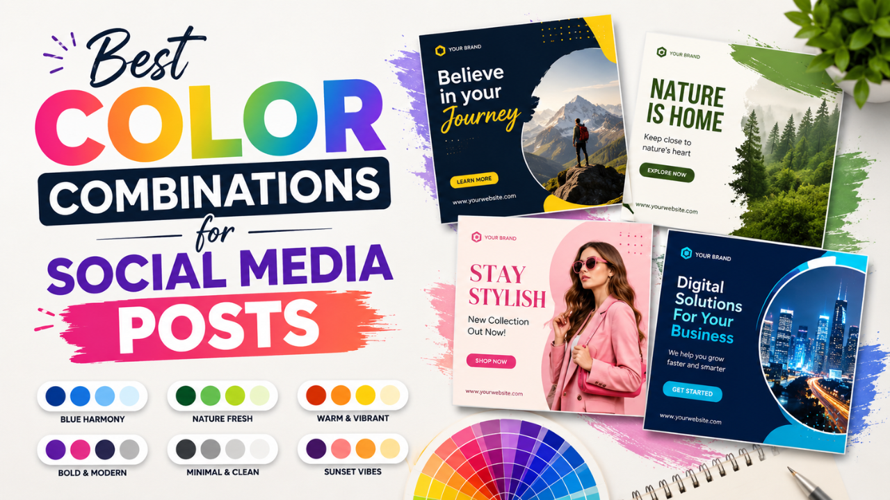
Most successful social-media designs use 2-3 colours. Not 8. Not "every colour in the brand kit." Two or three, picked with intention.
This guide covers the colour combinations that consistently perform across platforms, why they work, and how to apply them to your own posts.
The science: why colour matters more than design
Eye-tracking studies show that scroll viewers form an opinion about a post in <400 milliseconds. That's before they read text. Colour does most of the heavy lifting in that initial judgement.
High-engagement posts share traits:
- High contrast between subject and background
- Limited palette (rarely more than 3 colours)
- Brand consistency — viewers recognise the source instantly
- Avoid colour noise — every additional colour competes for attention
Tested combinations that work
1. Black + Single accent (timeless)
- Black background + yellow text (logo "Glo", banking apps)
- Black background + neon pink (fashion, tech launches)
- Black background + green (cybersecurity, finance)
Why: maximum contrast. Single accent feels intentional. Works on every platform.
2. Off-white + dark navy (premium feel)
- Cream/ivory background + dark navy text
- Used by: high-end brands, agencies, editorial content
Why: feels expensive. Calm, professional, signals "carefully crafted."
3. Soft beige + olive green (organic / wellness)
- Latte beige + sage / olive green
- Used by: wellness brands, sustainable products, mindfulness content
Why: feels natural, calming. Currently trending hard in 2024-2026.
4. Hot pink + electric blue (Gen Z energy)
- Magenta / hot pink + cyan blue
- Used by: pop culture, music, beauty brands targeting under-25
Why: unmistakable energy. Cuts through scroll fatigue.
5. Cream + terracotta (warm, friendly)
- Soft cream + burnt orange / terracotta
- Used by: hospitality, food brands, lifestyle content
Why: warm without being aggressive. Feels human.
6. Forest green + cream (luxury wellness)
- Deep forest green + cream / off-white
- Used by: sustainable luxury, premium skincare, eco-fashion
Why: signals "thoughtful" + "premium" simultaneously.
7. Black + white + single accent (max readability)
- Black text + white background + one accent (red CTAs, blue links)
- Used by: news, knowledge content, B2B
Why: optimised for reading, not aesthetics. Works for content where text matters more than vibes.
What doesn't work
Rainbow palettes
Using all six rainbow colours feels chaotic. Pride-month branding works in June; the rest of the year, pick 1-2 dominant colours and use the rest as accents.
Pure gray + pure gray
Gray-on-gray reads as "I gave up on design." Add at least one chromatic colour — even pale blue, cream, or soft pink — to give the design somewhere to anchor.
High-saturation everything
Bright red + bright green + bright blue in the same image fights for attention and tires the viewer. Pick one bright; mute the others.
Trendy gradients on text
The pink-to-purple text gradient was fresh in 2022, generic in 2024, dated by 2026. Avoid unless you're being intentionally retro.
Platform-specific notes
- Square (1:1) crops dominate the feed. Test designs at 1080×1080.
- Bright colours outperform muted ones in feed scrolls
- Story format (9:16) has more vertical space — use it for layered designs
- Carousel posts benefit from a consistent palette across all slides
- Tall pins (2:3) like 1000×1500 outperform other ratios
- Light backgrounds outperform dark ones (counter-intuitive but consistent in data)
- Red and pink accents drive saves
- Subdued palettes outperform loud ones — audience leans corporate
- Blue + white + gray is overused but works
- Single-column designs that read like documents perform well
Twitter / X
- High contrast matters most — feed is small, you have <2 seconds to grab attention
- Black text on yellow or white text on dark red are unfairly effective
- Avoid thin fonts — they disappear at thumbnail size
How to pick palettes for your brand
Method 1: Start from your products / content
What colour is your product or subject? Use that as your anchor, build the palette around it.
Example: green tea brand → cream + sage green + dark forest accent. Done.
Method 2: Audit competitors
Screenshot 10 competitors' top-performing posts. Note the colour palettes. Pick a combination that's distinct from theirs (not opposite — just identifiably different).
Method 3: Use a colour palette tool
- Coolors.co — generates palettes with one tap, save your favourites
- Adobe Color — extracts palettes from photos
- Our free Color Palette Extractor — extracts dominant colours from any image you upload
Workflow: applying colour to social posts
- Pick your 2-3 colours. Save the hex codes.
- Apply consistently across all posts in a campaign — 5 posts in a row in the same palette teaches viewers your brand.
- Use one dominant + one accent + one neutral. 60/30/10 ratio is a starting heuristic.
- Test thumbnail readability. Designs that look great at full size often disappear at thumbnail size. Always check.
- Apply to imagery, not just text. Use the Watermark tool to add brand-coloured elements consistently.
Common colour mistakes
- Too many colours fighting — limit to 2-3
- Low contrast text — light grey text on white is unreadable on most screens
- Brand colour applied to everything — your CTAs need to stand out; if everything is brand-blue, nothing pops
- Different palettes per post — kills brand recognition
- Not considering colour-blindness — ~8% of men are colour-blind. Red/green combinations cause readability problems. Use brightness contrast (light vs dark), not just hue contrast.
Quick-start palettes you can copy
If you don't have a brand yet, start with one of these tested combinations:
| Vibe | Hex codes |
|---|---|
| Premium minimal | #1A1A1A + #F5F1E8 |
| Wellness organic | #6B7B5F + #E8DFD3 |
| Tech bold | #000000 + #FFC700 |
| Friendly warm | #C76B3E + #FDF6EE |
| Editorial chic | #1B1F3A + #F2EFEA |
| Gen Z energy | #FF006E + #00C9FF |
Test these as your social-media post background + accent colour. If one feels right for your content, build out from there.
For colour extraction from existing inspiration images, try our free Color Palette Extractor — drop any image, get the dominant colours with hex codes ready to copy.
Ready to optimize your images?
Every tool mentioned in this article is free to use. No upload, no signup, no watermarks on small files.
Try our free toolsRelated articles

How Professional Designers Edit Images 10× Faster (Real Workflow Secrets)
The gap between amateur and pro editing isn't talent — it's workflow. Here's how working designers process 100+ images per day without burning out.

Best Fonts for Thumbnail and Poster Design (and the Ones to Avoid)
The wrong font is the difference between 'amateur Canva' and 'looks professionally designed'. Here are the fonts that consistently work for thumbnails and posters — most free.

How to Make Viral YouTube Thumbnails (Real Patterns That Actually Work)
Mr Beast didn't get to 100M subscribers with bad thumbnails. We analysed 500+ trending thumbnails to find the patterns that consistently drive clicks.