How to Add Watermarks to Images Professionally (Without Ruining Them)
A bad watermark screams 'amateur'. A good one protects your work invisibly. Here's the difference, with practical placement, opacity, and sizing rules.
A watermark serves one job: claim authorship of an image so it can't be passed off as someone else's work. Done well, it's barely noticeable. Done badly, it ruins the image and screams "amateur photographer."
Here's how professionals actually do it.
The two watermark philosophies
There are two valid approaches:
- Defensive watermark — small, corner-placed, low opacity. Goal: prove ownership if challenged. Not a deterrent against theft.
- Branding watermark — visible, often centred or repeated. Goal: brand recognition + theft deterrent. Used on social media shareable graphics.
Pick one consciously. Mixing them produces watermarks that don't accomplish either goal cleanly.
Six rules for professional watermarks
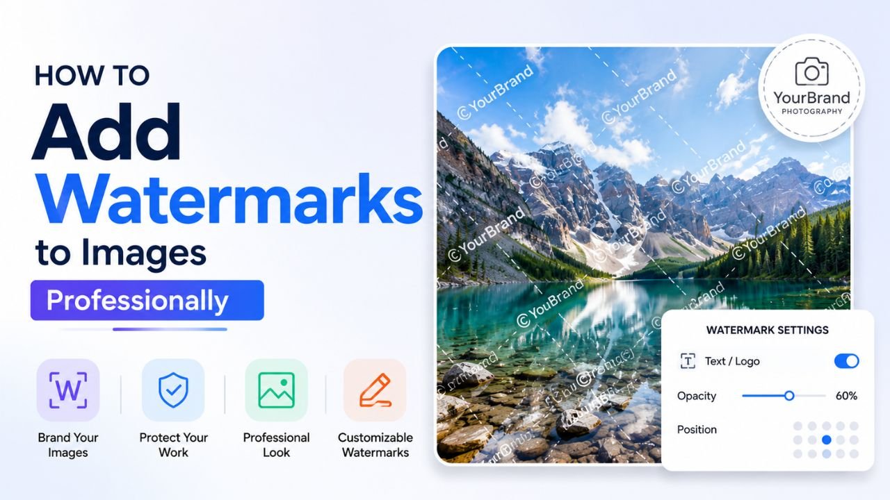
1. Pick the right corner
Bottom-right is the standard for defensive watermarks. Why:
- Eye reads photos top-left → bottom-right (Western), so the watermark is the last thing seen
- Cropping a photo usually retains the bottom area more than the top
- It feels "expected" — viewers recognise it as a watermark, not a design element
For branding watermarks: centred or repeated patterns work better, since the goal is visibility.
2. Size: 2-4% of the image's longest edge
Most amateur watermarks are too large. Pro convention: the watermark height is 2-4% of the image's longer dimension.
- For a 1920×1080 photo: watermark height ~30-50px
- For a 1080×1080 Instagram post: watermark height ~25-40px
- For a 4000×3000 print: watermark height ~80-120px
Bigger than 4% starts to compete with the image content. Smaller than 1% becomes invisible (which might be fine for purely defensive use).
3. Opacity: 25-50%
Solid white or solid black watermarks fight the image. Reduce opacity:
- 50% opacity for branding watermarks (visible but not distracting)
- 25-35% opacity for defensive watermarks (just barely there)
If your watermark is text on a busy image, drop opacity further (15-25%) — the busy background lets the lower opacity still read.
4. Add a subtle shadow or backdrop
A watermark that sits directly on the image can disappear into bright or busy areas. Two fixes:
- Soft shadow behind the watermark (2-3px blur, 60% opacity)
- Subtle white halo behind the watermark (1-2px white outline, low opacity)
Both make the watermark legible against any image content without dominating the photo.
5. Use a real logo or styled name
A name in Arial at default settings looks unprofessional. Three better options:
- A simple logomark (an icon + your name) designed once and reused
- A signature font — Brittany Signature, Allura, Pacifico work well for signature-style watermarks
- A monospace font — Roboto Mono, JetBrains Mono read as "technical" and feel professional
Avoid script fonts that are hard to read at small sizes (Lobster, Comic Sans).
6. Use the right format for the output
A watermarked image is typically:
- JPG quality 90+ for photography portfolios — preserves the watermark's antialiasing
- WEBP for web — same quality at smaller file size
- PNG only if you need transparency — bigger files, no advantage for solid photos
Save the watermark itself as a transparent PNG so you can reuse it on any image without re-creating the file.
The professional workflow
-
Design your watermark once. Could be your name in a signature font, a small logo, or both. Save as transparent PNG at high resolution (at least 300×300).
-
Use a watermark tool for placement. Our free Watermark tool supports:
- Text or image watermarks
- 9-position grid (corners, sides, centre)
- Opacity slider
- Live preview before applying
- Scale slider for image watermarks
-
Apply consistently across a batch. Same position, opacity, size on every photo. Inconsistency screams amateur.
-
Resize and compress the final output. Free resize + the watermark tool together get you delivery-ready photos.
Common watermark mistakes
- Too large — covering 20% of the image is graffiti, not branding
- Centred and bold on every photo — distracts from the actual content
- Different position on each photo — kills consistency
- High-contrast colour against the image content — looks pasted, not designed
- Watermark in a corner that's easy to crop out — useless as a deterrent
- Watermark made of pure black at 100% opacity — looks like graffiti
The "no-watermark" reality
Here's the uncomfortable truth: a watermark won't actually prevent image theft. Anyone who wants to remove it can:
- Use AI inpainting tools (which got very good in 2025-2026)
- Crop it out
- Just use the lower-quality preview without a watermark
What watermarks DO accomplish:
- Make casual / lazy theft less convenient
- Provide branding consistency when images get shared
- Document ownership if you ever need to prove it (your watermark + original file metadata)
If your images are highly valuable and getting stolen, the better solution is:
- Smaller previews online (don't post full-res)
- Reverse image search alerts (Google Images, TinEye) to find unauthorised use
- DMCA takedown for sites that don't respect attribution
- Image licensing platforms (Getty, Shutterstock) that handle enforcement
When NOT to use a watermark
Some images shouldn't be watermarked:
- Product photos for your own store — your customers don't need to see your name; clean photos sell better
- Profile photos — watermarking your own face on LinkedIn is weird
- Behind-the-scenes / casual content — feels overly precious
- Internal documentation — wasted effort
Watermarks make sense for: photography portfolios, paid licensed photos, social media branded content, original artwork shared online.
Quick recipe for the "looks expensive" watermark
- Take your name or initials in a signature font
- White text, 30-40% opacity
- Soft shadow (2px blur, 50% black, 50% opacity)
- Place bottom-right with 5% padding from edges
- Size: 3% of image's longer dimension
Apply this consistently. The result feels professional without dominating the image.
Try it now with our free Watermark tool — text or image watermarks, 9-position grid, opacity slider, live preview.
Ready to optimize your images?
Every tool mentioned in this article is free to use. No upload, no signup, no watermarks on small files.
Try our free toolsRelated articles
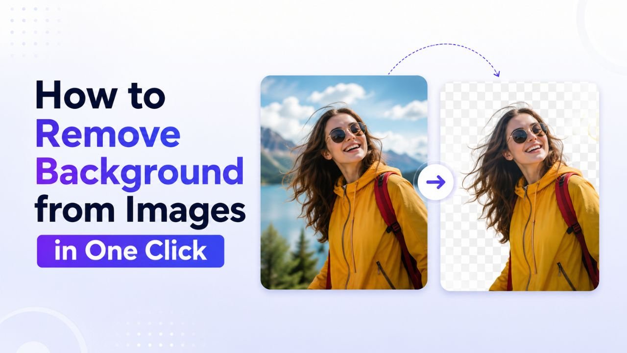
How to Remove Background from Images in One Click (Free, No Photoshop)
Background removal used to take 10 minutes per image with the Pen Tool. In 2026 it takes one click. Here's the practical guide for any image type.

How to Blur Background Like a DSLR Using Online Tools (No Camera Needed)
That dreamy DSLR portrait blur (bokeh) is now reproducible from any phone photo — using free online tools that simulate depth of field convincingly.

How to Resize Images Without Losing Quality (The Real Guide)
Resizing seems trivial but most tools make it look worse than it should. Here's how to keep images crisp regardless of which direction you're going.