
How to Make a YouTube Thumbnail With Two Images
Learn how to make a YouTube thumbnail with two images. Follow simple steps to combine photos, arrange them clearly, and create a balanced thumbnail that works on mobile.
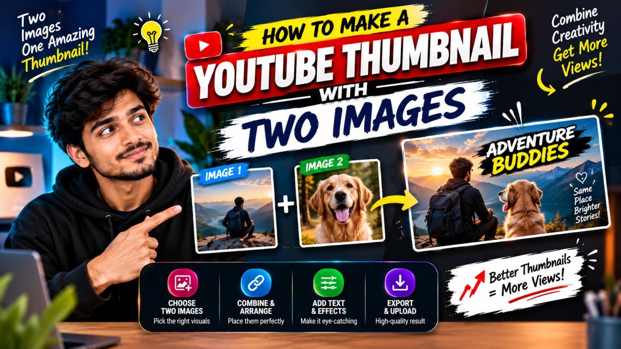
How to Make a YouTube Thumbnail With Two Images
Using two images in a YouTube thumbnail can help show a comparison, introduce two people, or present a before-and-after result. The challenge is making both images easy to understand without making the design look crowded.
Learning how to make a YouTube thumbnail with two images is mostly about choosing the right pictures, arranging them clearly, and making sure the important details remain visible at a small size.
This beginner-friendly guide explains how to combine two images, choose a layout, add text, and check your thumbnail before uploading it.
Why Use Two Images in a YouTube Thumbnail?
Two images can communicate a video idea quickly when each image has a clear purpose. For example, one image might show a problem while the other shows the result.
A two-image thumbnail can work well for:
- All Tools
- Before-and-after videos
- Product comparisons
- Versus or challenge videos
- Tutorials showing a starting point and final result
- Videos featuring two people, places, or objects
Two images are not automatically better than one. Use them when they help explain the video. If the second image adds no useful information, a simpler thumbnail may be more effective.
1. Choose Two Images That Work Together
Start by selecting images that support the same video idea. They do not need to look identical, but they should be clear enough to understand when placed side by side.
Pick images with a clear purpose
Before editing, decide what each image should communicate.
For example:
| Video type | Image 1 | Image 2 |
|---|---|---|
| Before and after | Original result | Improved result |
| Product comparison | Product A | Product B |
| Travel video | First location | Second location |
| Tutorial | Starting step | Final outcome |
| Challenge video | First participant | Second participant |
This simple planning step helps prevent the thumbnail from becoming a collection of unrelated pictures.
Check image quality and ownership
Use images that are sharp enough for your design and that you have permission to use. Your own photos, properly licensed images, or assets you are allowed to use are safer choices than copying pictures from another creator.
If the images have very different lighting or colors, you can adjust them during editing so they feel more consistent.
2. Create a Thumbnail Canvas
A common YouTube thumbnail working size is 1280 × 720 pixels, with a 16:9 aspect ratio. Use the current thumbnail requirements shown in YouTube Studio or official YouTube Help when preparing your final file.
In your design app:
- Create a new design.
- Choose a 16:9 canvas or enter your preferred thumbnail dimensions.
- Add both images to the canvas.
- Keep the original files available in case you need to crop or reposition them.
You can create the design in a graphics editor, a browser-based design tool, or an image-editing app. The exact buttons differ, but the main process is similar: add the images, arrange them, adjust the crop, and export the finished thumbnail.
3. Choose a Layout for the Two Images
The layout should make the relationship between the images obvious. Choose one that suits the story you want the thumbnail to tell.
Side-by-side layout
Place one image on the left and the other on the right. This is useful for comparisons, versus videos, and before-and-after designs.
Try to give both images enough room. If one image is more important, it can be slightly larger, but avoid making the other so small that viewers cannot recognize it.
Top-and-bottom layout
Place one image above the other. This can work when the images are portrait-oriented or when a horizontal split better suits the composition.
Make sure the dividing line does not cut through an important face or object.
Overlapping layout
Place one image partly over the other. This can create depth, but it requires careful layering and enough separation between the images.
Use overlap only when both pictures remain understandable. Avoid covering the main subject with the second image.
4. Add the First Image
Import the first image and position it where you want it to appear.
Crop carefully
Most images will not fit the thumbnail canvas perfectly. Resize and crop the image so the main subject remains visible.
Check that:
- Faces are not cut off awkwardly.
- Important objects remain inside the frame.
- The image does not look stretched.
- The crop supports the video topic.
Do not stretch an image to fill a space if doing so changes the shape of people or objects. Crop it instead, or choose a layout that suits its proportions.
5. Add the Second Image
Import the second image and place it beside, above, or partly over the first image, depending on your chosen layout.
Match the scale and alignment
For a split layout, align the images so the design looks intentional. Their subjects do not need to be the same size, but the difference should have a purpose.
For example, if you are comparing two products, make both products large enough to recognize. If you are showing a before-and-after result, use similar framing so viewers can compare them easily.
Check the image boundary
A visible divider can help separate the images. It might be a narrow gap, a simple line, or a clean edge between two panels.
Keep the divider subtle. A thick decorative border can take up space that the images need.
6. Make the Two Images Look Consistent
Two pictures taken in different places or at different times may have different brightness, contrast, or color temperature. These differences can make the thumbnail feel disconnected.
You can improve consistency by making small adjustments.
Adjust brightness and contrast
If one image is much darker than the other, adjust it so the subjects are similarly visible. Avoid making both images equally bright if that causes details to disappear.
Balance the colors
If one image is very warm and the other is very cool, consider making a light color adjustment so they feel more compatible.
Do not force the images to match perfectly. A before-and-after thumbnail may need visible differences to communicate the result.
7. Add Text Only If It Helps
A two-image thumbnail may already explain the topic visually. Add text only when it provides useful context.
Good thumbnail text is:
- Short
- Easy to read at a small size
- Directly related to the video
- Placed where it does not cover important details
For a comparison, a short label such as “A vs B” may be enough. For a before-and-after video, “BEFORE” and “AFTER” can clarify the two sides.
Avoid adding a full sentence across both images. Too much text can make the thumbnail difficult to read on mobile.
8. Keep the Main Subjects Easy to See
When two images share one canvas, the subjects can become too small. Make sure viewers can quickly identify the people, products, or results that matter.
Remove unnecessary details
Crop away empty areas or distracting background details when doing so does not change the meaning of the image.
Keep text away from key subjects
Do not place text over a face, product label, or important result. If there is no clear area for text, try a small panel or remove the text entirely.
9. Preview the Thumbnail at a Small Size
A thumbnail may look clear while you are editing it at full size but become confusing when reduced.
Before exporting:
- Zoom out until the thumbnail is close to the size it may appear in a mobile feed.
- Check whether both images are recognizable.
- Make sure the main idea is clear without zooming in.
- Confirm that any text is readable.
- Remove details that become cluttered at small size.
If the two images are hard to distinguish, try a simpler layout, stronger separation, or a tighter crop.
Part 1 Summary
To make a YouTube thumbnail with two images, choose pictures that support one clear idea, create a 16:9 canvas, arrange the images in a suitable layout, and crop them carefully. Adjust brightness or color only when it improves consistency, and add text only if it helps explain the thumbnail.
Most importantly, preview the design at a small size. Both images should remain recognizable, and the overall message should be easy to understand.
Part 2 — Advanced Tips for a YouTube Thumbnail With Two Images
10. Use a Clear Visual Relationship
The two images should feel connected, not like unrelated pictures placed on the same canvas. Make the connection clear through the topic, composition, labels, or a simple divider.
For example:
- A before-and-after thumbnail should make the change easy to compare.
- A product comparison should give both products similar space and visibility.
- A two-person thumbnail should make both people recognizable.
- A tutorial can show the starting point and the final result.
If viewers cannot tell why the images appear together, simplify the design or choose pictures that communicate the relationship more clearly.
11. Choose the Right Crop for Each Image
Images often have different proportions. One might be a close-up portrait, while the other is a wide scene. Cropping helps them fit the same thumbnail without stretching.
Keep the subject inside the frame
When cropping, check that the important part of each image remains visible. Leave enough space around faces and objects so the composition does not feel cramped.
Use similar framing for comparisons
If you are comparing two products or showing a before-and-after result, similar framing can make the difference easier to see. Keep the subjects at roughly comparable sizes when that supports the comparison.
For a more dramatic design, different sizes can work—but make the choice intentional.
12. Separate the Images Without Overdesigning
A small amount of separation can make a two-image thumbnail easier to scan.
You can use:
- A narrow gap between the images
- A thin divider line
- A simple edge or frame
- A slight difference in background tone
Choose one approach. Multiple thick borders, stickers, and decorative shapes can make the thumbnail feel crowded.
13. Use Layers to Control Overlapping Images
If you want one image to overlap the other, place each image on its own layer in your editing app. This lets you move, resize, crop, and reorder the pictures independently.
A simple layer order might be:
- Background
- Main image
- Second image
- Text or labels
- Optional subtle effects
Keep the main subject visible. If the top image covers too much of the lower image, reduce the overlap or use a side-by-side layout instead.
14. Add a Divider or Label When It Clarifies the Story
A divider can help viewers distinguish the two sides of a comparison. Labels can also make the meaning clear.
Examples include:
- “BEFORE” and “AFTER”
- “A” and “B”
- “OLD” and “NEW”
Use labels only when they help. If the images already explain the comparison, extra text may not be necessary.
Keep labels short and readable. Place them near the image they describe, and make sure they do not cover important details.
15. Balance the Visual Weight
Two images can have equal dimensions but still feel unbalanced. A bright, close-up subject may attract more attention than a darker or smaller subject.
To balance the design:
- Give both subjects enough room.
- Avoid placing all the bright or detailed elements on one side.
- Keep the headline from overpowering either image.
- Adjust crop and placement before adding decorative effects.
Equal image size is not always required. The goal is a composition where the important information is easy to notice.
16. Keep Text Separate From the Main Images
Text can clarify a two-image thumbnail, but it can also compete with the pictures.
Try placing text:
- In an open area above or below the images
- In a small panel that does not cover the subjects
- Near the image it describes
- Between the images only if there is enough room
Avoid squeezing a long headline into the divider area. If the message needs too much space, shorten it or leave the text out.
17. Practical Layout Examples
| Video type | Suggested layout | Helpful detail |
|---|---|---|
| Before and after | Two equal panels | Use similar framing and short labels |
| Product comparison | Side by side | Keep both products recognizable |
| Two people | Side by side or slight overlap | Make both faces clear |
| Tutorial result | Starting image plus larger result | Give the final result more emphasis |
| Travel comparison | Two panels | Choose images with a clear connection |
These are starting points, not strict rules. Choose the layout that makes your video’s idea easiest to understand.
18. Common Mistakes to Avoid
Using two unrelated images
Two attractive images do not automatically make a useful thumbnail. Make sure both pictures support the same video topic.
Cropping out important details
A close crop can make a subject more visible, but it can also remove the detail viewers need to understand the image. Check each crop at full size and in the reduced preview.
Making one image too small
If one picture is only a tiny accent, viewers may not understand why it is there. Give each image enough space to serve its purpose.
Adding too many labels
A thumbnail with multiple captions, arrows, badges, and decorative elements can become hard to scan. Keep only the elements that clarify the message.
Stretching images to fit
Stretching can distort faces and objects. Crop the image or change the layout instead.
Ignoring mobile readability
Details that appear clear on a large monitor may become indistinct on a phone. Preview the complete thumbnail at a small size before exporting.
19. Final Quality Checklist
Before publishing, review the design:
- Both images support the same video idea.
- Each image has a clear purpose.
- The main subjects are recognizable.
- Cropping does not remove important details.
- Neither image is stretched or distorted.
- The layout makes the relationship between images obvious.
- Dividers and borders are simple.
- Text is short and readable at a small size.
- Labels are accurate and placed near the correct image.
- The thumbnail is not crowded with unnecessary effects.
- The thumbnail accurately represents the video.
- The finished design has been checked in a mobile-sized preview.
Part 2 Summary
A strong two-image thumbnail uses pictures that clearly belong together. Choose a layout that fits the video, crop each image carefully, and use simple separation or labels when they make the relationship easier to understand.
Keep the design focused. Both images should remain recognizable, and every added element should help viewers understand the video.
Part 3 — Conclusion, FAQs, and Publishing Checklist
Conclusion
A YouTube thumbnail with two images can make a comparison, transformation, or two-part idea easier to understand. The key is to choose images that belong together, arrange them clearly, and keep both subjects recognizable.
Use a simple layout, crop carefully, and add labels or text only when they help explain the video. Before publishing, preview the thumbnail at a small size to make sure the images and message are still clear.
Key Takeaways
- Use two images only when both help communicate the video’s idea.
- Choose a side-by-side, top-and-bottom, or overlapping layout that suits the content.
- Crop images carefully instead of stretching them.
- Keep both main subjects large enough to recognize.
- Use a simple divider or short labels when they clarify the relationship.
- Avoid unnecessary borders, stickers, and decorative effects.
- Preview the thumbnail at mobile size before exporting.
- Use images you own or have permission to use.
Call to Action
Create a simple draft with both images, then check it at a small size. If the thumbnail feels crowded, remove extra text or decoration and give the main subjects more space.
Make sure the finished thumbnail accurately represents your video and helps viewers understand what they can expect.
Frequently Asked Questions
1. How do I make a YouTube thumbnail with two images?
Create a 16:9 thumbnail canvas, add both images, arrange them in a clear layout, crop them carefully, and export the finished design. Check that both images remain recognizable at a small size.
2. What is the best layout for two images in a YouTube thumbnail?
Side-by-side layouts work well for comparisons and before-and-after videos. Top-and-bottom or overlapping layouts can also work, depending on the images and the story.
3. Can I use two different-sized images?
Yes. Different sizes can create emphasis, but both images should remain clear enough to understand. Use unequal sizes only when the difference supports the thumbnail’s message.
4. Should I add a line between the two images?
A thin divider or narrow gap can help separate the images. Keep it simple, and avoid adding a thick border unless it serves a clear purpose.
5. How do I make two images look consistent?
You can make small adjustments to brightness, contrast, and color so the images feel more compatible. Do not force them to match if their differences are important to the video.
6. Should I add text to a thumbnail with two images?
Add text only when it helps explain the images. Short labels such as “BEFORE” and “AFTER” may be useful, but avoid long sentences that crowd the design.
7. How can I prevent the thumbnail from looking crowded?
Use a simple layout, crop away unnecessary details, keep text short, and remove decorative elements that do not help communicate the video’s idea.
8. Can I overlap two images in a YouTube thumbnail?
Yes. Place each image on a separate layer so you can control its position and size. Make sure the top image does not cover important parts of the other image.
9. What size should I use for a YouTube thumbnail?
A commonly used working canvas is 1280 × 720 pixels with a 16:9 aspect ratio. Check YouTube’s current thumbnail requirements before exporting.
10. How do I know if my two-image thumbnail works on mobile?
Preview it at a small size. Both images should be recognizable, any text should be readable, and the main idea should be clear without zooming in.
FAQ Schema JSON-LD
Add this schema only if the same FAQs are visible on the page. Check your website or SEO plugin to avoid duplicate FAQ schema.
Ready to optimize your images?
Every tool mentioned in this article is free to use. No upload, no signup, and no watermarks — ever.
Try our free toolsRelated articles
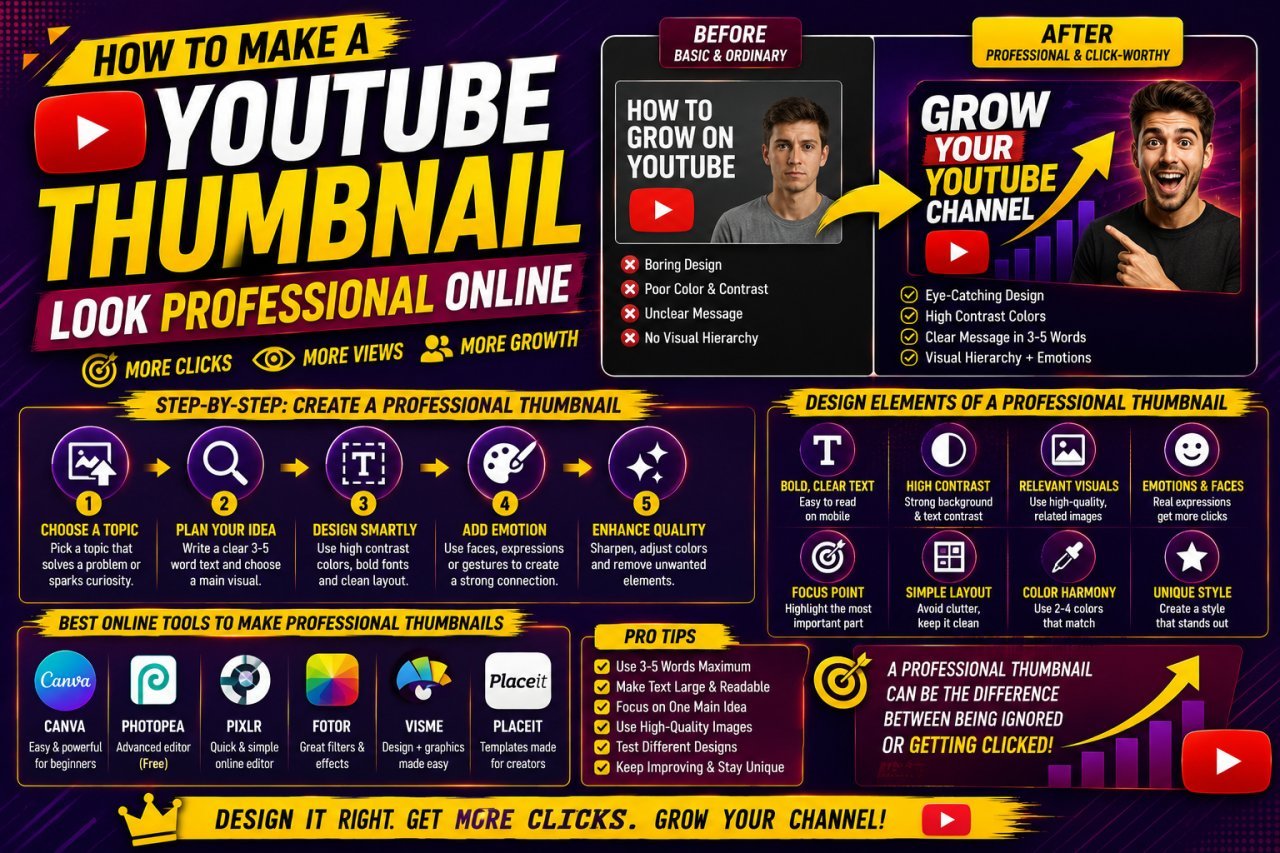
How to Make a YouTube Thumbnail Look Professional Online
Learn how to make a YouTube thumbnail look professional online with better layouts, images, text, colors, branding, and simple design techniques.

How to Create a YouTube Thumbnail With AI
Learn how to create a YouTube thumbnail with AI using simple prompts, image generation, editing, text placement, and mobile-friendly design tips.

How to Make YouTube Thumbnail Text Clear and Sharp
Learn how to make YouTube thumbnail text clear and sharp with better fonts, sizing, contrast, spacing, outlines, export settings, and simple design techniques.