10 Photo Editing Mistakes Every Beginner Makes (and How to Fix Them)
Over-sharpened skin, jacked-up saturation, the dreaded HDR halo — the mistakes beginners make are easy to spot once you know what to look for.
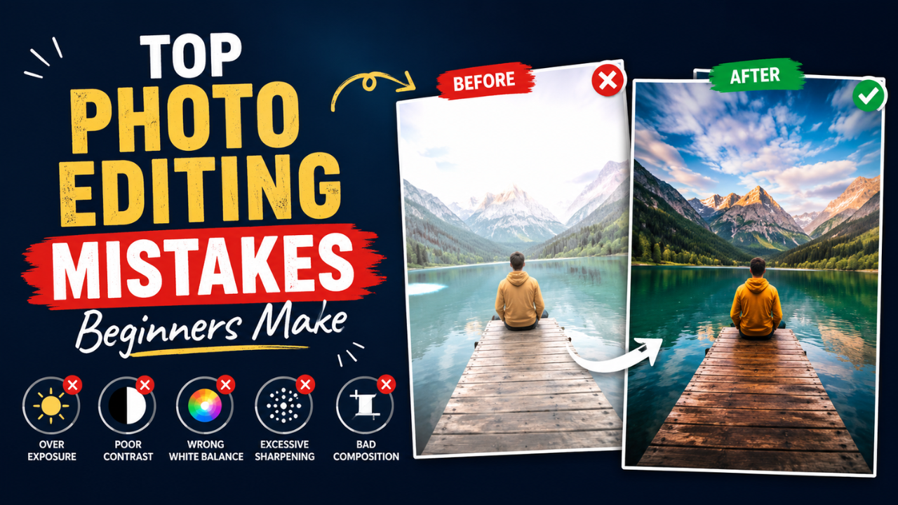
Everyone's photos look slightly worse than they should when they first start editing. The good news: the same mistakes show up over and over. Avoid these ten, and your photos will jump several quality levels — without learning anything technical.
1. Over-sharpening
Sharpening makes photos look "crisper," so beginners crank it. Problem: too much sharpening creates visible halos around edges and accentuates skin texture, dust, and JPEG artefacts.
Fix: apply sharpening at maybe 40-60% strength, never 100%. View at 100% zoom before saving — if you can see halos around contrast edges, you've gone too far.
2. Saturation cranked to 11
The other big "make it pop" mistake. Beginners push saturation to make photos look "more vibrant," but the result usually looks artificial — skin tones turn orange, skies turn neon blue, greens turn radioactive.
Fix: raise saturation by 10-15%, not 50-80%. For nuance, use "Vibrance" instead — it boosts only the colours that aren't already saturated, protecting skin tones.
3. Cropping too tight, then needing to recrop later
Tight crops eliminate context and headroom. They also paint you into a corner — if you later need a different aspect ratio (say, story format), you have nothing to work with.
Fix: crop with breathing room. Keep ~5-10% extra space around the subject. Use our free Crop tool with aspect ratio presets and recrop as needed for different platforms.
4. Forgetting to straighten the horizon
A tilted horizon makes every other edit feel "off." Beginners often don't notice until someone else points it out.
Fix: before any other edit, check if the horizon (or any clearly horizontal element like a building edge) is level. Most editors have a Straighten tool that lets you draw a line along the horizon and auto-rotates the image.
5. White balance left on "auto" forever
Auto white balance gets it right ~70% of the time. The other 30% (mixed lighting, sunset, indoor with multiple bulb types), it's wrong.
Fix: glance at known-white objects in your photo (a white shirt, a white wall). If they look yellow, adjust temperature cooler. If they look blue, adjust warmer. Takes 10 seconds, transforms photos.
6. The HDR halo
Heavy HDR processing (raising shadows, lowering highlights, increasing local contrast) creates visible "glow" around edges where light meets dark areas. Photos look surreal in a bad way.
Fix: use Shadow and Highlight sliders moderately — never max them out. If the photo's tonal range is truly extreme, accept that you'll lose some detail in shadows or highlights. Better than ugly halos.
7. Removing all the noise
Noise reduction smooths out grain — but applied too aggressively, it removes texture from skin, leaves, fabric, etc. Faces start looking like plastic dolls.
Fix: use noise reduction sparingly. A small amount of grain often looks more natural than aggressively smoothed surfaces. For portraits, target noise reduction to specific areas (sky, shadows) rather than the whole image.
8. Saving everything as PNG
PNG is great for graphics with sharp edges. PNG is terrible for photos — files are 6-12× larger than JPG with no quality benefit at normal viewing.
Fix: save photos as JPG (quality 85) or WEBP. Reserve PNG for screenshots, logos, and graphics. Convert existing PNG photos with our free PNG to JPG tool.
9. Compressing at quality 60 or below
Beginners compress too aggressively, thinking "smaller is better." Quality below 70 introduces visible blocking, especially in skies and skin.
Fix: use quality 80-85 as your default. The file is only ~20% bigger than quality 60 but the visible improvement is substantial. See our compression guide.
10. Not viewing photos at 100% before publishing
Photos look fine at small preview sizes. At full size they may have visible artefacts, missed dust spots, weird halos, or focus issues.
Fix: before publishing or printing, zoom to 100% (1:1 pixel mapping). Scan around the image. Fix what's obviously wrong. This single habit catches 90% of "why does my photo look bad" issues.
Bonus mistakes worth mentioning
Bonus 1: Editing on a phone screen for desktop output
Phone screens are colour-calibrated for vivid social media viewing. Your edits look great on phone but look over-saturated or over-contrasted on a desktop monitor. Fix: always check on multiple devices before publishing for general audiences.
Bonus 2: Using the same preset on every photo
Presets are great starting points, but every photo is different. The same preset that works on a sunny outdoor portrait will fail on an indoor low-light shot. Fix: treat presets as 80% of the work; spend 30 seconds adjusting per photo.
Bonus 3: Editing in chronological order without breaks
After 30 photos, your eye is tired. Photos 31-50 get edited worse than 1-30, with no awareness that's happening. Fix: edit in 20-30 photo batches with breaks. Cross-check your "tired editing" decisions later.
How to actually improve
Beyond avoiding mistakes, the path to good editing:
- Look at professional photos in your niche. Photography is taste-driven; you need a reference point.
- Edit the same photo three different ways and decide which you like. Builds intuition.
- Get feedback from someone who edits well. A 5-minute critique teaches you more than 5 hours of self-reflection.
- Use AI auto-correct as a starting point, then refine manually. Beats starting from scratch.
- Develop a personal style — don't try to mimic every Instagram trend. Pick a look, stick with it for 6 months, see if it ages well.
The "good enough" workflow
For everyday photos (social media, family, blog), this 60-second workflow handles 90% of cases:
- Crop to remove distractions (free Crop)
- Straighten horizon
- White balance (adjust temperature if off)
- Slight exposure / contrast tweak
- Slight vibrance boost (10-15%)
- Optional: subtle vignette to draw eye to subject
- Resize for destination (free Resize)
- Compress quality 85 (free Compressor)
Skip steps 1-6 for casual snapshots; do all 8 for anything you'll be judged on.
Photo editing rewards moderation. Most beginner mistakes share the same root cause: cranking sliders to extremes. The pros' secret isn't doing more — it's doing less, more carefully.
Ready to optimize your images?
Every tool mentioned in this article is free to use. No upload, no signup, no watermarks on small files.
Try our free toolsRelated articles
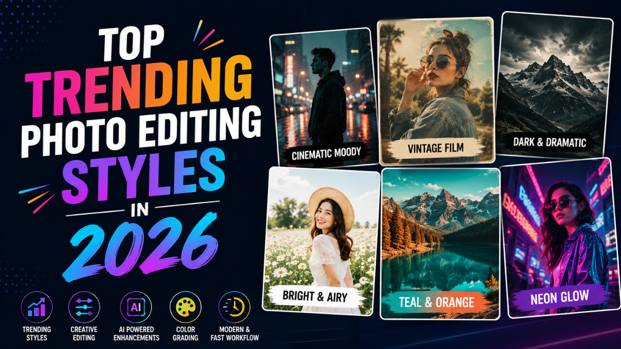
Top 7 Photo Editing Styles Trending in 2026
From soft film grain to AI-blended hyperreal — these are the editing aesthetics dominating Instagram, Pinterest, and fashion campaigns this year.

Best Color Combinations for Social Media Posts (Tested Across Platforms)
The right two colours can double a post's engagement. The wrong combination kills the scroll. Here are the palettes that consistently work — across Instagram, LinkedIn, Pinterest, and Twitter.

How Professional Designers Edit Images 10× Faster (Real Workflow Secrets)
The gap between amateur and pro editing isn't talent — it's workflow. Here's how working designers process 100+ images per day without burning out.