
How to Make YouTube Thumbnail Text Clear and Sharp on Mobile
Make thumbnail text readable on a phone: fewer words, a bold font, strong contrast, careful outlines, smart placement and an export that keeps letter edges crisp.
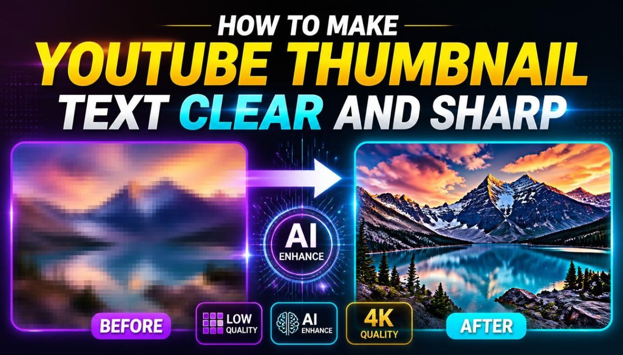
Thumbnail text is clear on mobile when it is short, large, bold, and clearly separated from the image behind it, and when the exported file keeps the letter edges crisp. Most unreadable thumbnail text has one of two problems: too many words squeezed into a small space, or letters that blend into a busy photo. Fix those first, then check that your export settings are not softening the result.
This guide covers wording, fonts, size, contrast, outlines, placement and export, with a quick mobile test at the end. For overall thumbnail design and composition, see how to make a YouTube thumbnail that gets more clicks.
Why Text That Looks Fine on Your Monitor Fails on a Phone
You design a thumbnail at full size on a large screen, but most viewers see it as a small preview in a feed, next to titles, channel names and other thumbnails. At that size, thin strokes disappear, small words turn into grey smudges, and text over a detailed background breaks into noise.
Text that is clear when you zoom in to edit is not necessarily clear in the feed. Judge your text at the size viewers actually see it.
Cut the Words Before You Touch the Font
The quickest way to make text bigger is to use fewer words. A long phrase forces you to shrink the font or add lines, and both hurt readability.
| Too long for a thumbnail | Shorter alternative |
|---|---|
| The Best Way to Make Your YouTube Thumbnails Look Professional | BETTER THUMBNAILS |
| How I Edited My First Travel Video | FIRST TRAVEL EDIT |
| Is This Budget Phone Actually Worth the Price? | WORTH IT? |
| Fixing the Blurry Text on My Thumbnails | FIX BLURRY TEXT |
Two tests help:
- Remove-a-word test: if you delete a word and the message is still clear, leave it out. Words like "the", "a" and "how to" are rarely needed when the image already shows the topic.
- Title test: the thumbnail should not repeat the title. Let the title explain and the thumbnail highlight one idea.
Very short text can lose meaning. "SHARP!" on its own says little, while "SHARP TEXT" is clear. Aim for the fewest words that still make sense, and make sure they describe what the video actually contains.
Pick a Font Built for Small Sizes
Choose a font whose letters stay distinct when tiny:
- Heavy weight: bold, extra-bold or black weights have thick strokes that survive reduction
- Simple, open shapes: sans-serif fonts with clear differences between similar letters (I, l, 1; O, 0)
- Moderate width: very condensed fonts fit more words but blur together when small
- No flourishes: script, handwritten, thin and highly decorative fonts are fine as a small accent at most, not for the main message
Use one font for the headline. If you add a second, give it a clear secondary role, such as a small label. Type your real phrase in a few candidate fonts and compare them zoomed out, because a font that looks great at full size can fall apart in the preview. Our guide to fonts for thumbnails and posters lists options worth testing.
All caps is common in thumbnails because short uppercase phrases look solid and bold. Mixed case can feel calmer and more professional. Both work if the phrase is short and the weight is heavy.
Make It Big, and Make One Word Bigger
There is no universal point size for thumbnail text, because it depends on the canvas, the font and how many words you have. The practical rule: make the main phrase as large as the layout allows without covering the subject, then check it at phone-preview size. If you cannot read it instantly, shorten it or enlarge it.
Not every word needs the same size. Find the word that carries the message and emphasise it:
MAKE IT
SHARP
Here "SHARP" is larger or in an accent colour, and "MAKE IT" is smaller. Emphasise one word or phrase. If everything is large, bold and outlined, nothing stands out.
Never stretch or squash letters to fill a space. Distorted type looks unnatural and is harder to read. Shorten the phrase, adjust the size, or move the text.
Get the Contrast Right
Large text still disappears if it is too close in brightness to what is behind it. White on a pale sky, yellow on a sunlit wall and dark grey on a shadowy room all fail on a phone.
Contrast is mostly about lightness, not hue. Red text on a green background can be nearly unreadable if both colours have similar brightness (our guide to the best color combinations for social media has pairings that hold up). Light text needs a dark area behind it, and dark text needs a light one. The WCAG contrast guidance was written for web pages, but its core idea applies to thumbnails: the greater the brightness difference between letters and background, the easier the text is to read, especially at small sizes.
A simple colour plan keeps text readable:
- One main text colour that contrasts strongly with the background
- One accent colour for the key word
- Nothing else competing in the text block
Use Outlines, Shadows and Panels to Separate Text
Photos rarely have one even tone behind the text, so you often need help separating the letters. In order of preference:
Move the Text to a Calmer Area
The cleanest fix is placement. Hair, foliage, crowds, shelves, patterned clothes and detailed buildings all fight with letters. Put text over sky, a plain wall, a blurred area or empty background.
Darken or Blur Behind the Text
If there is no calm area, create one: add a soft dark gradient on the text side, or blur and darken the section of background behind the words. This keeps the photo visible while giving the letters a clean base.
Add a Modest Outline
A dark outline around light text (or the reverse) keeps letters readable over a background that changes from light to dark. Keep it thin relative to the letter strokes. If the outline is the first thing you notice, or it fills in the gaps inside letters like "e" and "a", it is too thick.
Add a Tight Shadow
A small, fairly sharp drop shadow adds separation. Large, soft, distant shadows make text look muddy and blurry, which is the opposite of what you want. If you use an outline and a shadow together, keep both subtle.
Put a Panel Behind It
For very busy images, a solid or semi-transparent shape behind the text gives the most reliable readability. It covers part of the photo, so keep the panel just large enough for the words.
Effects should support well-chosen text, not rescue a thin font in a bad spot. If you need a thick outline, heavy shadow and glow to read the words, change the font, size or placement instead.
Place Text Where It Will Not Be Covered or Cramped
- Keep text off faces and key details. Do not cover eyes, mouths, product labels or the result you are showing. Give the subject one area and the text another.
- Mind the bottom-right corner. YouTube overlays the video duration there in most feeds, so do not put important words in that corner.
- Leave breathing room. Text pressed against the canvas edge or another object feels cramped and is harder to read. Leave a margin on every side.
- Keep related words together. Do not split "IMAGE" and "QUALITY" across opposite sides of the frame.
- Break lines naturally. For two lines, break between meaningful groups ("FIX YOUR / BLURRY TEXT"), never mid-phrase. Keep line spacing tight enough that the block reads as one unit, but loose enough that lines do not touch.
Export So Letter Edges Stay Crisp
Text is the first thing to suffer from poor exports, because its hard edges show compression artefacts and softness more than photos do.
Design at Full Size From the Start
Create the canvas at 16:9, at least 1280 × 720 pixels, which is the size YouTube's custom thumbnail help page recommends (it also lists a 2 MB limit and JPG, GIF or PNG). Do not design small and enlarge later, because enlarged text loses its sharp edges. Keep text as editable text or vector layers until the final export instead of flattening early and resizing the flattened image. For a full breakdown of dimensions and quality settings, see the YouTube thumbnail HD size guide.
Choose the Format and Quality Deliberately
JPG compression creates faint blocky artefacts and halos around high-contrast edges, which is exactly what text is. If your JPG shows smudging around letters, raise the quality setting or export as PNG, which is lossless. Then make sure the file is under 2 MB. If a PNG is too large, a high-quality JPG is usually fine. You can bring either format under the limit with the compress to target size tool while checking the before/after preview for text damage.
Export Once, Then Inspect the Real File
Every resize and re-save softens text a little. Export once from the full-resolution design, then open the exported file (not the editor preview) and compare letter edges, thin strokes and outlines. If the export is softer than the design, check the export size and compression.
Fixing Text That Is Already Soft
If all you have is a finished thumbnail with slightly soft text, the YouTube Thumbnail Enhancer can upscale and sharpen it to 1280 × 720. Sharpening improves mild softness, but it cannot rebuild letters that were lost to a tiny canvas or heavy compression. Re-exporting from the original design file is always better. If the text looks sharp on your computer but soft on YouTube, read why YouTube thumbnails look blurry after upload.
A Worked Fix: From Unreadable to Clear
Say your thumbnail reads "HOW TO MAKE YOUR THUMBNAIL TEXT LOOK MORE PROFESSIONAL AND CLEAR" in a thin font over a detailed photo, and it looks soft after export. Work through it in order:
- Cut the words to "CLEAR TEXT" and let the title explain the rest.
- Switch to a heavy sans-serif and enlarge the phrase until it fills the open side of the frame.
- Emphasise "CLEAR" with size or an accent colour.
- Move the text off the busy part of the photo into the calmest area, and add a soft dark gradient behind it.
- Add a thin outline only if letters still blend in at a few points.
- Remove glow and large shadows, which make edges look blurry.
- Re-export once at 1280 × 720 with a higher JPG quality or as PNG, under 2 MB.
- Check the exported file at phone-preview size.
Most of the improvement comes from steps 1 to 4. Effects and export settings refine the result, but they do not replace short wording and good placement.
The Two-Minute Mobile Test
Before uploading:
- Zoom out until the thumbnail is about the size of a phone-feed preview, or send the file to your phone and view it there.
- Look away, then glance back for about a second. Could you read the main words?
- Check for letters that merge, thin strokes that vanish, or outlines that clog the letters.
- Check that no text sits in the bottom-right corner or over the subject's face.
- If anything fails, shorten, enlarge, move or add contrast, then export and test again.
Frequently Asked Questions
Why does my YouTube thumbnail text look blurry?
The usual causes are a design canvas that was too small and then enlarged, repeated resizing and re-saving, heavy JPG compression around letter edges, very thin fonts, and strong glow, blur or shadow effects. Weak contrast can also make sharp text look unclear.
How many words should YouTube thumbnail text have?
There is no fixed limit, but a short phrase of a few words is far easier to read on a phone than a sentence. Fewer words let you set the text larger, and the video title can carry the detail.
What font works best for thumbnail text?
A bold or extra-bold sans-serif with simple, open letter shapes is the safest starting point. Avoid thin, script and very condensed fonts for the main message, and always test your actual phrase at a small size.
Should I add an outline or shadow to thumbnail text?
Only when the text sits over a varied photo and needs separation. Keep the outline modest and the shadow tight. If the text is still hard to read, move it to a calmer area or put a solid or semi-transparent panel behind it.
Can sharpening fix blurry thumbnail text?
Only slightly soft text. Sharpening cannot rebuild letter edges lost to a low-resolution canvas or heavy compression. It is better to fix the source: design at full size, use a heavier font, and export once at good quality.
Related articles
How to Change, Remove or Blur the Background of a YouTube Thumbnail
Remove, replace or blur the background of your own YouTube thumbnail, clean up distracting objects, and make the cutout look natural at 1280×720.
Why Does My YouTube Thumbnail Look Blurry After Upload? Causes and Fixes
A blurry, pixelated or low-quality YouTube thumbnail usually loses its sharpness before upload. Here is how to find the exact step and fix it.

How to Extract the Best Frame From Your Video for a YouTube Thumbnail
Find the sharpest moment in your own video, export it at full resolution instead of screenshotting a player, and turn it into a clean 1280×720 thumbnail.