
How to Make YouTube Thumbnail Text Readable on Mobile
Learn how to make YouTube thumbnail text readable on mobile with better font size, contrast, spacing, and layout. Follow practical design tips and a simple mobile-preview checklist.
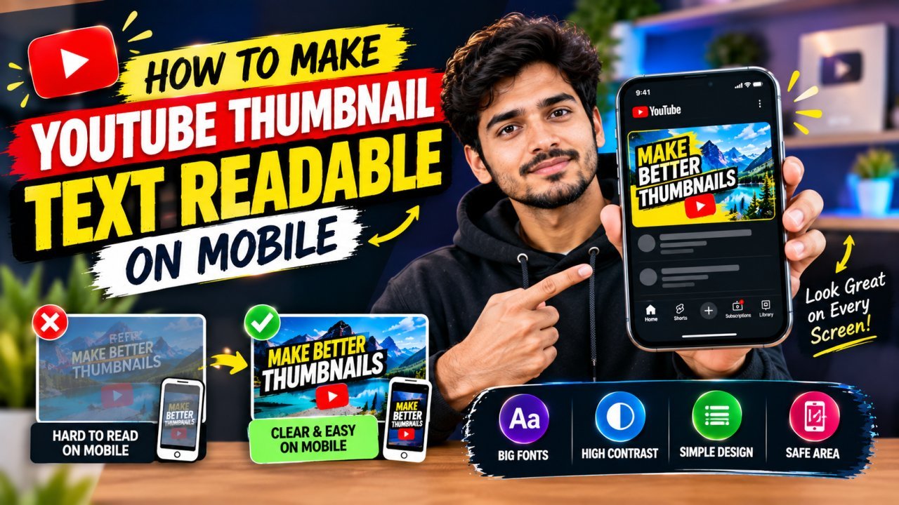
How to Make YouTube Thumbnail Text Readable on Mobile
A YouTube thumbnail has only a moment to communicate what a video is about. That becomes harder on a phone, where the thumbnail appears much smaller than it does on a laptop or desktop screen. If the text is tiny, crowded, or low in contrast, viewers may not be able to read it before scrolling past.
Learning how to make YouTube thumbnail text readable on mobile starts with a simple principle: design for the smallest screen first. Use a short message, a clear font, strong contrast, and enough empty space around the words.
This guide explains how to create mobile-friendly thumbnail text, what common mistakes to avoid, and how to check your design before publishing.
Why Mobile Thumbnail Readability Matters
Many viewers browse YouTube on phones. On a small screen, thumbnail text competes with the video image, surrounding recommendations, and other interface elements. Details that look clear in a large design can become difficult to recognize when the image is reduced.
Readable text helps viewers quickly understand the thumbnail’s message. It should support the video topic rather than repeat the entire title.
For example, if your video title is “How I Edited My First Travel Video,” the thumbnail might use a short phrase such as “FIRST TRAVEL EDIT” instead of squeezing the full title into the image.
1. Keep Thumbnail Text Short
The easiest way to improve readability is to reduce the number of words.
Long text requires smaller lettering or more lines. Both can make the thumbnail harder to read on mobile. Aim for a short phrase that communicates one main idea.
Use a few meaningful words
Try to make the text:
- All Tools
- Easy to understand at a glance
- Directly related to the video
- Focused on one key benefit, result, or question
- Different from the full video title when possible
Examples:
| Video topic | Possible thumbnail text |
|---|---|
| Beginner photo editing | “EDIT LIKE THIS” |
| Budget travel | “TRIP UNDER ₹5,000” |
| Cooking tutorial | “CRISPY EVERY TIME” |
| Study routine | “FOCUS FOR 2 HOURS” |
| Phone review | “WORTH THE PRICE?” |
These are examples, not fixed formulas. Choose wording that accurately reflects the video and avoids promising something the content does not deliver.
Remove words that do not add meaning
Words such as “the,” “a,” and “how to” may be unnecessary on the thumbnail if the image already communicates the topic. Keep them when they are important to the message, but do not include them automatically.
A useful editing test is to ask: If I remove this word, does the message become unclear? If not, consider removing it.
2. Choose a Bold, Simple Font
A font can look stylish on a computer but become difficult to read when reduced. For thumbnail text, clarity should come before decoration.
What to look for in a font
Choose lettering with:
- Clear letter shapes
- Strong, consistent strokes
- Enough space between letters
- A simple style without excessive flourishes
- Good visibility when displayed at a small size
Bold sans-serif fonts are often a practical starting point because their letterforms are straightforward. However, no font is automatically readable in every design. Size, contrast, spacing, and the background all affect the result.
Avoid overly decorative lettering
Script fonts, thin handwritten fonts, and highly condensed lettering can be difficult to recognize at small sizes. They may still work for a short accent, but avoid using them for the main message unless the words remain easy to read in a mobile preview.
Use one main font family where possible. If you combine fonts, give each one a clear role—for example, a bold headline and a small supporting label.
3. Make the Text Large Enough
There is no single font size that works for every thumbnail. The right size depends on the number of words, the font, the composition, and how much space the text needs.
Instead of relying only on a number in your design app, judge the text at the size viewers are likely to see it.
Design at full size, then preview it small
YouTube thumbnails are commonly designed in a wide 16:9 format. A frequently used working canvas is 1280 × 720 pixels, but the design will often appear much smaller in recommendations.
A practical workflow is:
- Create the thumbnail at your intended export dimensions.
- Add the text and arrange the main image.
- Zoom out until the thumbnail is close to the size you see in a mobile feed.
- Check whether you can read the message without zooming in.
- Increase the text size or shorten the phrase if it is difficult to read.
Do not make every word equally large. Give the most important phrase the strongest visual emphasis, and keep any supporting text secondary.
4. Use Strong Text-to-Background Contrast
Text is easier to read when it stands apart from the image behind it. A bright font on a bright background, or a dark font on a dark background, can disappear—especially on a small screen.
Choose contrasting colors
Common combinations include:
- White text over a dark area
- Dark text over a light area
- A bright accent color against a darker background
- A restrained color palette with one main text color
The best combination depends on the image. Check the actual thumbnail rather than assuming that a particular color will always work.
Add a text outline or shadow when needed
A subtle outline or shadow can separate letters from a busy background. Use the effect to improve clarity, not to decorate every word.
If the text is still difficult to read after adding an outline, try moving it to a simpler part of the image or placing a solid or semi-transparent shape behind it.
Avoid using several heavy effects at once. Thick outlines, strong shadows, gradients, and multiple glows can make the lettering look cluttered.
5. Place Text Over a Simple Area
A clear font can still be hard to read when it sits over a busy image. Faces, objects, patterns, and bright details can compete with the letters.
Look for an area with less visual activity. If the image does not have one, create separation by adjusting the composition or adding a simple background panel behind the text.
Keep text away from important details
Do not cover the main subject’s face, a product that viewers need to recognize, or another key part of the image. The thumbnail should communicate both through its picture and its words.
A useful approach is to give the text and the main subject separate areas. For example, place the subject on one side and the headline on the other, as long as the composition still feels balanced.
6. Leave Enough Space Around the Words
Crowded text is harder to scan. Give the headline room to breathe by leaving space around its edges and between lines.
Check:
- The gap between letters
- The distance between lines
- The space between the text and the thumbnail edges
- The distance between the words and nearby objects
Do not stretch letters or squeeze words just to fit a long phrase. Shorten the text or adjust the layout instead.
7. Use Line Breaks That Make Sense
If your message needs more than one line, break it into natural groups. Avoid splitting a word or separating words that belong together.
Part 3 — Conclusion, FAQs, and Publishing Checklist
Conclusion
Making YouTube thumbnail text readable on mobile is mainly about keeping the design simple. Use a short headline, a clear font, strong contrast, and enough space around the words. Place the text where it does not compete with the main subject, then check the thumbnail at a small size before publishing.
Remember: the goal is not to fit the entire video title into the thumbnail. The goal is to make one useful message easy to understand at a glance.
Key Takeaways
- Keep thumbnail text short and focused on one idea.
- Choose a bold, clear font that remains readable when reduced.
- Use strong contrast between the text and its background.
- Place words over a calm area or use a simple text panel.
- Leave enough space around letters and lines.
- Avoid excessive colors, outlines, shadows, and decorative effects.
- Preview the thumbnail at mobile size before exporting.
- Make sure the thumbnail accurately represents the video.
Call to Action
Before publishing your next video, review your thumbnail on a phone-sized preview. If the headline is difficult to read, shorten the wording, increase its size, or simplify the background.
Create thumbnails that help viewers understand your video quickly—and make sure the design delivers on what the video actually offers.
Frequently Asked Questions
1. How many words should a YouTube thumbnail have?
There is no fixed word limit, but a short phrase is usually easier to read on mobile than a full sentence. Use only the words needed to communicate the main idea.
2. What font is best for YouTube thumbnail text?
Choose a clear, bold font with simple letter shapes. Bold sans-serif fonts are a practical starting point, but always test the font at a small size.
3. How large should YouTube thumbnail text be?
There is no single font size that works for every design. Make the headline large enough to read in a reduced preview, and shorten the wording if it becomes cramped.
4. Which text color is best for YouTube thumbnails?
Use a color that contrasts strongly with the area behind the text. White often works on dark backgrounds, while dark text can work on light backgrounds. Check the actual image before deciding.
5. Should I add an outline or shadow to thumbnail text?
Use an outline or shadow only when it improves separation from the background. If the text is still hard to read, try moving it or placing it on a simple panel.
6. Should the thumbnail text match the YouTube video title?
It can support the title without repeating it word for word. Use the thumbnail to highlight one key idea and let the title provide additional detail.
7. Is it better to use one line or two lines of thumbnail text?
Either can work. Use the line breaks that make the phrase easiest to read, and avoid squeezing too many words into a small space.
8. How can I check if my thumbnail text is readable on mobile?
Zoom out until the thumbnail is close to the size it might appear in a mobile feed. If you cannot read the headline quickly, simplify the text or improve its size, contrast, or placement.
9. Can I use multiple colors in thumbnail text?
Yes, but use them carefully. One main text color and a restrained accent color can create emphasis. Too many colors may make the message harder to scan.
10. Should I put text over a person’s face or the main object?
Avoid covering important details. Place the text in open space when possible, or use a simple panel that keeps the headline separate from the subject.
FAQ Schema JSON-LD
Add this JSON-LD to the page only if these FAQs are visible to readers. Check your SEO plugin or website setup to avoid adding duplicate FAQ schema.
Internal Link Suggestions
Add relevant links to existing articles on your website, where available:
Ready to optimize your images?
Every tool mentioned in this article is free to use. No upload, no signup, and no watermarks — ever.
Try our free toolsRelated articles
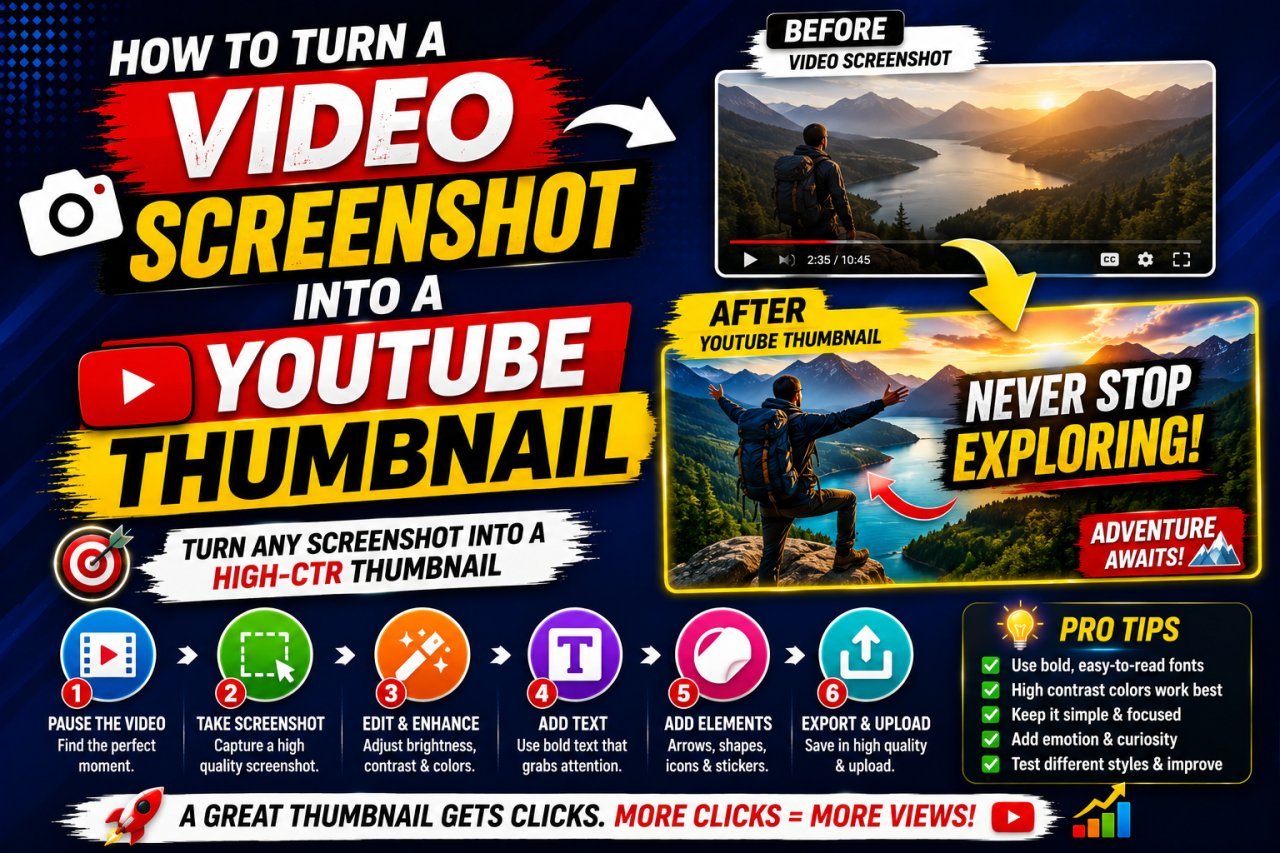
How to Turn a Video Screenshot Into a YouTube Thumbnail
Learn how to turn a video screenshot into a YouTube thumbnail using the right frame, cropping, sharpening, text, contrast, and image optimization techniques.
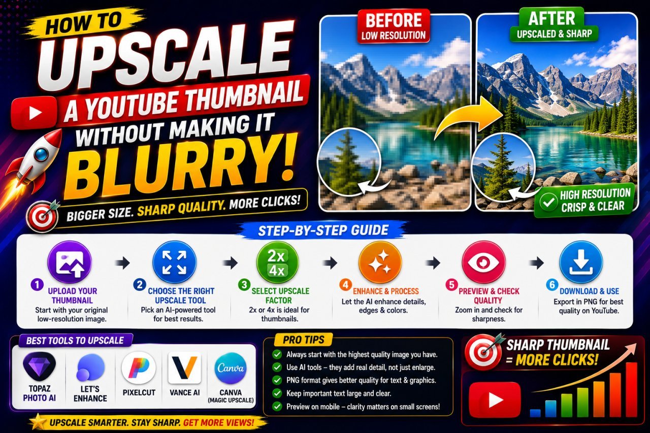
How to Upscale a YouTube Thumbnail Without Making It Blurry
Learn how to upscale a YouTube thumbnail without making it blurry. Discover the right image size, AI upscaling tips, sharpening techniques, and common mistakes to avoid.
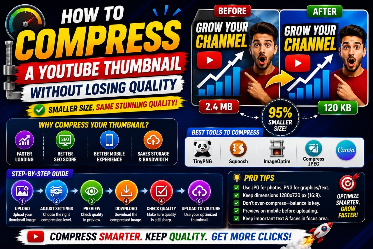
How to Compress a YouTube Thumbnail Without Losing Quality
Learn how to compress a YouTube thumbnail without losing quality using the right dimensions, file format, compression settings, and simple image optimization techniques.