
How to Optimize Images for SEO and Faster Website Loading
Learn how to optimize images for SEO and faster website loading. Discover image compression, WebP and AVIF, image dimensions, alt text, lazy loading, responsive images, file naming, and practical image SEO tips.
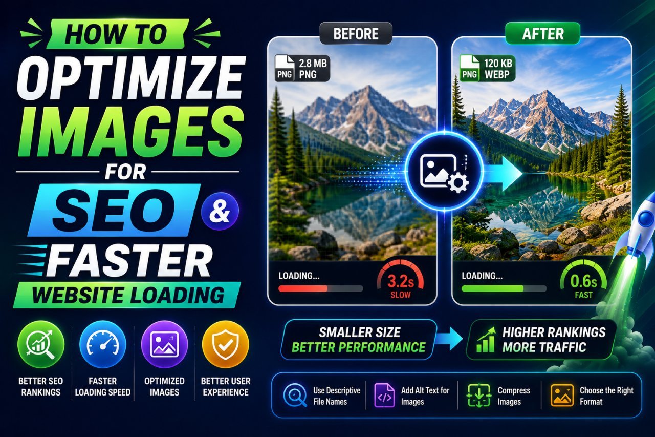
How to Optimize Images for SEO and Faster Website Loading
Introduction
Images are an important part of almost every modern website.
They can make blog posts easier to understand, improve product pages, explain complex topics, and give visitors a better visual experience.
But large, poorly prepared images can also create problems. [Image Compressor (Home)](Image Compressor (Home)/) A website may have beautiful images but still load slowly because those images are unnecessarily large, served in the wrong format, or displayed at dimensions that are much bigger than needed.
That is why image SEO optimization is about more than adding alt text.
A good image optimization strategy considers:
- File size
- Image dimensions
- File format
- Alt text
- File names
- Responsive images
- Lazy loading
- Image quality
- Browser delivery
- Page layout
- Accessibility
- Search visibility
The goal is simple:
Deliver the right image, at the right size, in the right format, with useful information for both visitors and search engines.
In this guide, you will learn how to optimize images for SEO, reduce unnecessary image weight, improve website loading performance, and create a better experience for users on desktop and mobile devices.
Why Image Optimization Matters for SEO
Image optimization can affect several parts of a website experience.
A very large image can increase the amount of data a browser needs to download.
If several pages contain unnecessarily large images, visitors may have to wait longer before the page becomes usable.
This matters even more for mobile visitors who may have:
- Smaller screens
- Limited bandwidth
- Slower connections
- Less powerful devices
Image optimization can help reduce unnecessary data while keeping images visually useful.
Image SEO Also Helps Search Engines Understand Images
Search engines cannot interpret an image exactly like a person does.
They use available signals to understand what an image represents.
Useful information can include:
- Descriptive file names
- Relevant alt text
- Surrounding page content
- Image captions
- Page topic
- Structured data where appropriate
- Image dimensions and technical information
This means image SEO should be treated as part of the overall page optimization process.
What Is Image SEO?
Image SEO means optimizing images so they are useful, accessible, technically efficient, and easier for search engines to understand.
It includes both content and technical optimization.
Content Optimization
This includes:
- Descriptive file names
- Helpful alt text
- Relevant captions
- Appropriate surrounding text
Technical Optimization
This includes:
- Compressing images
- Choosing suitable formats
- Using appropriate dimensions
- Responsive image delivery
- Lazy loading where appropriate
- Avoiding unnecessarily large files
- Providing efficient image resources
Good image SEO combines both areas.
The Basic Image SEO Checklist
Before publishing an image, check the following:
| Optimization Area | What to Check |
|---|---|
| File size | Is the image unnecessarily large? |
| Dimensions | Is it larger than its display size? |
| Format | Is JPG, PNG, WebP, AVIF, or another format appropriate? |
| File name | Does it describe the image? |
| Alt text | Does it accurately describe useful image content? |
| Responsive images | Can different devices receive suitable sizes? |
| Lazy loading | Is it appropriate for below-the-fold images? |
| Compression | Has unnecessary data been removed? |
| Quality | Does the image still look good? |
| Layout | Will the image load without causing visual movement? |
You do not need to optimize every image in exactly the same way.
The right settings depend on the image and its purpose.
1. Compress Images Before Uploading Them
One of the easiest ways to improve image performance is to reduce unnecessary file size before uploading an image to your website.
For example, imagine an image is:
3.5MB
but the website only needs a visually similar image that is:
250KB
Uploading the 3.5MB version may waste bandwidth.
Compression can reduce the amount of data that needs to be downloaded.
But Do Not Over-Compress
The smallest possible file is not always the best file.
Too much compression can create:
- Blurry edges
- Blocky artifacts
- Color problems
- Loss of fine details
- Poor-looking product images
The goal is efficient compression with acceptable visual quality.
2. Resize Images to Appropriate Dimensions
Image dimensions are just as important as compression.
Suppose your website displays an image at approximately:
1000 pixels wide
but you upload an image that is:
5000 pixels wide
The browser may only display the image at a smaller size, but the visitor may still have to download a much larger resource than necessary.
This is inefficient.
Better Approach
Prepare the image close to the largest size actually needed.
For example:
Original: 5000 × 3333 pixels
Required display: approximately 1200 pixels wide
Create an appropriately sized version rather than uploading the full original.
3. Choose the Right Image Format
The image format can have a major effect on file size and quality.
Common formats include:
- JPEG/JPG
- PNG
- WebP
- AVIF
- GIF
- SVG
Each has different strengths.
JPG
JPG is commonly useful for photographs and images with many colors.
It can provide relatively small files with good visual quality when compressed appropriately.
Good For
- Photographs
- Blog images
- Product photos
- Travel images
- General website photography
PNG
PNG is useful when you need features such as transparency or when working with certain graphics.
It is often a good choice for:
- Logos
- Transparent graphics
- Icons
- Screenshots
- Images where lossless compression is important
However, PNG can produce larger files for detailed photographs.
WebP
WebP is a modern image format designed for efficient web delivery.
It supports both lossy and lossless compression and can support transparency.
For many websites, WebP can be a practical alternative to older formats when browser and platform support meet the site's requirements.
AVIF
AVIF is another modern image format designed for efficient compression.
It can provide strong compression efficiency for many types of images.
However, the best format depends on your website setup, browser support requirements, image type, and delivery system.
Do not switch formats blindly.
Always compare the resulting quality and file size.
JPG vs PNG vs WebP vs AVIF
| Format | Best For | Main Advantage | Main Consideration |
|---|---|---|---|
| JPG | Photographs | Widely used and efficient | Lossy compression |
| PNG | Graphics/transparency | Lossless options and transparency | Can be large for photos |
| WebP | Web images | Efficient modern format | Workflow/support considerations |
| AVIF | Modern web delivery | Strong compression potential | Compatibility/workflow considerations |
| SVG | Vector graphics | Scales without pixelation | Mainly for vector artwork |
There is no single format that is best for every image.
Choose based on the image type and website requirements.
4. Use Descriptive Image File Names
Before uploading an image, give it a meaningful file name.
Compare:
IMG_8392.jpg
with:
image-compression-before-after.jpg
The second name provides useful context.
A descriptive file name can help communicate what the image represents.
Good File Name Example
compress-image-without-losing-quality.webp
Poor File Name Example
DSC83929-final-new2.jpg
Use simple words that describe the image.
File Naming Best Practices
When naming image files:
- Describe the actual image
- Use relevant words naturally
- Use hyphens between words
- Keep the name reasonably short
- Avoid unnecessary numbers
- Avoid meaningless names
- Do not stuff keywords into every file name
Example
Instead of:
IMG_2026_04_29_001.jpg
Use:
website-image-optimization-example.jpg
The file name should describe the image rather than attempt to manipulate rankings.
5. Write Useful Alt Text
Alt text is one of the most important parts of accessible image content.
It provides a text alternative that can help users who cannot see the image and gives search engines additional context.
Example
Suppose the image shows a person compressing a JPG image using an online tool.
A useful alt text could be:
"Person compressing a JPG image to reduce file size"
An unhelpful version would be:
"image SEO image optimization best image compression tool"
The second example is keyword stuffing rather than a natural description.
What Makes Good Alt Text?
Good alt text should be:
- Accurate
- Concise
- Relevant
- Natural
- Useful to someone who cannot see the image
Do not describe every tiny visual detail unless it is relevant.
For Decorative Images
If an image is purely decorative and provides no useful information, the implementation may use an empty alt attribute so assistive technologies can skip it.
The exact implementation depends on the website and accessibility setup.
Alt Text vs Image Caption
These are not the same thing.
Alt Text
Primarily provides an accessible text alternative for the image.
Caption
Visible text displayed near the image that provides additional context.
For example:
Alt text:
"Comparison of JPG and WebP image file sizes"
Caption:
"WebP can produce smaller files than JPG for some images at similar visual quality."
Both can be useful, but they serve different purposes.
6. Use Responsive Images
A desktop computer may have a large screen.
A smartphone has a much smaller screen.
Serving the exact same huge image to every device can waste bandwidth.
Responsive image techniques allow a website to provide different image resources depending on the visitor's needs.
For example, a website might have versions such as:
- 400px
- 800px
- 1200px
- 1600px
A browser can then select an appropriate resource based on the page and device conditions.
This can reduce unnecessary downloads.
Why Responsive Images Matter
Imagine a visitor using a phone.
The page only needs an image around a few hundred pixels wide.
Sending a very large desktop-oriented image can be inefficient.
Responsive image delivery helps match the resource more closely to the actual display requirements.
This is especially useful for:
- Blog images
- Product photos
- Hero images
- Galleries
- News websites
- Content-heavy websites
7. Use Lazy Loading Carefully
Lazy loading allows suitable images to load when they are approaching the area where the visitor needs them rather than loading every image immediately.
This can be useful for images below the initial visible area.
For example, a long article might contain:
- 1 hero image
- 10 content images
- 5 related-post images
Loading every image immediately can require unnecessary work before the visitor reaches those sections.
Lazy loading can help defer appropriate below-the-fold images.
Important Warning
Do not blindly lazy-load every image.
An important image that appears immediately when the page opens may need to be available early.
In particular, the main visible image or other important above-the-fold content should be handled differently from images far down the page.
8. Avoid Uploading Images That Are Larger Than Necessary
One of the simplest image SEO mistakes is uploading the original camera file directly to the website.
Modern phones and cameras can produce extremely large images.
For a blog, you may not need the full original resolution.
Before uploading, ask:
How large does this image actually need to be?
If the image only appears at a moderate width, create a version appropriate for that use.
This reduces unnecessary data and makes optimization easier.
9. Preserve Image Quality While Reducing File Size
Good optimization is a balance.
You want:
Smaller file + good visual quality
not:
Smallest possible file + poor image quality
When compressing an image, compare the original and optimized versions.
Pay attention to:
- Text
- Faces
- Fine details
- Gradients
- Product edges
- Shadows
- Background textures
If the difference is difficult to notice at the intended display size, the optimization may be effective.
A Simple Image Optimization Workflow
For most website images, you can use this workflow:
Step 1: Choose the Original
Start with the highest-quality source available.
Step 2: Resize
Set appropriate dimensions for the intended use.
Step 3: Choose the Format
Select JPG, PNG, WebP, AVIF, SVG, or another appropriate format.
Step 4: Compress
Reduce unnecessary file size.
Step 5: Add a Descriptive File Name
Use a natural name related to the image.
Step 6: Add Useful Alt Text
Describe the image accurately when alt text is needed.
Step 7: Implement Responsive Delivery
Provide suitable image sizes for different devices.
Step 8: Use Lazy Loading Where Appropriate
Defer suitable below-the-fold images.
Step 9: Test the Page
Check the page on desktop and mobile.
Step 10: Review Performance
Look for unusually large image resources and opportunities to improve delivery.
Image Optimization Example
Imagine you have a blog image:
Original dimensions: 4000 × 3000 pixels
Original size: 3.2MB
The article displays it at around:
1200 pixels wide
Instead of uploading the 3.2MB original directly, you could:
Resize → Choose an efficient format → Compress → Add alt text → Serve responsively
The final image could be substantially smaller while still looking sharp at its intended display size.
The exact final file size will depend on the image and compression settings.
The Most Important Image SEO Factors
If you are new to image SEO, start with these priorities:
- Use appropriately sized images
- Compress unnecessary file data
- Choose an appropriate format
- Write useful alt text
- Use descriptive file names
- Serve responsive image sizes
- Lazy-load suitable below-the-fold images
- Check image quality after optimization
You do not need to make image optimization complicated.
Start with the biggest problems first.
Advanced Image Optimization for SEO and Website Speed
Optimizing an image before uploading it is only the first part of image SEO.
For a fast website, you also need to think about how images are delivered, where they appear on the page, how browsers load them, and whether each visitor receives an appropriately sized file.
A well-optimized image can still contribute to a slow page if the website delivers an unnecessarily large version or loads too many images immediately.
The following techniques can help you take image optimization further.
9. Match Image Dimensions to the Actual Display Size
One of the most common image optimization mistakes is confusing file dimensions with display dimensions.
An image might be 3000 pixels wide but displayed at only 800 pixels wide.
In that situation, the browser may receive considerably more image data than the page actually needs.
Better Approach
Determine the approximate maximum display width.
For example:
| Original Image | Display Width | Better Approach |
|---|---|---|
| 4000px | 800px | Create an appropriate smaller version |
| 3000px | 1200px | Resize closer to required dimensions |
| 1600px | 1200px | May already be suitable |
| 800px | 800px | Usually appropriate |
The exact dimensions depend on your website layout.
Do not resize every image to the same width automatically.
A hero image, thumbnail, logo, and product image can all have different requirements.
10. Create Multiple Image Sizes
Responsive websites often need more than one image size.
For example, a blog image might have:
- Small version
- Medium version
- Large version
- High-resolution version
The website can then choose an appropriate resource.
Example
Imagine an article image is displayed differently on various screens.
| Device/Use | Possible Image Width |
|---|---|
| Small mobile area | 400px |
| Larger mobile/tablet | 800px |
| Desktop content area | 1200px |
| Large desktop | 1600px |
These are examples rather than universal requirements.
The correct sizes depend on your site's layout and image usage.
11. Use Responsive Image Attributes
HTML provides mechanisms such as srcset and sizes that can help browsers choose an appropriate image resource.
A simplified example looks like this:
<img
  src="image-800.webp"
  srcset="
    image-400.webp 400w,
    image-800.webp 800w,
    image-1200.webp 1200w
  "
  sizes="(max-width: 600px) 100vw, 800px"
  alt="Person compressing an image file">
The browser can use these hints to select a suitable resource based on the available display conditions.
This is more efficient than forcing every visitor to download the largest version.
12. Use Width and Height Attributes
Image dimensions can also help browsers reserve the appropriate space for an image.
For example:
<img
  src="optimized-image.webp"
  width="1200"
  height="800"
  alt="Example of an optimized website image">
Providing dimensions can help reduce unexpected layout movement while images load.
This is useful for user experience because visitors should not see page content suddenly move when an image finishes loading.
13. Understand Lazy Loading
Lazy loading is useful, but it needs to be implemented thoughtfully.
A long article might contain twenty images.
If all twenty are loaded immediately, the browser may need to request resources that the visitor will not see for several screenfuls.
For suitable below-the-fold images, lazy loading can defer those downloads until they are closer to being needed.
A common HTML example is:
<img
  src="article-image.webp"
  loading="lazy"
  width="1200"
  height="800"
  alt="Example of image optimization">
Do Not Lazy-Load Everything
Images that are immediately visible can be more important for the initial page experience.
Use lazy loading primarily where it makes sense rather than applying it blindly to every image.
14. Optimize the Largest Visible Image Carefully
Many pages have a large image near the top.
This could be:
- A blog hero image
- Product image
- Featured image
- Banner
- Main article photograph
Because it appears early, it can be important to the initial loading experience.
Do not automatically treat it like a distant below-the-fold image.
Instead:
- Use an appropriately sized image.
- Compress it carefully.
- Select an efficient format.
- Provide dimensions.
- Make sure it is discoverable by the browser.
- Avoid unnecessarily large source files.
The goal is to make the important visual content available without sending excessive data.
15. Use Modern Image Formats Strategically
Modern formats such as WebP and AVIF can reduce image file sizes in many situations.
However, do not convert every image without checking the result.
A useful test is:
Original format → WebP → AVIF
Then compare:
- File size
- Visual quality
- Transparency requirements
- Browser and platform support
- Website implementation
- Processing workflow
The "best" format is the one that meets your site's technical and visual requirements efficiently.
16. When Should You Use JPG?
JPG remains useful for many photographic images.
It can work well for:
- Blog photographs
- Travel images
- Product photography
- Food photography
- Landscapes
- General photos
JPG is especially useful when broad compatibility and a familiar workflow are important.
If a modern format produces a significantly better result for your particular image and setup, you can consider using it instead.
17. When Should You Use PNG?
PNG is useful when preserving certain image characteristics is more important than achieving the smallest possible file.
Common examples include:
- Logos
- Transparent graphics
- Certain screenshots
- Interface graphics
- Images requiring lossless compression
However, a large photographic image saved as PNG may be unnecessarily heavy.
If you have a photograph, compare PNG with an appropriate photographic format before publishing.
18. When Should You Use WebP?
WebP is often a practical choice for web images.
It can support:
- Photographs
- Graphics
- Transparency
- Lossy compression
- Lossless compression
For many websites, converting suitable JPG or PNG images to WebP can reduce file size while maintaining good visual quality.
Always inspect the converted image.
A smaller file is only useful if the visual result remains acceptable.
19. When Should You Use AVIF?
AVIF can be useful when your image delivery system supports it effectively.
It can provide strong compression efficiency for many images.
However, conversion speed, tooling, compatibility requirements, and workflow complexity may matter.
If your website already has a reliable modern image pipeline, AVIF can be worth testing.
If your setup is simple, a well-optimized WebP workflow may be easier to manage.
20. Do Not Ignore Image Quality
Image compression should not become an obsession with file size.
Imagine two versions:
Image A: 80KB but visibly blurry
Image B: 160KB with much better visual quality
For an important website image, Image B may be the better choice.
The objective is not:
"Make every image as small as possible."
The objective is:
"Remove unnecessary data while preserving useful visual quality."
21. Use the Right Image for the Right Purpose
Different website images have different jobs.
Hero Image
Usually needs strong visual quality because it may be one of the first things visitors see.
Thumbnail
Can often use a smaller image because it occupies less screen space.
Product Image
Needs enough detail for visitors to inspect the product.
Decorative Background
May need different optimization and loading treatment.
Logo
Often works well as a vector image when the logo is suitable for SVG.
Icon
A small SVG or appropriately optimized raster image may be more efficient.
Do not optimize every image using the same settings.
22. Optimize WordPress Images
If your website uses WordPress, image optimization can often be integrated into the publishing workflow.
A typical process is:
Upload → Resize → Generate suitable image sizes → Compress → Serve responsive versions
WordPress can generate multiple image sizes for uploaded media.
However, you should still pay attention to:
- Original image dimensions
- File size
- Theme image sizes
- Plugin-generated copies
- Lazy loading
- Modern image formats
- CDN configuration
Installing an optimization plugin does not automatically guarantee that every image is perfectly optimized.
Review the actual output.
23. Use a CDN for Image Delivery
A content delivery network, commonly called a CDN, can help deliver website resources from infrastructure positioned closer to visitors.
For websites with visitors in different countries, image delivery can be an important consideration.
Some image-focused delivery systems can also provide:
- Automatic resizing
- Compression
- Format conversion
- Responsive delivery
- Caching
This can reduce the amount of manual work required.
However, a CDN does not replace proper image preparation.
Sending a huge original file through a CDN is still inefficient if the image could have been much smaller.
24. Use Browser Caching
Images that do not change frequently can often be cached by browsers and intermediary systems.
When a visitor returns to your website, cached resources may reduce the need to download the same image again.
Caching strategy depends on your website infrastructure.
For static images, appropriate cache settings can be useful for reducing repeat downloads.
25. Remove Unnecessary Image Metadata
Image files can contain metadata.
Some metadata can be useful, while other metadata may not be necessary for website delivery.
Depending on your workflow, removing unnecessary metadata can sometimes reduce file size slightly.
However, metadata should not be removed blindly.
For example, copyright or attribution information may be important for your workflow.
Always understand what metadata your process removes before automating it.
26. Use Image Compression Before Uploading
A simple pre-publishing workflow can save time later.
Before uploading an image:
Crop → Resize → Compress → Convert if appropriate → Rename → Upload
This means your CMS does not have to handle an unnecessarily large original when it is not needed.
It also makes your media library easier to manage.
27. Avoid Using CSS to Shrink Huge Images
Suppose you upload:
3000 × 2000 pixels
but use CSS to display it at:
600 × 400 pixels
The visual size may be correct, but the downloaded image can still be much larger than necessary.
CSS controls display size.
It does not automatically make the downloaded source file smaller.
A better solution is to provide an appropriately sized image resource.
28. Optimize Background Images Too
Image optimization should not stop at <img> elements.
Websites can also contain background images in CSS.
These can include:
- Hero backgrounds
- Decorative sections
- Banner images
- Pattern backgrounds
Large CSS background images can also contribute to page weight.
Review them when auditing website performance.
Ask:
- Is the image actually necessary?
- Is it larger than needed?
- Can it be compressed?
- Can a simpler graphic be used?
- Does it need to load immediately?
29. Avoid Image-Based Text When Possible
If a paragraph or important heading is stored entirely inside an image, search engines and assistive technologies may not have the same access to that content as they would with real HTML text.
Whenever practical, keep important textual content as actual webpage text.
Use images to support the content rather than replacing essential written information.
This is especially important for:
- Headings
- Instructions
- Product information
- Important announcements
- Navigation
30. Create SEO-Friendly Image URLs
A clean image URL can make your website easier to manage.
For example:
/images/image-compression-guide.webp
is easier to understand than:
/uploads/2026/08/IMG8392-final-v4.webp
A descriptive URL is not a replacement for useful page content, but it can provide additional context and make your media library easier to manage.
Image SEO: Common Mistakes
Mistake 1: Uploading Camera Originals
Large camera files may be much bigger than needed.
Better: Resize and compress before publishing.
Mistake 2: Using PNG for Every Image
PNG can be inefficient for photographs.
Better: Choose the format based on the image.
Mistake 3: Using Keyword-Stuffed Alt Text
Alt text should describe the image naturally.
Better: Write useful descriptions.
Mistake 4: Lazy-Loading Every Image
Important visible images may need different loading treatment.
Better: Use lazy loading mainly for appropriate deferred content.
Mistake 5: Using One Huge Image for Every Device
Mobile users may download more data than necessary.
Better: Use responsive image delivery.
Mistake 6: Relying Only on CSS Resizing
Displaying a huge file at a small size does not necessarily reduce the downloaded file.
Better: Provide appropriately sized image resources.
Mistake 7: Over-Compressing
Tiny files can look terrible.
Better: Find a practical balance between file size and quality.
Mistake 8: Ignoring Background Images
CSS images can also add page weight.
Better: Include them in your image audit.
Image Optimization Pros and Cons
| Optimization Method | Pros | Cons |
|---|---|---|
| Compression | Reduces file size | Too much can reduce quality |
| Resizing | Prevents oversized downloads | Requires choosing suitable dimensions |
| WebP | Efficient modern format | Requires appropriate workflow |
| AVIF | Strong compression potential | Workflow may be more complex |
| Responsive images | Better device-specific delivery | Requires proper implementation |
| Lazy loading | Defers unnecessary downloads | Not ideal for every image |
| CDN | Can improve global delivery | Adds infrastructure/configuration |
| Alt text | Improves accessibility and context | Must be written accurately |
| Image CDN | Can automate optimization | May add service dependency |
A Practical Website Image Optimization Workflow
For a typical blog or business website, this workflow is a good starting point:
Before Upload
- Select the best original.
- Crop unnecessary areas.
- Resize to an appropriate maximum dimension.
- Choose a suitable format.
- Compress the image.
- Give it a descriptive file name.
During Publishing
- Add accurate alt text.
- Add a caption when useful.
- Use responsive image sizes.
- Provide image dimensions.
- Lazy-load appropriate below-the-fold images.
After Publishing
- Test the page on mobile.
- Test the page on desktop.
- Check image file sizes.
- Review the largest image resources.
- Check whether important images load appropriately.
- Compare visual quality.
- Re-optimize unusually large images.
How to Find Images That Are Slowing Down Your Website
If your website feels slow, do not guess which image is responsible.
Use a performance testing tool and inspect the page resources.
Look for:
- Very large image files
- Images much larger than their displayed dimensions
- Too many image requests
- Unoptimized formats
- Images loaded before they are needed
- Duplicate image resources
You can then prioritize the biggest opportunities.
Start With the Largest Files
If one image is several megabytes and another is 80KB, the large image deserves attention first.
Optimization works best when you focus on the biggest problems rather than spending time making tiny files slightly smaller.
Image SEO and User Experience
SEO should not be separated from usability.
Visitors do not care whether an image has technically perfect metadata if the page takes too long to become useful.
Likewise, a fast page is not necessarily successful if the images are so heavily compressed that the content looks poor.
Good image optimization balances:
Performance + Quality + Accessibility + Relevance
That balance is what makes an image useful for both visitors and search engines.
A Simple Image SEO Checklist for Every Blog Post
Before publishing a new article, ask:
- Is every important image relevant?
- Is the image appropriately sized?
- Is the file compressed?
- Is the format suitable?
- Does the file name describe the image?
- Does the alt text accurately describe it?
- Are important images available at the right time?
- Are below-the-fold images handled efficiently?
- Are responsive image sizes available?
- Are image dimensions defined?
- Does the image look good on mobile?
- Have unnecessary large images been removed?
If you can answer these questions confidently, your article is already in a much stronger position from an image optimization perspective.
The Biggest Image SEO Priorities
If you only have time to fix a few things, start here:
Priority 1: Reduce Oversized Images
Do not upload files that are dramatically larger than the display area requires.
Priority 2: Compress Images
Reduce unnecessary file weight while maintaining acceptable quality.
Priority 3: Use Suitable Formats
Choose JPG, PNG, WebP, AVIF, SVG, or another format based on the image.
Priority 4: Add Useful Alt Text
Describe meaningful images naturally.
Priority 5: Deliver Responsive Sizes
Avoid sending desktop-sized images to every visitor.
Priority 6: Handle Loading Properly
Use lazy loading for appropriate below-the-fold images and treat important visible images differently.
Priority 7: Test Real Pages
Do not assume an image is optimized just because its file size looks small.
Check the actual page.
Final Practical Example
Imagine you publish a blog post about image compression.
Your original featured image is:
3000 × 2000 pixels
and:
2.8MB
The article displays the image at approximately:
1200 pixels wide
A practical optimization process would be:
1. Resize
Create a version suitable for the page.
2. Convert
Test a modern format such as WebP or AVIF if appropriate.
3. Compress
Reduce unnecessary file data while preserving visual quality.
4. Rename
Use a descriptive name such as:
image-compression-guide.webp
5. Add Alt Text
For example:
"Image compression settings for reducing website file size"
6. Add Dimensions
Tell the browser the intended image dimensions.
7. Use Responsive Delivery
Provide suitable sizes for different screen conditions.
8. Load It Appropriately
If it is the main visible image, do not treat it like a distant below-the-fold image.
9. Test
Check the actual page on desktop and mobile.
This is much more effective than simply uploading the original 2.8MB image and letting CSS make it look smaller.
Final Tip for Image SEO
Do not think of image optimization as a single compression step.
It is a complete process:
Create → Resize → Compress → Format → Rename → Describe → Deliver → Test
When these steps work together, your website can use images that look good without carrying unnecessary file weight.
The best image SEO strategy is not about manipulating search engines.
It is about making images useful, accessible, relevant, and efficient.
How to Optimize Images for SEO and Faster Website Loading
Conclusion
Images can improve a website's content, but poorly optimized images can also add unnecessary page weight.
The solution is not to remove images or make every image extremely small.
Instead, optimize each image for its actual purpose.
A strong image optimization workflow includes:
- Choosing the right image
- Resizing it appropriately
- Compressing unnecessary data
- Selecting a suitable image format
- Using descriptive file names
- Writing useful alt text
- Serving responsive image sizes
- Loading images appropriately
- Checking image quality
- Testing the actual webpage
The most important principle is simple:
Serve the smallest practical image that still provides the quality and detail visitors need.
When you combine technical optimization with useful image descriptions and accessible content, you create images that are better suited for both users and search engines.
Key Takeaways
Here are the most important lessons from this guide.
1. Compress Images Before Publishing
Large image files can add unnecessary page weight.
Compress them while keeping acceptable visual quality.
2. Resize Oversized Images
Do not upload a 4000-pixel image if your page only needs a much smaller version.
3. Choose the Right Format
JPG, PNG, WebP, AVIF, and SVG have different purposes.
Choose the format that fits the image.
4. Use Descriptive File Names
Names such as image-compression-guide.webp are more useful than generic camera-generated names.
5. Write Helpful Alt Text
Describe meaningful images naturally.
Do not turn alt text into a list of keywords.
6. Use Responsive Images
Different devices do not always need the same image dimensions.
Provide suitable image resources where practical.
7. Use Lazy Loading Where Appropriate
Below-the-fold images can often be deferred.
Important visible images should be handled carefully.
8. Avoid CSS-Only Resizing
Making a huge image visually smaller does not necessarily make the downloaded resource smaller.
9. Keep Quality in Mind
The smallest image is not automatically the best image.
A good optimization keeps the image visually useful.
10. Test the Real Website
Do not stop after optimizing the file.
Check how the image behaves on the actual webpage and on different devices.
Image SEO Checklist
Use this checklist whenever you publish an image.
| Task | Done? |
|---|---|
| Choose the best original | ☐ |
| Crop unnecessary areas | ☐ |
| Resize to an appropriate dimension | ☐ |
| Compress the file | ☐ |
| Select a suitable format | ☐ |
| Use a descriptive file name | ☐ |
| Add useful alt text | ☐ |
| Add a caption when helpful | ☐ |
| Provide responsive image sizes | ☐ |
| Define image dimensions | ☐ |
| Lazy-load suitable below-the-fold images | ☐ |
| Check mobile appearance | ☐ |
| Check desktop appearance | ☐ |
| Test image loading | ☐ |
| Compare quality before and after | ☐ |
| Keep the original backup | ☐ |
Image Optimization Checklist for Blog Posts
If you run a blog, you can use this simple process for every new article.
Before Uploading
- Find the highest-quality source.
- Remove unnecessary parts of the image.
- Resize it to the required dimensions.
- Compress it.
- Choose an appropriate format.
- Rename the file descriptively.
During Publishing
- Add meaningful alt text.
- Add a caption when it provides useful context.
- Use responsive image delivery.
- Define image dimensions.
- Use appropriate loading behavior.
After Publishing
- Open the article on a mobile device.
- Check the article on desktop.
- Look for oversized image files.
- Review the main visible image.
- Check below-the-fold image loading.
- Make sure images still look sharp enough.
- Test the page performance.
What Is the Best Image Format for SEO?
There is no universal image format that is automatically best for SEO.
The better question is:
Which format provides the required visual quality and efficient file size for this particular image and website?
For Photographs
JPG, WebP, or AVIF may be suitable depending on your workflow.
For Transparent Graphics
PNG or WebP may be appropriate.
For Vector Logos and Icons
SVG may be a strong choice when the artwork is genuinely vector-based.
For Modern Web Delivery
WebP and AVIF are worth considering where they fit your browser, CMS, and delivery setup.
SEO does not require you to use one specific format for every image.
Does Image Compression Improve SEO?
Image compression can contribute to better page performance by reducing the amount of data that needs to be transferred.
But image compression by itself is not a complete SEO strategy.
A page can still have performance problems caused by:
- Large JavaScript files
- Slow server response
- Too many resources
- Poor caching
- Unoptimized CSS
- Third-party scripts
- Large fonts
- Inefficient image delivery
Therefore, think of image optimization as one part of broader website performance optimization.
Does Alt Text Improve Image SEO?
Useful alt text helps describe an image in a textual form and supports accessibility.
It can also provide search engines with additional context about the image.
However, alt text should not be written primarily to insert keywords.
Poor Example
best SEO image optimization image SEO website speed fast images
Better Example
Laptop showing an image compression tool reducing a photo's file size
The second example communicates what the image actually shows.
Write for people first.
How Many Images Should a Blog Post Have?
There is no fixed number that is automatically best for SEO.
Use images when they add value.
A useful image can:
- Explain a process
- Show an example
- Break up long sections
- Demonstrate a result
- Support a tutorial
- Help readers understand a concept
Do not add images simply to reach a particular number.
A relevant, useful image is generally better than several unnecessary images.
Should Every Image Have Alt Text?
Meaningful content images generally need appropriate alternative text.
Decorative images may use an empty alt attribute when that is the correct accessibility implementation.
The important question is:
Does the image communicate information that a visitor needs?
If yes, provide a useful text alternative.
If it is purely decorative, unnecessary descriptive text can create noise for assistive technology users.
What Is Responsive Image Optimization?
Responsive image optimization means providing image resources that can adapt to different screen sizes and display conditions.
A phone may need a much smaller image than a large desktop monitor.
Instead of forcing both visitors to download the same huge image, responsive techniques can allow the browser to choose a more appropriate resource.
This can reduce unnecessary downloads.
What Is Lazy Loading in Image SEO?
Lazy loading delays the loading of suitable images until they are closer to being needed.
For example, an image several sections below the visible area may not need to download immediately when the page opens.
This can reduce the amount of work required during the initial page load.
However, lazy loading should be used intelligently.
Images that are immediately visible may need to load earlier.
Image SEO vs Image Compression
These terms are related but not identical.
Image Compression
Focuses mainly on reducing file size.
Image SEO
Covers a broader range of practices, including:
- Compression
- File formats
- File names
- Alt text
- Responsive images
- Image dimensions
- Loading behavior
- Accessibility
- Relevant surrounding content
Compression is one part of image SEO, not the entire process.
Common Image SEO Mistakes to Avoid
1. Uploading Huge Original Files
Camera and phone images can be much larger than a webpage needs.
Fix: Resize before publishing.
2. Using the Wrong Format
A photograph saved as a very large PNG may be unnecessarily heavy.
Fix: Compare appropriate formats.
3. Keyword Stuffing Alt Text
Search engines do not need a paragraph of repeated keywords.
Fix: Describe the image naturally.
4. Forgetting Mobile Users
A desktop-sized image can be unnecessarily large for a phone.
Fix: Use responsive image delivery.
5. Lazy-Loading Important Visible Images
Not every image should be deferred.
Fix: Handle above-the-fold images carefully.
6. Relying on CSS to Resize Images
CSS changes how an image is displayed, not necessarily how much data is downloaded.
Fix: Serve appropriately sized image resources.
7. Compressing Until the Image Looks Bad
A tiny file is not useful if visitors can clearly see compression artifacts.
Fix: Balance size and quality.
8. Ignoring Background Images
Large CSS background images can also add page weight.
Fix: Include them in your performance audit.
9. Keeping Generic File Names
Names such as IMG_1029.jpg provide little context.
Fix: Use descriptive names.
10. Optimizing Files but Never Testing the Page
A technically small image can still be delivered inefficiently.
Fix: Test the actual webpage.
A Practical Image SEO Strategy for Small Websites
If you run a small blog or business website, you do not need an overly complicated system.
Start with these steps:
Step 1
Resize every large image before uploading.
Step 2
Compress the image.
Step 3
Use an appropriate modern format when practical.
Step 4
Give the image a descriptive file name.
Step 5
Add accurate alt text.
Step 6
Use responsive image sizes.
Step 7
Lazy-load suitable images below the initial viewport.
Step 8
Keep important visible images efficient and available early.
Step 9
Check the page on mobile.
Step 10
Review your largest image resources regularly.
This simple process can prevent many common image-related performance problems.
A Practical Image SEO Strategy for Larger Websites
Large websites may need a more automated approach.
For example, an e-commerce site could have thousands of product images.
Manual optimization may become difficult.
A larger image pipeline might include:
Original upload
↓
Automatic resizing
↓
Automatic format conversion
↓
Compression
↓
Multiple responsive sizes
↓
CDN delivery
↓
Caching
↓
Performance monitoring
Automation can make image management easier when a site contains a large media library.
However, automated systems should still be monitored.
A badly configured image pipeline can generate unnecessary files or deliver inappropriate dimensions.
How to Measure Image Optimization Results
Do not judge optimization only by looking at the image file.
Look at the webpage as a whole.
Useful things to monitor include:
- Image resource sizes
- Number of image requests
- Image dimensions
- Loading behavior
- Page performance
- Mobile experience
- Visual quality
When making changes, compare before and after.
For example:
Before optimization
- Large original images
- Heavy page resources
- Unnecessary image dimensions
After optimization
- Appropriately sized images
- Efficient formats
- Responsive delivery
- Better loading behavior
This gives you a clearer picture of whether the optimization actually helped.
Frequently Asked Questions
1. How do I optimize images for SEO?
Resize images to appropriate dimensions, compress them, choose suitable formats, use descriptive file names, write accurate alt text, provide responsive image sizes, and use appropriate loading behavior.
2. What is the best image size for SEO?
There is no single image size that is best for every website. The image should be large enough for its intended display but not dramatically larger than necessary.
3. Which image format is best for website speed?
WebP and AVIF can provide efficient compression for many web images, while JPG, PNG, and SVG remain useful for specific purposes. The best format depends on the image type and your website's technical setup.
4. Does compressing images improve website speed?
Reducing unnecessary image file size can reduce the amount of data that browsers need to download. This can help page performance, especially when pages contain several large images.
5. Should I use WebP for all website images?
Not necessarily. WebP is useful for many web images, but the appropriate format depends on the image type, desired quality, transparency requirements, and website implementation.
[All Tools](## 6. Is AVIF better than WebP?/tools)
Neither format is universally better. AVIF can offer strong compression efficiency for many images, while WebP may provide a simpler or more established workflow for some websites. Compare quality, file size, compatibility, and implementation requirements.
7. Does alt text help image SEO?
Useful alt text provides an accessible text alternative and can give search engines additional context about an image. It should describe the image naturally rather than being filled with keywords.
8. Should images be lazy-loaded for SEO?
Suitable below-the-fold images can often be lazy-loaded to defer unnecessary downloads. Important images visible when the page opens should be handled carefully rather than automatically lazy-loaded.
9. How can I reduce image size without losing quality?
Resize the image to an appropriate dimension, choose an efficient format, and use moderate compression. Compare the optimized image with the original at its intended display size.
10. Can large images slow down a website?
Yes. Large image resources can require more data to download and process. Serving appropriately sized, compressed images can reduce unnecessary resource weight.
Ready to optimize your images?
Every tool mentioned in this article is free to use. No upload, no signup, and no watermarks — ever.
Try our free toolsRelated articles
How to Reduce Image File Size Without Losing Quality: Complete Guide
Learn how to reduce image file size without losing quality using compression, resizing, format conversion, and practical optimization techniques. This beginner-friendly guide explains how to compress JPG, PNG, and WebP images for websites, email, social media, uploads, and everyday use.
How to Reduce Image Size in KB Without Losing Quality
Learn how to reduce image size in KB without losing quality using smart compression, resizing, format selection, and practical image optimization techniques.
How to Prepare Images for Online Forms: Complete Guide
Need to upload a photo to an online form? Learn how to prepare images with the correct pixels, dimensions, file format, KB or MB limit, aspect ratio, and image quality so your file uploads successfully without becoming blurry.