
Best Fonts for Thumbnails and Posters (and Ones to Avoid)
Free display fonts that stay readable on YouTube thumbnails and posters, reliable pairings, fonts to avoid, and text-on-image tips.

The best fonts for thumbnails and posters are heavy, simple display typefaces that stay readable when shrunk to a few centimetres on a phone. Condensed sans-serifs like Bebas Neue, Anton and Oswald are the safest choices for thumbnails, while serifs like Playfair Display suit editorial and premium posters. Most of the fonts below are free on Google Fonts, and the sections after the list cover pairings, fonts to avoid and how to keep text clear over a photo.
What Display Text Needs
Thumbnail and poster text has a different job from body text in an article:
- Readable at small sizes — a YouTube thumbnail is often seen at a small fraction of its 1280×720 size in search results and on phones.
- Strong at heavy weights — you will mostly use Bold or Black.
- Clear letter shapes — distinctive characters stay legible when blurred by compression.
- A licence that permits your use — commercial channels and client work need fonts licensed for that.
Neutral body fonts often look flat in a headline, and decorative display fonts are tiring to read in long passages. Use each for its job.
Reliable Free Display Fonts
All of these are available on Google Fonts.
Sans-serif
- Bebas Neue — tall, condensed, all caps. The go-to for bold statement headlines in sport, tech and entertainment.
- Anton — heavier and more aggressive than Bebas Neue. Good for fitness, urgent messages and short punchy words.
- Oswald — condensed but slightly more refined, with several weights for hierarchy.
- Montserrat — a versatile geometric sans that works for almost anything at Bold or ExtraBold.
- Poppins — rounded and friendly; suits education, lifestyle and tutorials.
- Inter — clean and neutral; better for subtitles and supporting text than the main headline.
Serif
- Playfair Display — high-contrast and elegant; fashion, beauty, editorial and event posters.
- Fraunces — a modern serif with personality, available in heavy weights.
- Lora — a balanced serif that works well as the supporting font beside a display face.
- EB Garamond — classical; history, literature and education topics.
Script and decorative
- Permanent Marker — hand-drawn marker; good for highlighting one word.
- Caveat — casual handwriting for notes and personal touches.
- Alfa Slab One — heavy slab serif for rustic, food and retro designs.
- Pacifico — retro script; popular, so use it sparingly.
Pre-installed options
Impact comes with Windows and macOS and has been a thumbnail staple for years. It works, but it is so familiar that a Google Fonts alternative like Anton can look fresher.
Pairings That Work
Display plus supporting text
- Bebas Neue headline with Inter subtitle
- Playfair Display headline with Lora supporting text
- Anton headline with Montserrat subtitle
Display plus accent
- Bebas Neue with Permanent Marker for one highlighted word
- Montserrat with Caveat for a handwritten note
- Fraunces with Inter for an editorial feel
Pair fonts that are clearly different. Two similar sans-serifs side by side look like a mistake rather than a choice.
How Many Fonts Per Design
- One family: clean and hard to get wrong. Use weight (Light, Regular, Black) for hierarchy.
- Two fonts: the standard display-plus-support pattern.
- Three: possible with an accent, but harder to balance.
- Four or more: almost always looks chaotic.
Fonts to Avoid
- Comic Sans and Papyrus — widely mocked and rarely appropriate.
- Curlz MT, Brush Script and similar bundled decorative fonts — instantly dated.
- Thin or hairline weights — they vanish at thumbnail size.
- Outline-only text — a stroke with no fill is unreadable when small.
- Unknown fonts from random download sites — they often have missing characters, poor spacing or unclear licences.
Typography Mistakes on Thumbnails
Tight all-caps spacing
Default spacing on all-caps headlines can make letters merge when the image is shrunk. Add a little letter-spacing.
Weights that are too close
Pairing Light with Regular looks accidental. Pair Light with Bold or Black so the difference is obvious.
Too many words
Three to five words is plenty for a thumbnail. The title already sits underneath; the thumbnail text should add to it, not repeat it.
Testing only on a big monitor
Shrink the design to roughly phone-thumbnail size before publishing. If you cannot read it instantly, increase size or contrast. For more on this, see how to make YouTube thumbnail text clear and sharp.
Keeping Text Clear Over Photos
- Pick the calmest area of the image — sky, a plain wall, out-of-focus background.
- Add an overlay — a dark or light semi-transparent band or gradient behind the text.
- Use a shadow or outline around filled text to separate it from detail behind it.
- Choose high contrast — white or yellow on dark areas, near-black on light ones. The WCAG contrast guideline (4.5:1 for normal text, 3:1 for large text) is a useful benchmark.
- Keep the subject and the text apart — a common layout puts text on one third and the subject on the other two.
Our guide to colour combinations for social media has palettes that work well with these fonts. Saving your chosen fonts and colours in a reusable template is one of the ways professional designers edit images faster.
Where to Find Fonts Safely
- Google Fonts — the easiest source; fonts use open licences that allow commercial use.
- Fontshare — a curated free collection; check each font's terms.
- Adobe Fonts — included with Creative Cloud subscriptions.
- DaFont and similar sites — large libraries, but many fonts are personal-use only. Read the licence before using one on a monetised channel or client work.
To identify a font you like in your own or a licensed design, font identification tools such as WhatTheFont can match it from a screenshot. Use them to find a similar style, then choose a properly licensed font.
A Simple Thumbnail Recipe
- A heavy display font (Bebas Neue, Anton or Impact).
- All caps with slightly increased letter-spacing.
- White or yellow text with a dark shadow or outline.
- Text on one side, subject on the other.
- Three to five words.
- Check it at phone-thumbnail size.
For final export, YouTube recommends 1280×720 and a file under 2 MB in JPG, GIF or PNG (YouTube Help). The resize tool has a 1280×720 YouTube preset, and the image compressor brings the file under the limit. Our YouTube thumbnail size and quality guide covers export settings in more detail.
Frequently Asked Questions
What font is best for YouTube thumbnails?
Heavy, condensed sans-serif fonts such as Bebas Neue, Anton, Oswald or Impact stay readable when a thumbnail is shown small. Use a bold weight, three to five words and strong contrast with the background.
Are Google Fonts free for commercial use?
Fonts on Google Fonts are released under open licences, mostly the SIL Open Font License, which allows commercial use in images, videos and print. Fonts from other free font sites may be personal-use only, so read each licence.
How many fonts should a poster or thumbnail use?
One or two. A single family with different weights is the safest choice, and a display font plus one supporting font covers most designs. Three or more usually looks cluttered.
How do I make text readable over a photo?
Place text on the calmest part of the image, add a dark or light overlay behind it, use a subtle shadow or outline, and choose a text colour that contrasts strongly with the area underneath.
Related articles
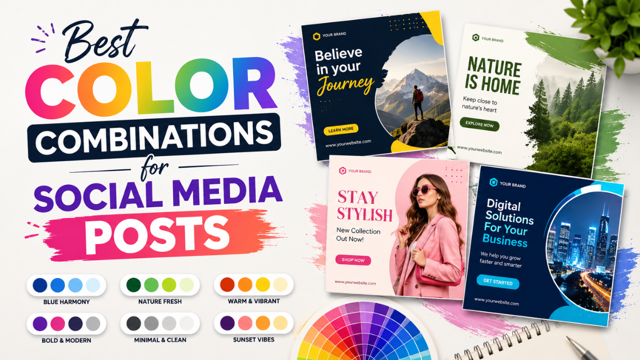
Best Color Combinations for Social Media Posts
Seven two- and three-colour combinations that work for social posts, with hex codes, contrast tips and a simple way to build a palette from your own photos.
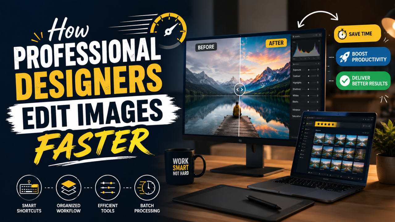
How Professional Designers Edit Images Faster
The habits that let designers get through large batches of images: templates, shortcuts, organised files, batch processing, export presets and working in passes.

What Your Photos Reveal: EXIF, GPS Location and How to Remove It
Most phone photos carry hidden EXIF data, including the GPS location where they were taken. What is stored, which apps remove it and which keep it, and how to strip it on iPhone, Android, Windows and Mac before you share.